Airbnb · Unlock Adventure
A travel campaign brings distant landscapes into familiar rooms, making the promise of adventure feel close to a place to stay.
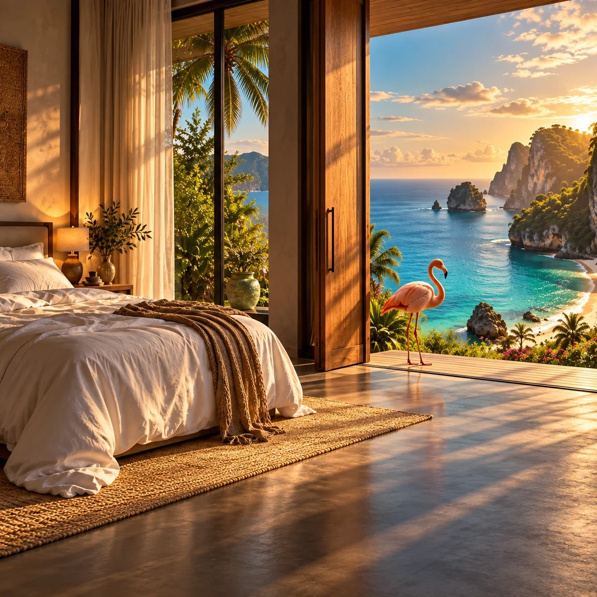
A global platform for places to stay and experiences, presented here through a campaign developed with a Kuwait-based creative studio.
Turn the promise of travel into a visual surprise by connecting a familiar interior with a changing destination beyond it.
Visual development, key visual design, photomontage and lighting direction.
Campaign key visuals adapted for outdoor and digital placements.
Arctic, rainforest, savannah and Antarctic scenes share the room as their visual anchor. Printed and illuminated placement studies carry the same idea into different viewing contexts.
Visual development and key visuals by Ali Komeili in collaboration with a Kuwait-based creative studio. Portfolio scenes recreated from original project references; outdoor settings are presentation mockups.
A place to stay opens a world
The campaign speaks to travellers imagining what their next stay could make possible. A familiar bedroom becomes the threshold to a distant landscape, with wildlife bringing the destination into the room. Developed with a Kuwait-based creative studio, the key visuals turn a simple interior into a direct invitation to explore.
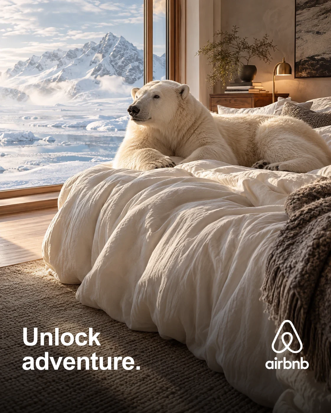
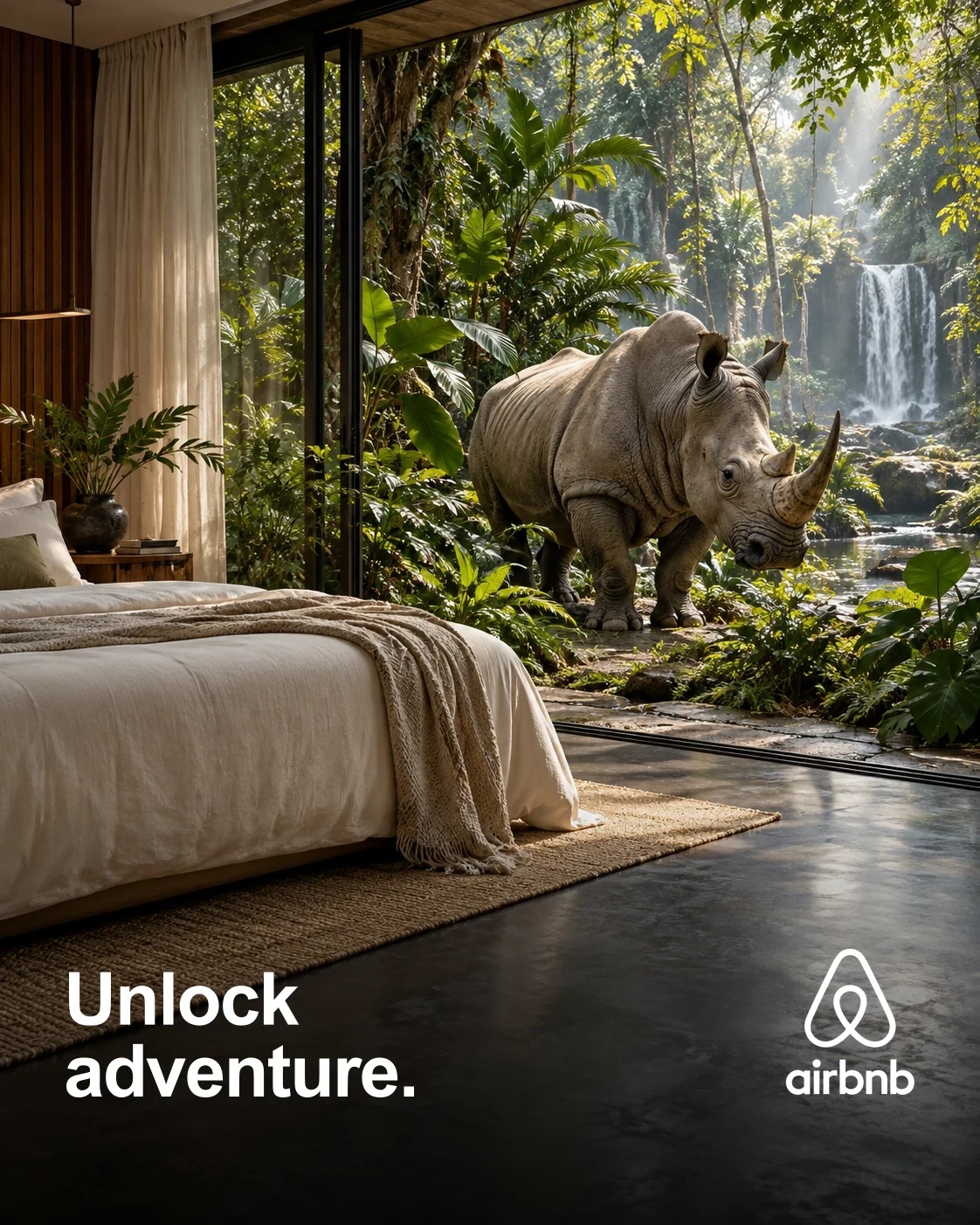
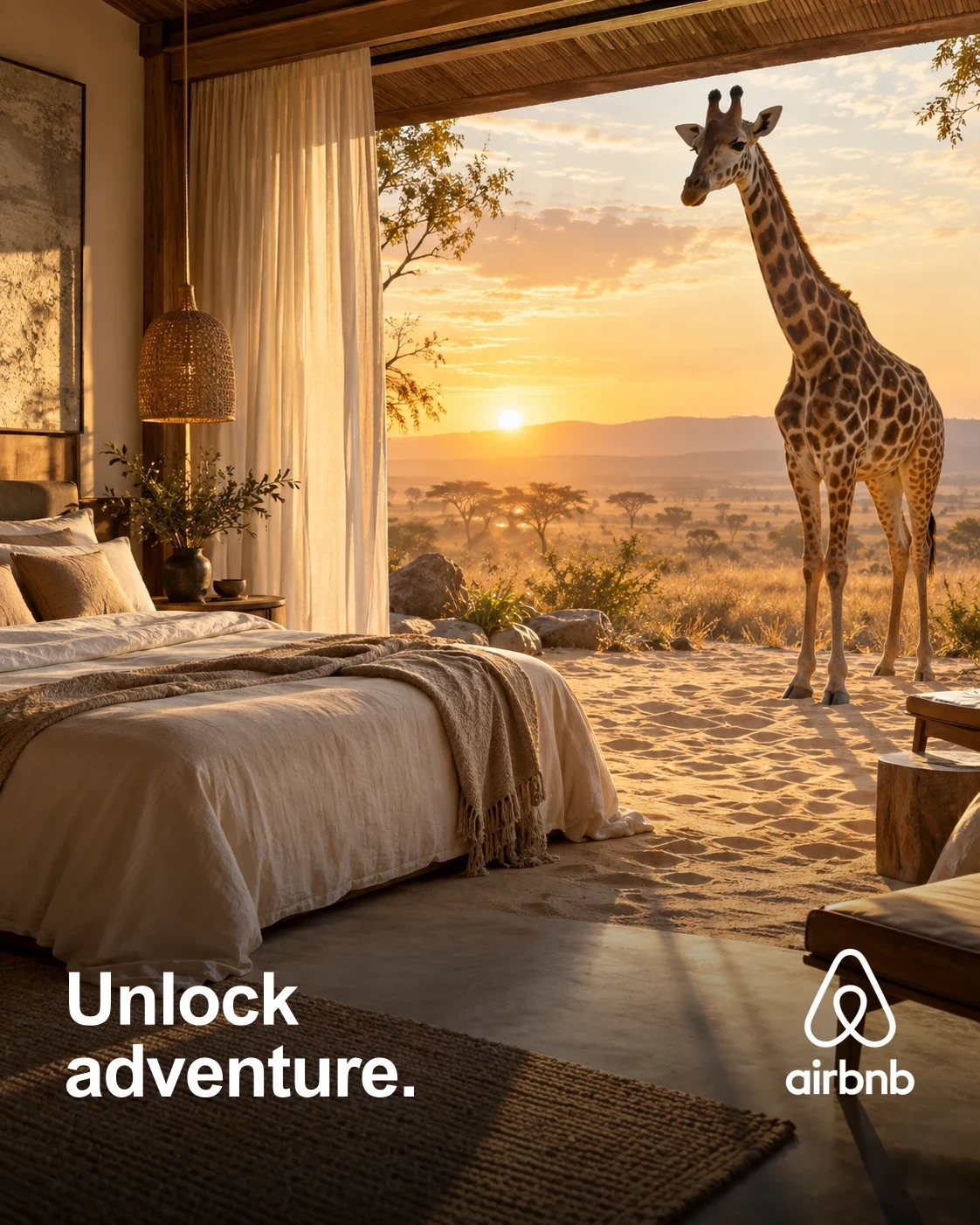
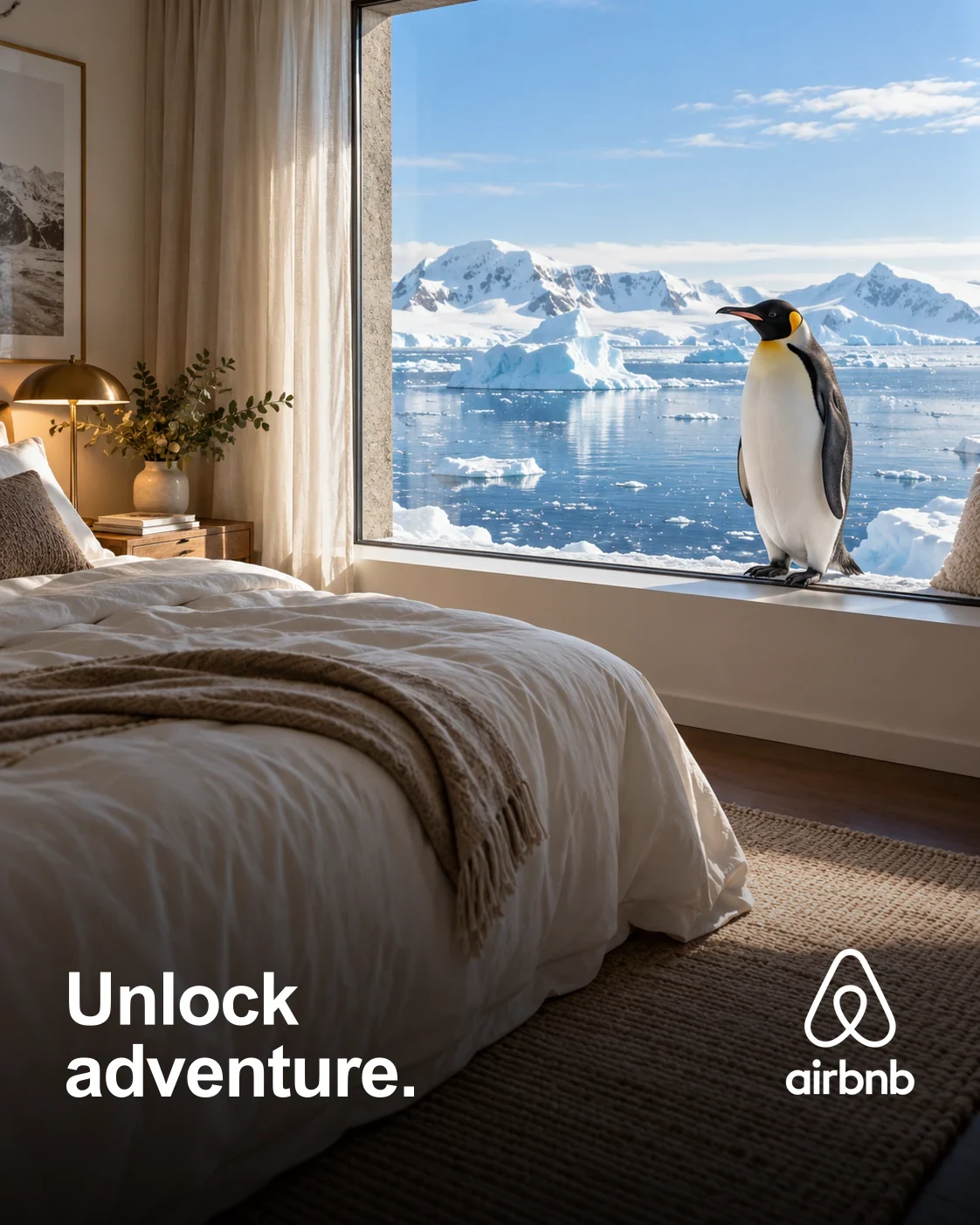
Keep a familiar frame for the surprise
The bed, window and interior light make each scene easy to enter. Beyond that frame, climate, landscape and animal change. The repeated headline and Airbnb mark hold the campaign together while the setting gives each execution its own story.
The idea across outdoor formats
Outdoor mockups explore the campaign on printed streetboards and illuminated transit displays. The placements are presented in a Kuwait City setting. Surface texture and reflections show how the artwork might read in context, rather than documenting a live installation.
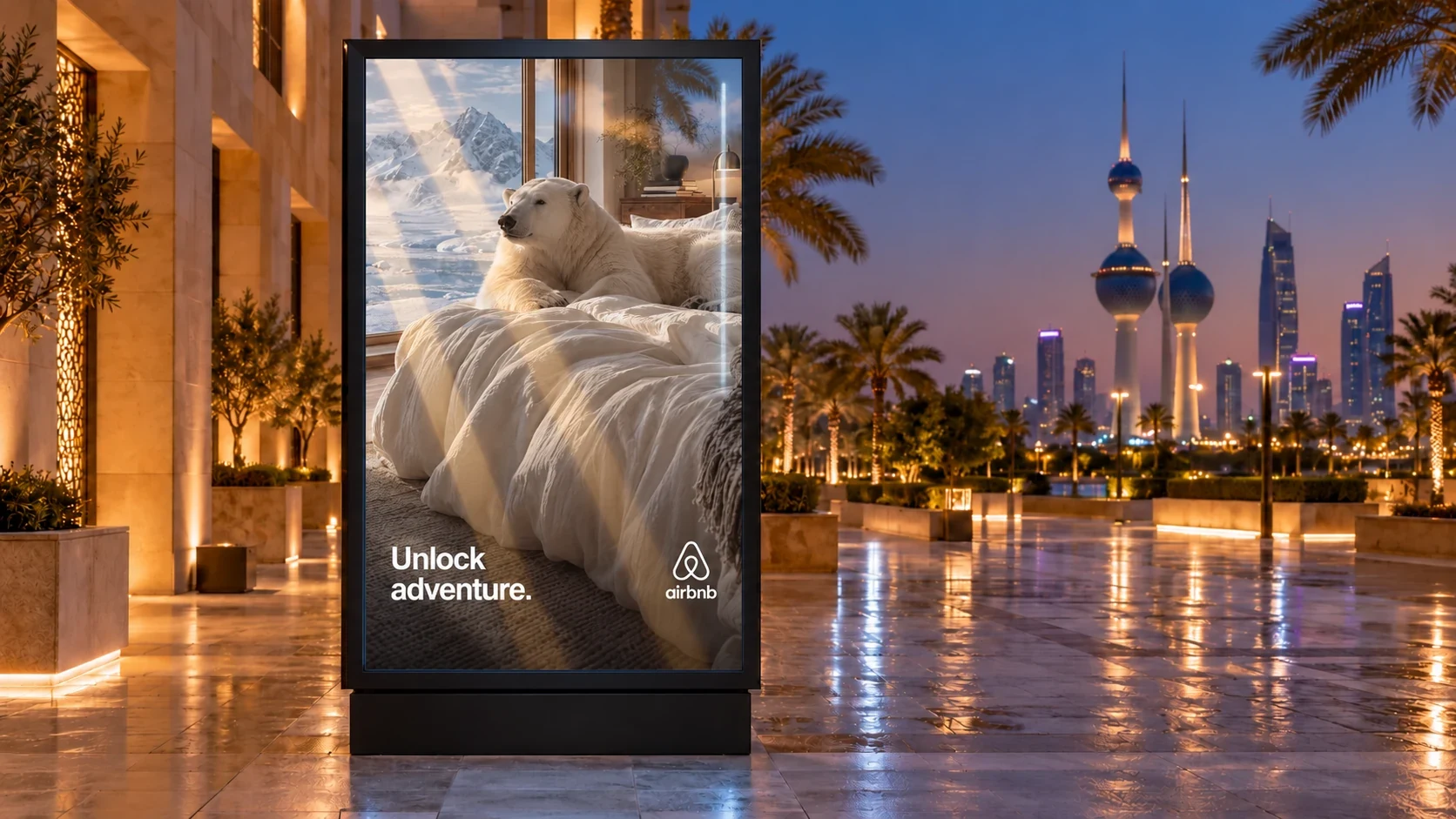
Composing for a streetboard
The streetboard studies carry the room-and-destination idea into large printed surfaces. Folds, mounting points and surrounding architecture give each composition a physical setting. A clear focal scene keeps the destination visible, while the familiar interior gives the campaign a consistent frame across different locations.
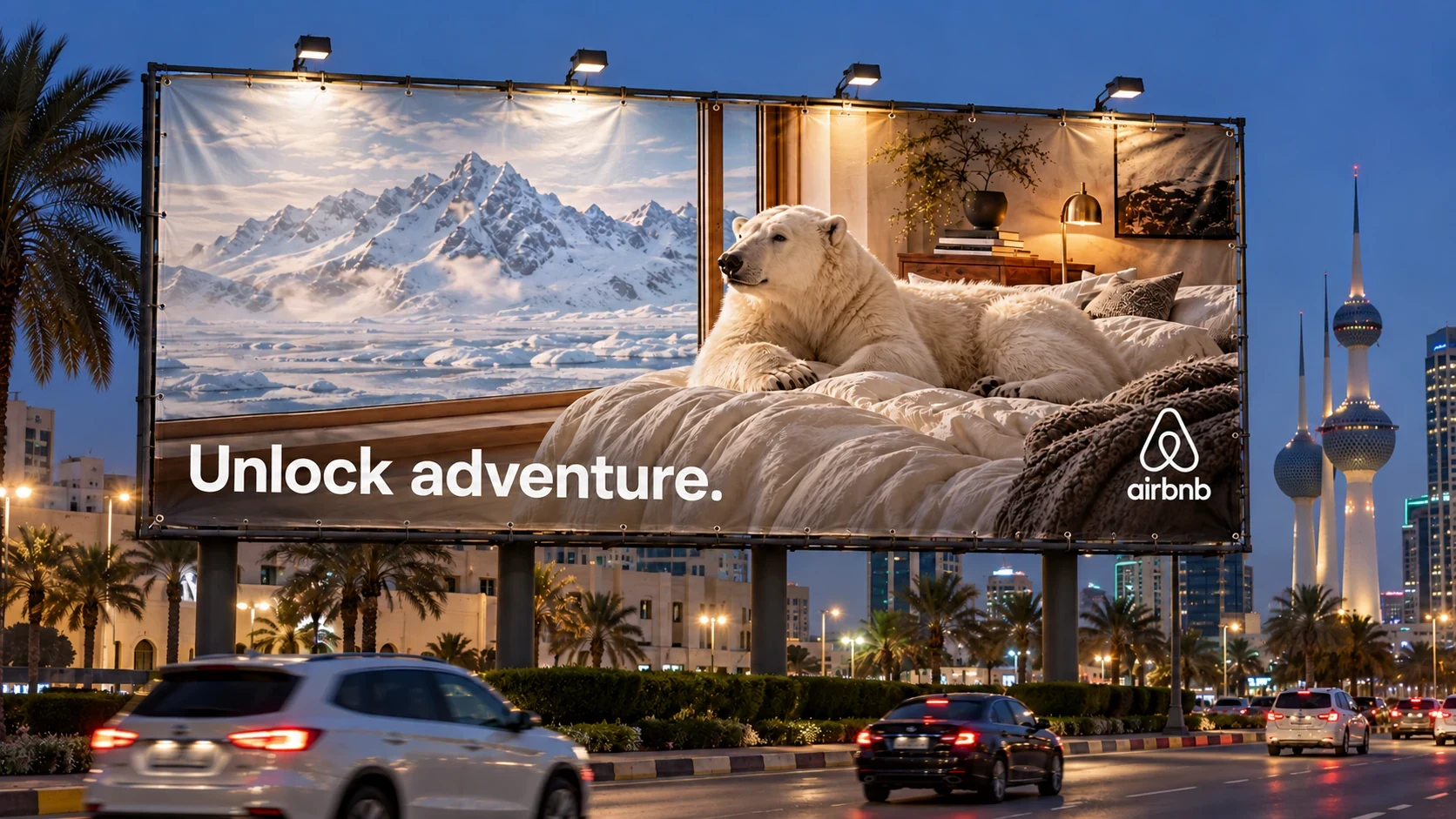
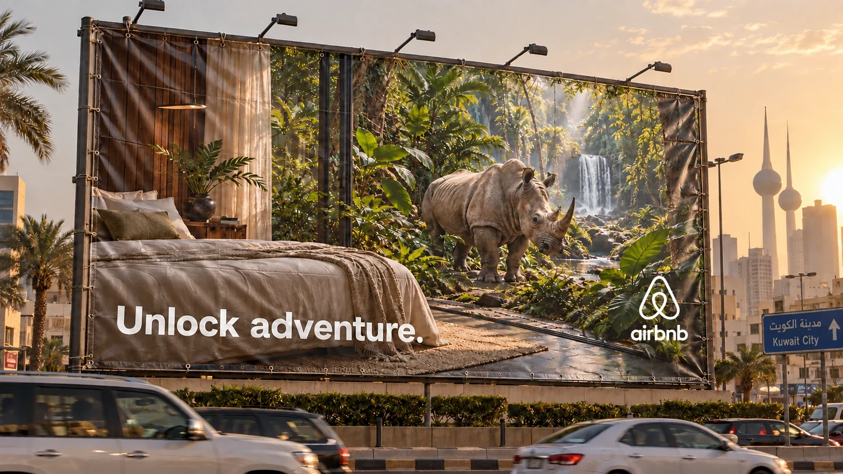
A consistent message across surfaces
The same image and brand arrangement carries across the vinyl mockups. Changes in wrinkles and lighting affect the surface, while the campaign remains recognisable. These details belong to the presentation context rather than the core artwork.
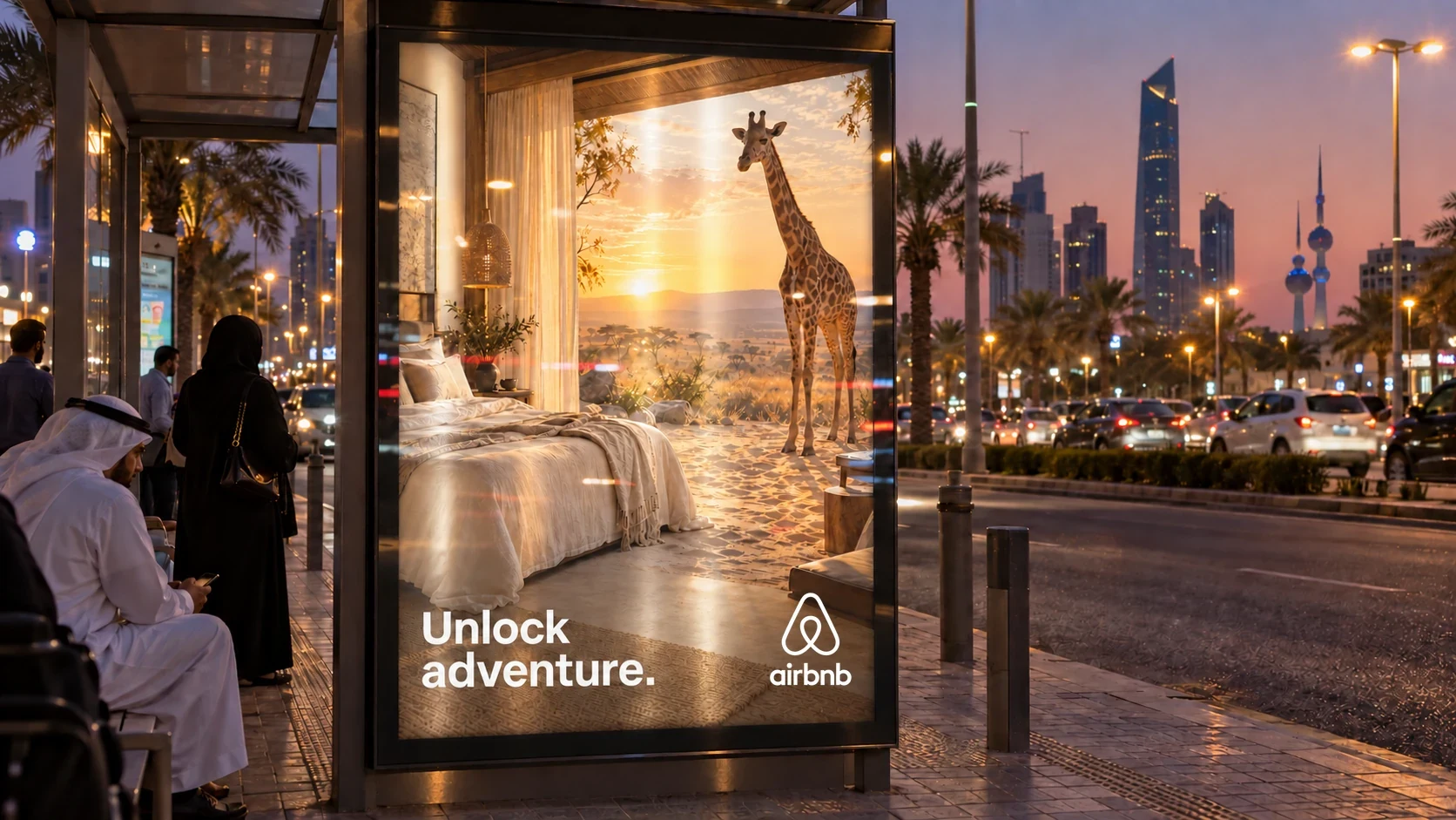
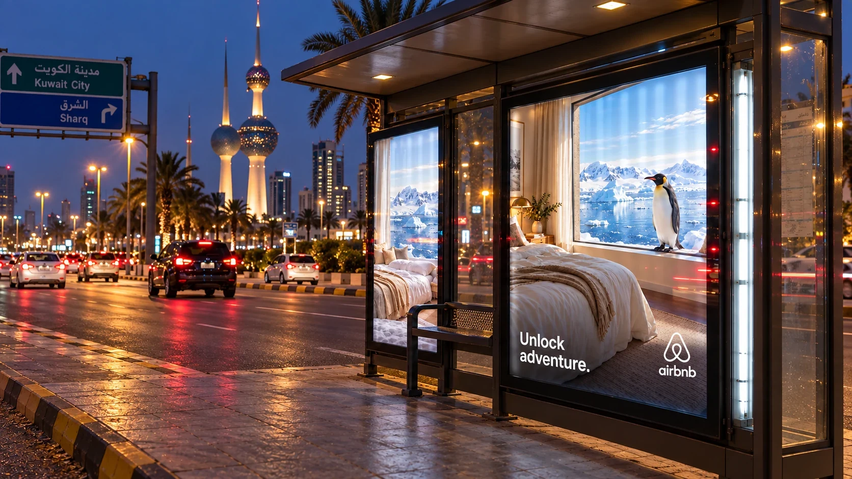
Adventure with a recognisable threshold
Arctic, rainforest, savannah and Antarctic scenes share the room as their visual anchor. Printed and illuminated placement studies carry the same idea into different viewing contexts. The campaign gains variety through the destinations while preserving a clear connection to the stay.