Café Darab
Café Darab’s visual identity pairs bold Persian lettering with architectural geometry, extending a black-and-ivory signature across the café setting.
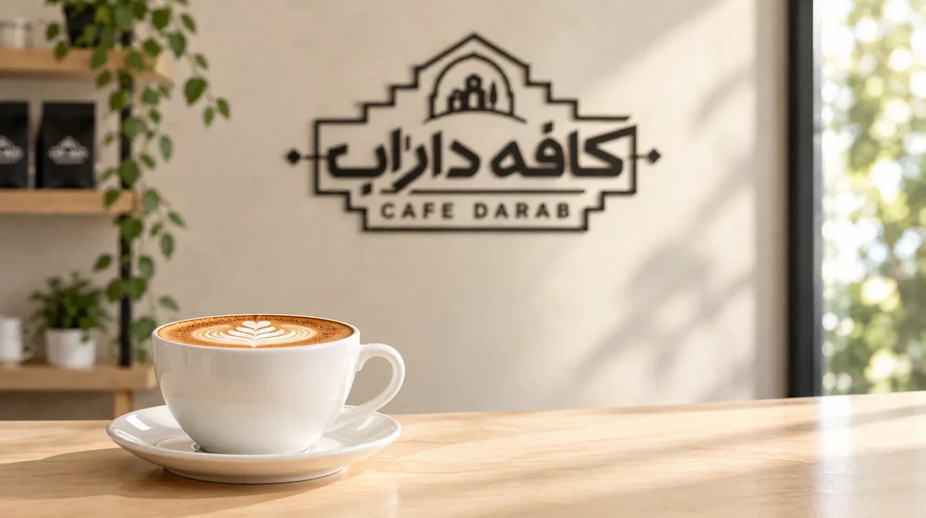
Café Darab is a café brand centred on coffee and hospitality. Its visual direction connects a prominent bilingual name with a calm, warm setting.
Create a distinctive café identity that gives Persian and Latin naming a clear hierarchy and carries its character into signage, uniforms and small service details.
Ali Komeili — Visual identity and art direction.
Bilingual brand mark, colour system, architectural graphic elements, signage direction, staff clothing and accessory applications, and café visualisations.
A coordinated visual direction linking the bilingual mark, supporting colours and proposed café applications through a consistent balance of strong graphics and warm materials.
Visual identity and art direction: Ali Komeili. Environmental and service scenes are design visualisations.
Giving Darab a visible character
Café Darab needed a visual identity with enough presence to define a space and enough restraint to sit comfortably within it. The direction places an expressive name against a quiet setting, using a compact mark as the link between the café’s larger surfaces and its smaller service details.
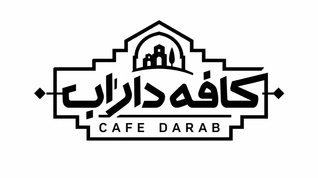
Lettering held by architecture
The Persian name fills the centre of the mark. The smaller Latin line anchors it, while a stepped border contains the lettering without flattening its character. A building emblem sits above the name, echoing the frame and connecting the typography to an architectural image.
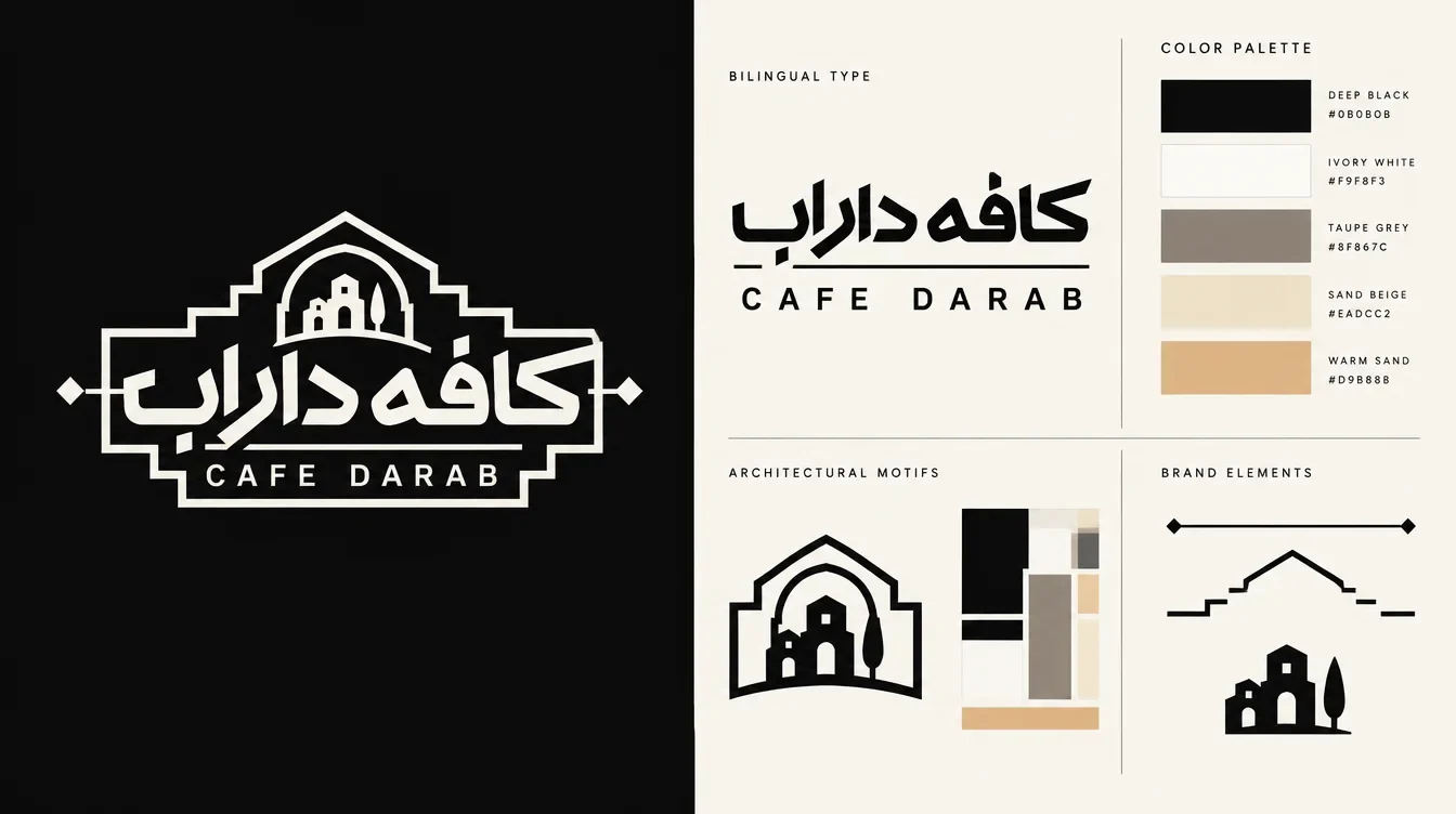
A strong mark on quiet surfaces
The palette gives each colour a distinct job. Black defines the lettering and frame; ivory provides the lighter counterpart. Taupe and sand belong to the surrounding surfaces. In the visualisations, that division lets the identity stand out against pale walls, wood and fabric without introducing competing colours.
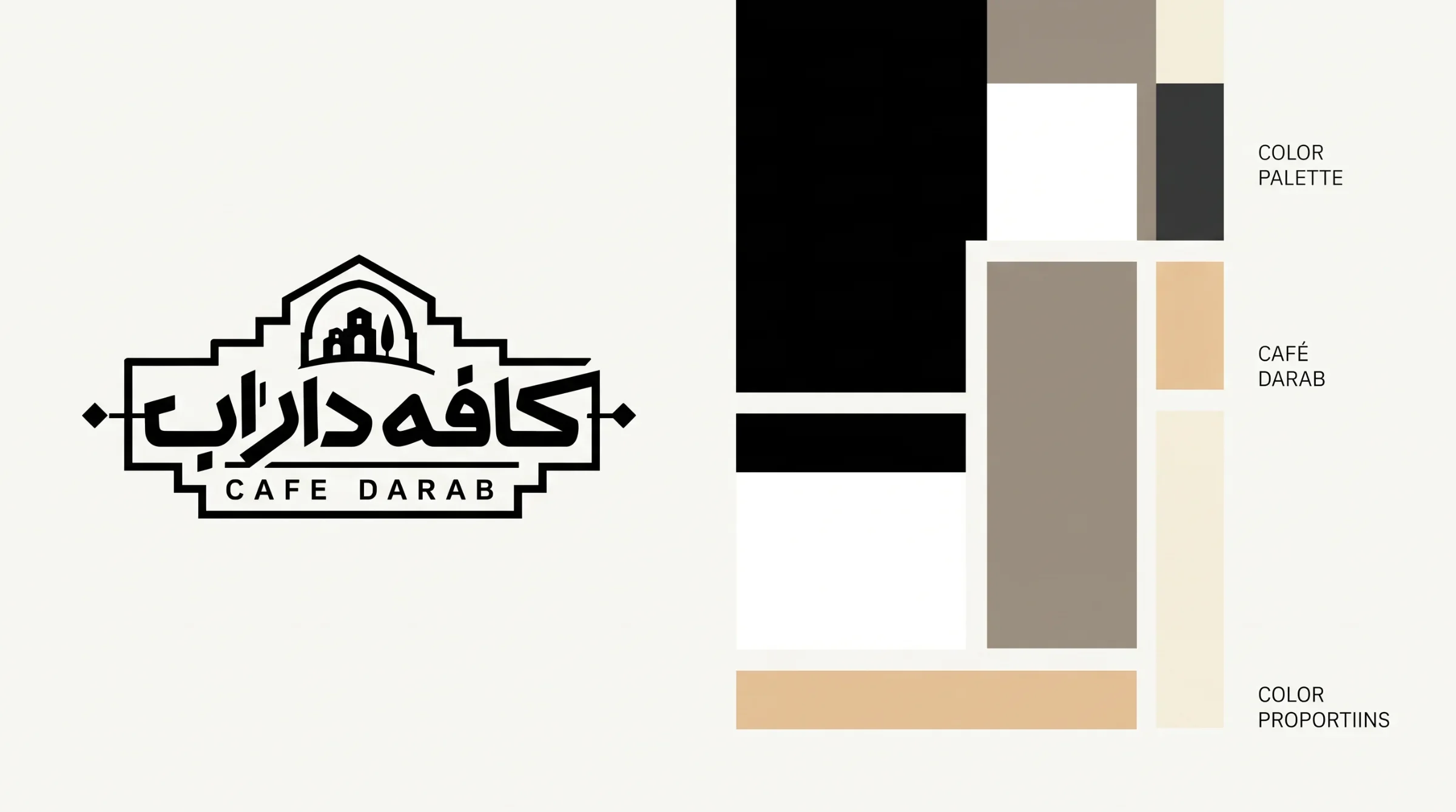

Scale changes, structure stays
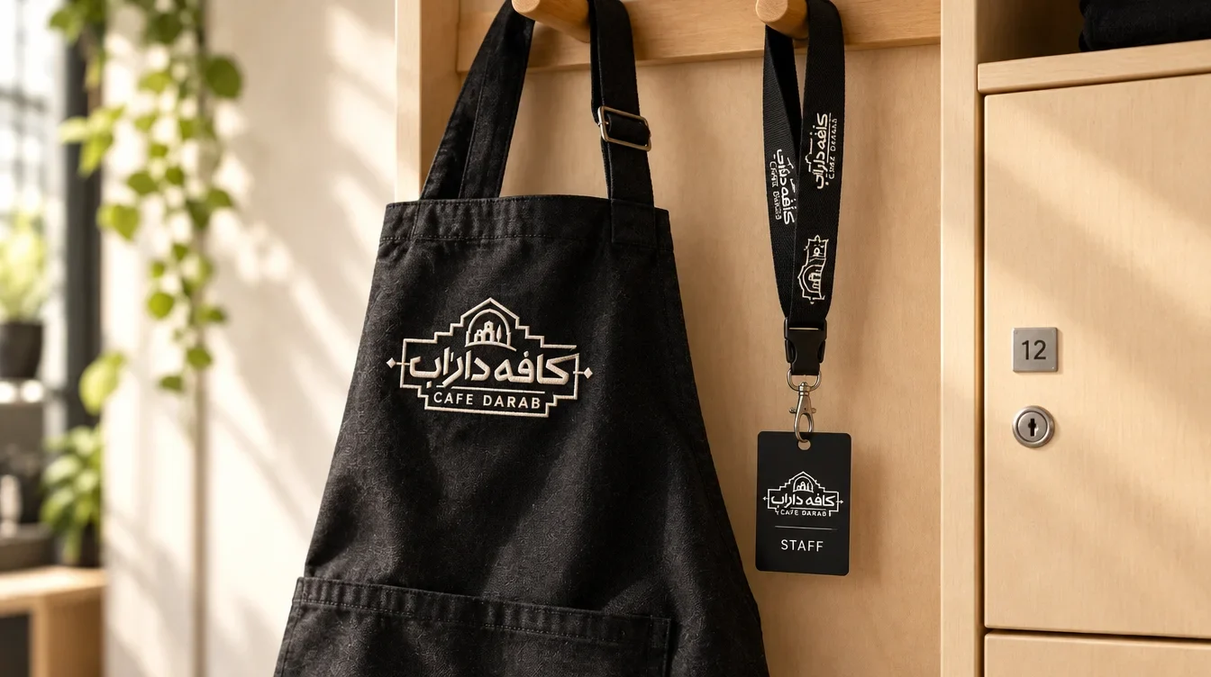
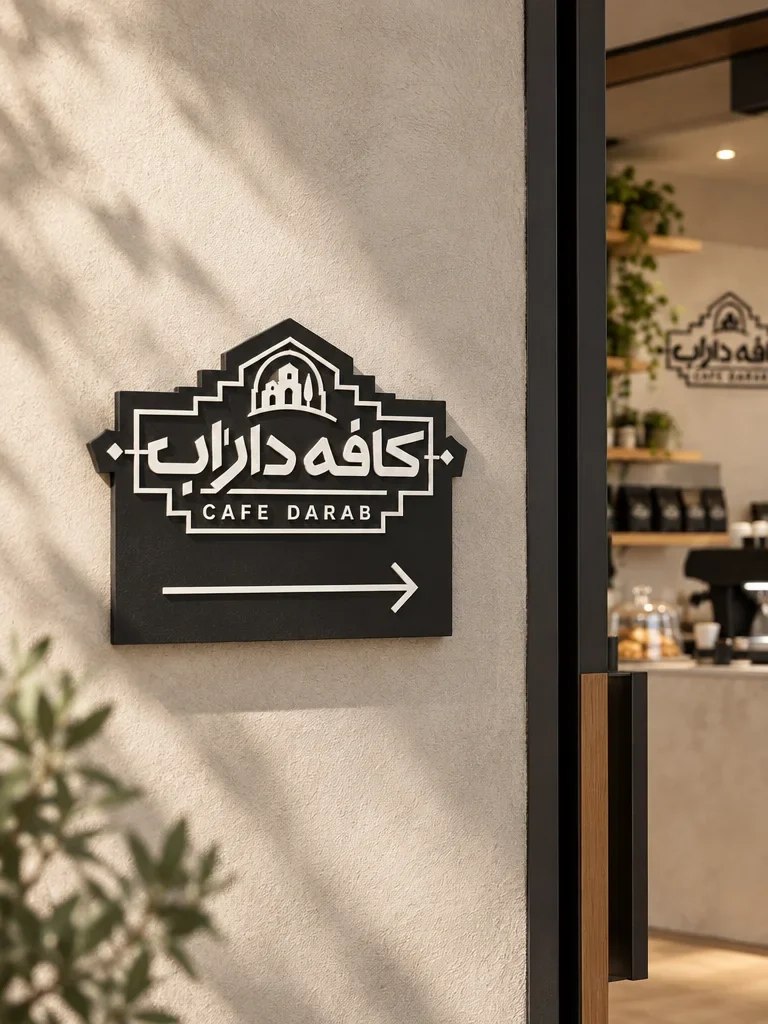
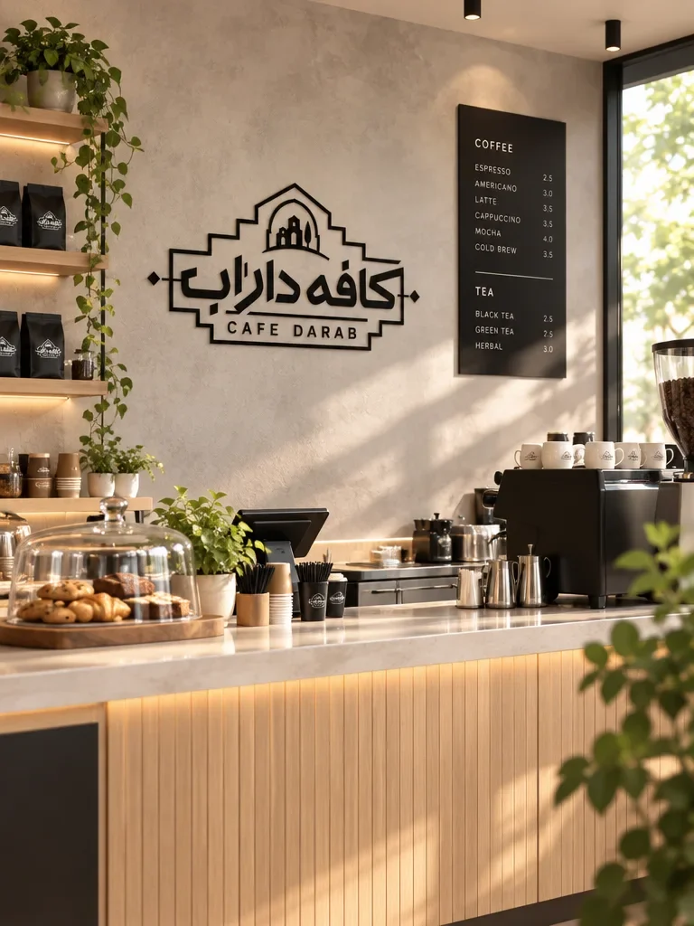
The complete lockup is repeated across the proposed entrance sign, counter wall and staff clothing. White lettering reverses out of the black sign and apron, while the wall carries the dark version. Lanyards and badges bring the same framing into compact formats, keeping the applications visibly connected.

The café as a complete composition
The result is a visual direction in which typography, colour and setting support each other. Identity artwork establishes the system, and the café scenes show its proposed use in signage, staff accessories and service. These are design visualisations; no installation or business results are claimed.