Café De La Corte
Coffee packaging extends Café De La Corte’s established identity through clear glass, a woven sleeve and a considered serving ritual.

Café De La Corte is a premium coffee brand built around ritual, craftsmanship and generous hospitality. Its identity combines a heraldic bird mark with warm metallic tones and tactile natural materials.
Extend an existing coffee identity into a coordinated packaging direction using glass, labels and woven materials at different scales.
Packaging design and visual execution. The project was commissioned through a Kuwait-based creative studio; the core brand identity was already established.
Material applications, label system, bottle treatments, burlap sleeve construction, product mockups and lifestyle presentation.
The packaging connects the bottle, transparent label and tied sleeve to the wider coffee setting. Its character comes from the relationship between materials and the existing identity, with each surface contributing to a coherent object that belongs on the table.
Brand identity supplied by the commissioning studio. Packaging design and visual execution by Ali Komeili.
Packaging around the coffee ritual
Café De La Corte brings coffee into a setting of careful preparation and generous hospitality. Commissioned through a Kuwait-based creative studio, my work extended its established identity into packaging. The bottle, shield label and woven sleeve give the product a tactile presence at the moment it is handled and served.
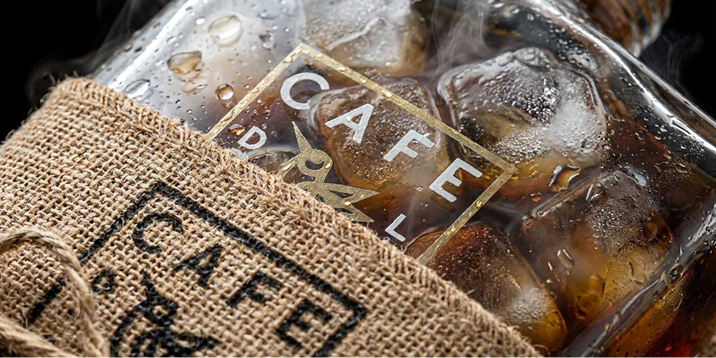
Let the coffee colour the bottle
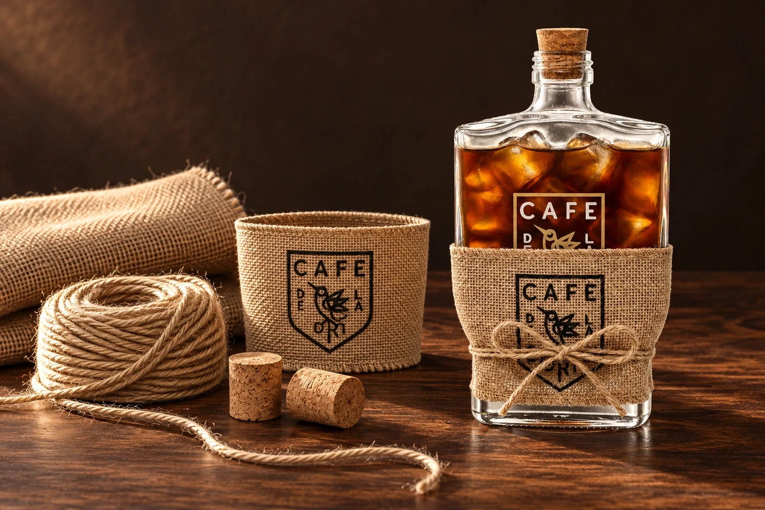
Clear glass keeps the coffee visible and gives the restrained label a changing background. Burlap and twine introduce a dry, woven texture beside the glossy bottle. The materials make the identity feel close to the serving ritual without adding another graphic layer around the supplied mark.
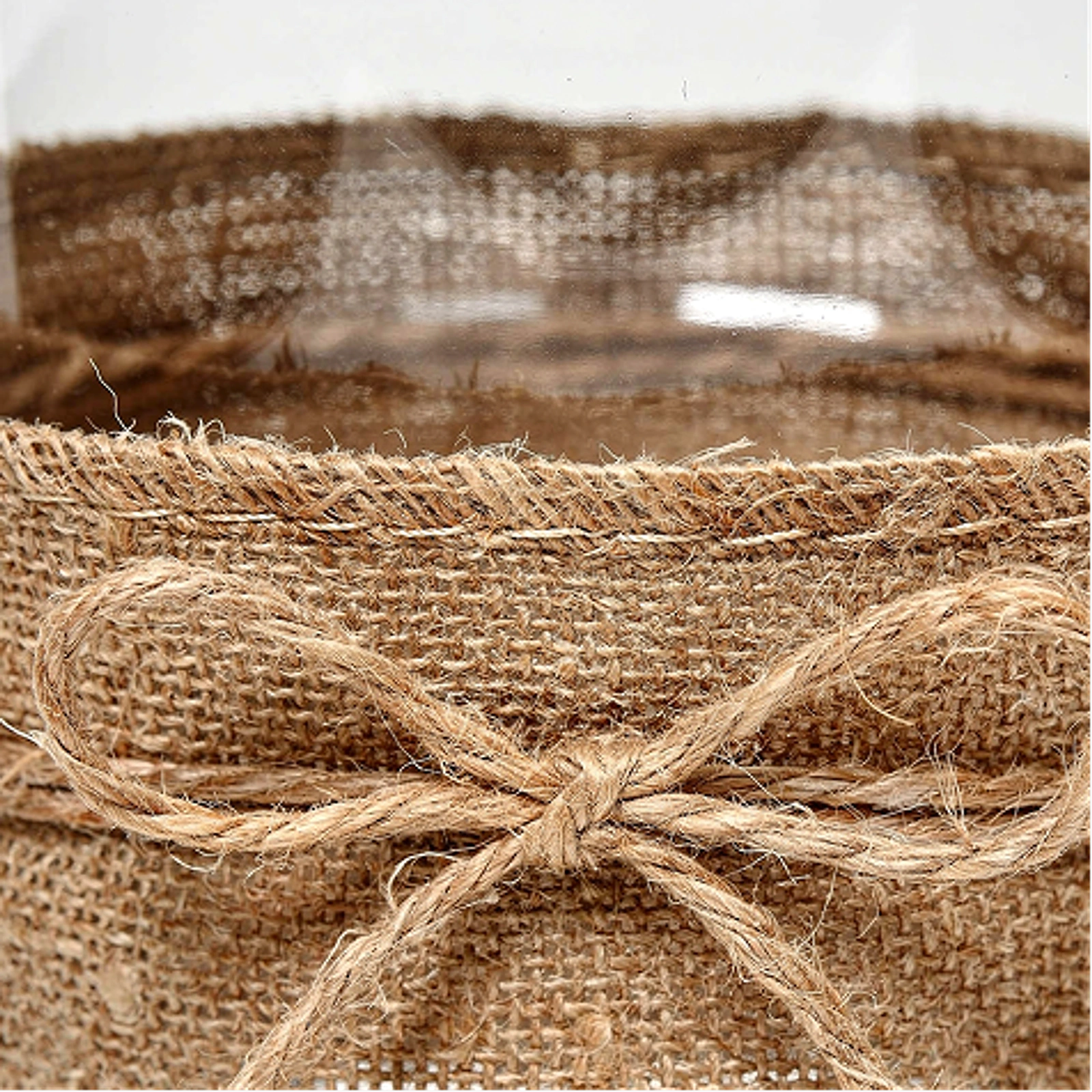

Proportions guided by the bottle
The bottle establishes the scale of the label and sleeve. Transparent areas preserve a view of the contents, and the shield mark links the surfaces. These studies explore placement and proportion across the packaging.
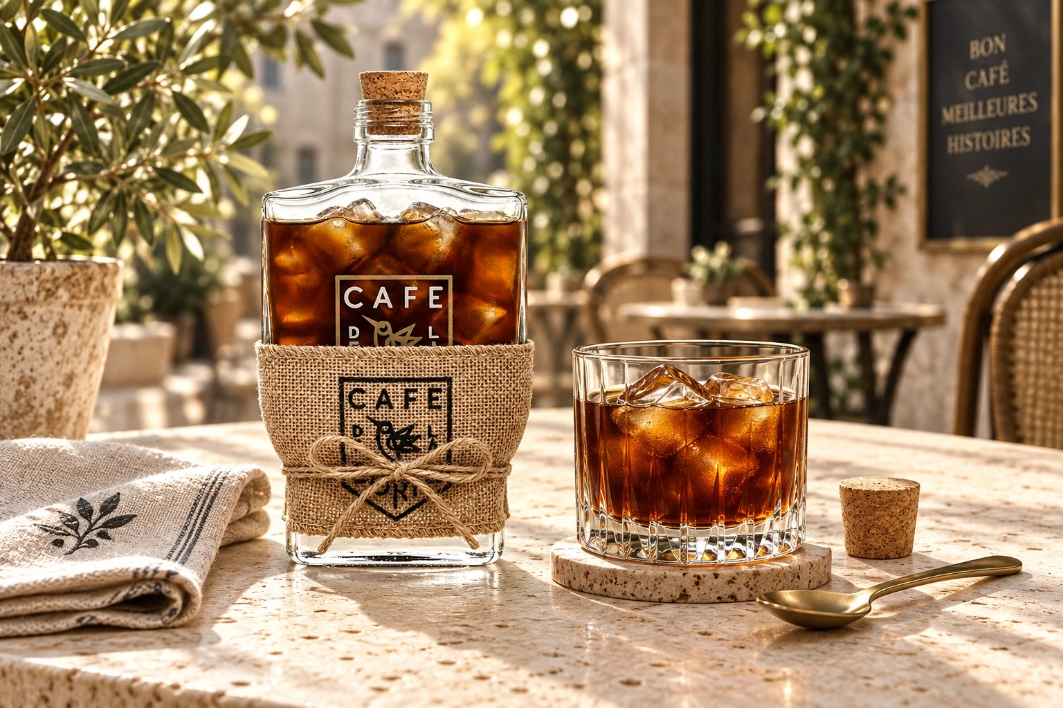
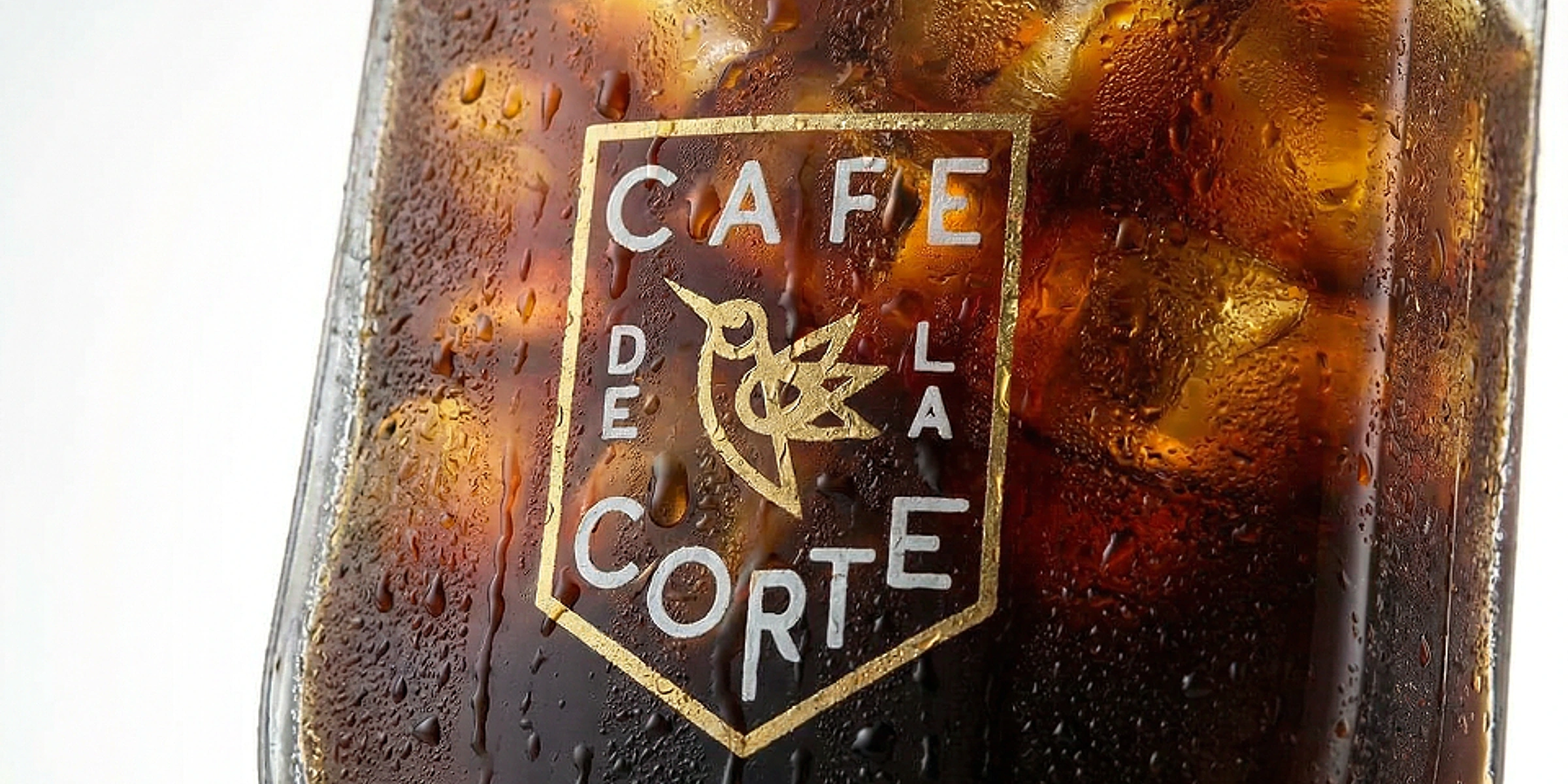
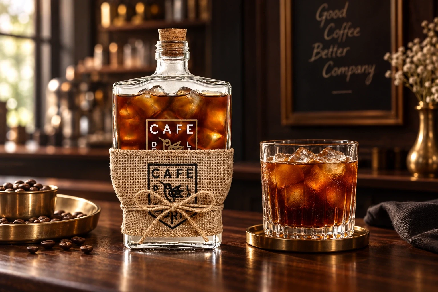
The brand carried through the pour
The packaging connects the bottle, transparent label and tied sleeve to the wider coffee setting. Its character comes from the relationship between materials and the existing identity, with each surface contributing to a coherent object that belongs on the table.