DesertCell
A solar energy identity built around luminous horizons, precise panel geometry and a bold contrast between desert warmth and electric blue.
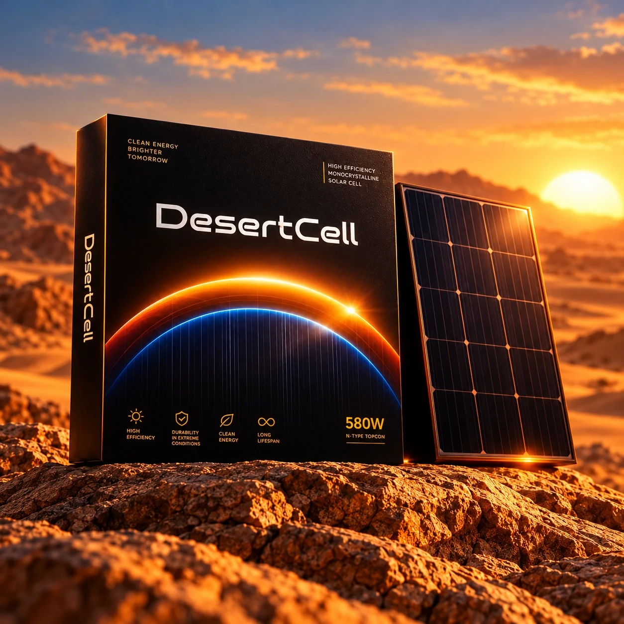
Solar cells and photovoltaic panels, presented through a visual identity grounded in desert light and technical precision.
Give solar technology a distinctive visual presence while keeping the product hierarchy clear across packaging, detailed product views and physical brand applications.
Visual identity presentation and art direction
Wordmark presentation, color palette, typography, graphic language, packaging visualizations, product imagery and workplace branding applications.
A coherent brand presentation connects the identity to the panel, packaging and workplace. Its central arc and controlled palette carry the same visual signature across wide scenes and compact applications.
Desartly — project presentation and art direction. AI-assisted application imagery generated from the supplied DesertCell references.
Solar power with a clear signature
DesertCell is presented as a solar technology brand with an industrial outlook. Its identity addresses buyers and teams who need equipment to feel precise, capable and ready for demanding environments. Desert light supplies the emotional cue; the geometry of photovoltaic cells supplies the structure.
A horizon becomes the signature
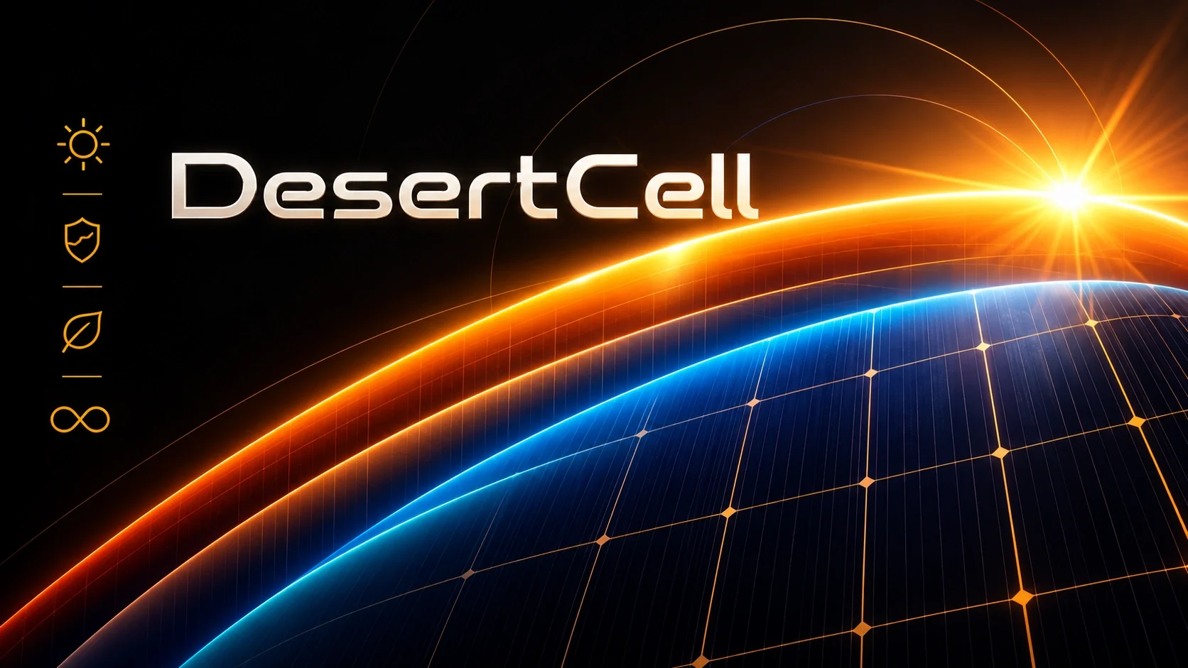
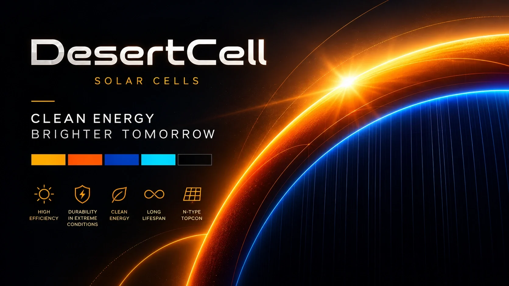
The rising arc turns sunlight into a repeatable brand device. Orange and gold trace the heat of a desert horizon, while blue and cyan introduce an electrical register. Fine vertical lines connect the image to the panel itself, making the graphic an extension of the product.
Warm light, precise structure
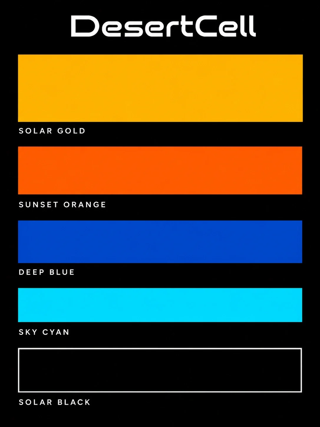
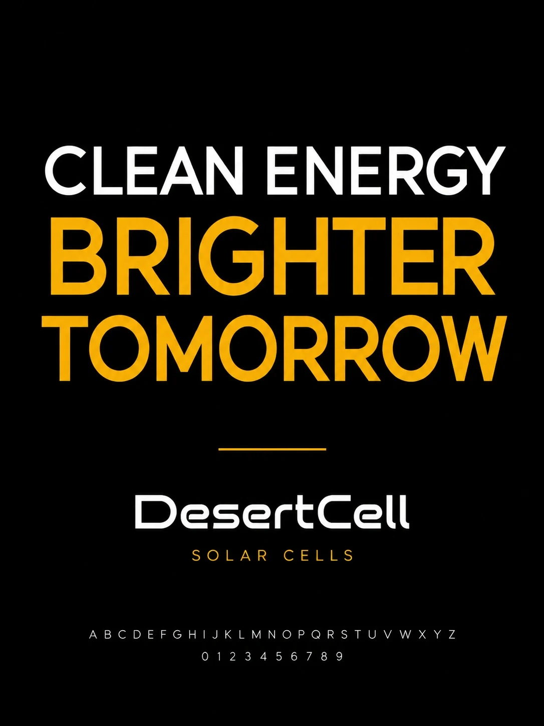
Black gives the system a stable ground. White carries the wordmark and headline hierarchy; gold marks secondary labels and icons. The rounded, extended lettering balances technical geometry with an open rhythm. Broad color fields establish the palette before the more expressive gradients enter product imagery.
The package carries the story
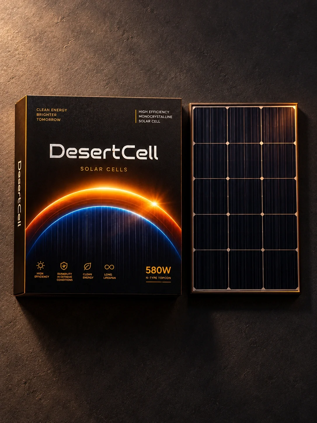
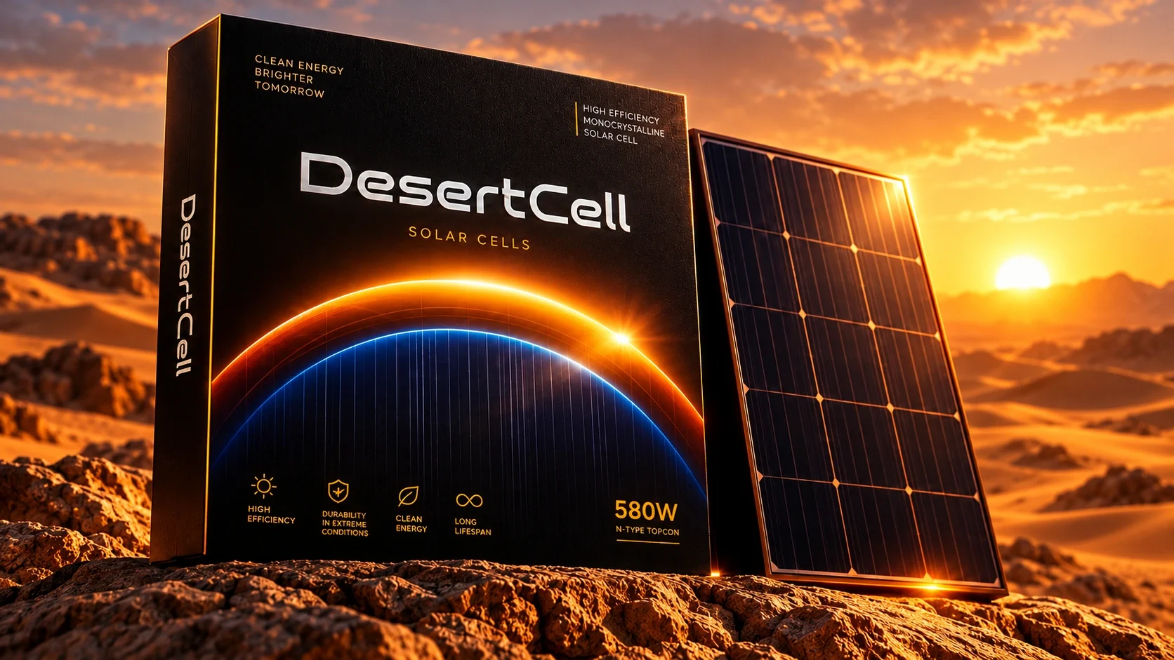
The packaging composition separates three reading levels: brand, product category and specification. The white wordmark occupies the upper field, the orbital graphic anchors the lower half, and the gold 580W label forms a distinct corner marker. Technical copy remains secondary to the brand and product identification.

From the cell to the landscape
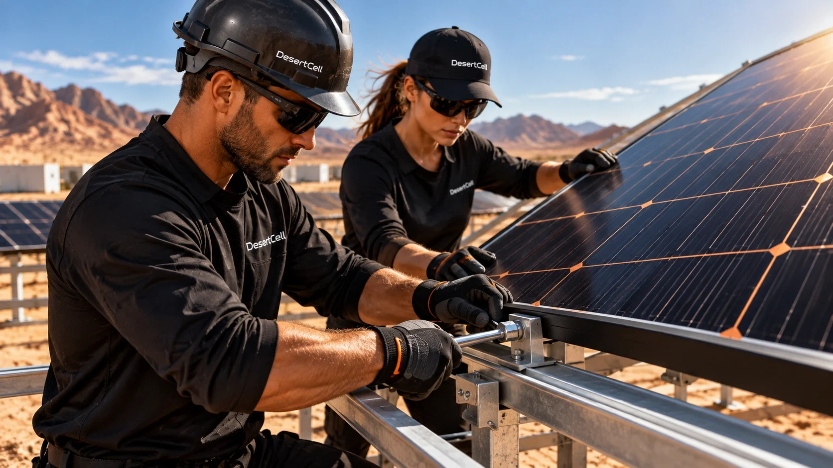
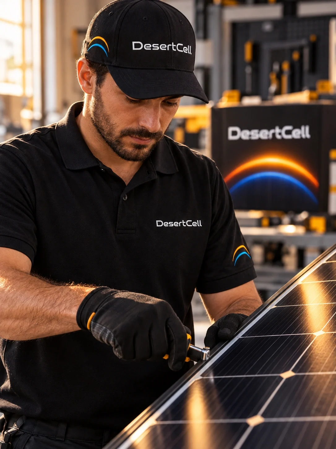
The image sequence moves between surface detail, installation and a wide solar field. Golden reflections keep the desert setting connected to the identity, while dark cell grids preserve the product’s technical character. Human presence shifts attention from a standalone object to the work around it.

A shared language inside the workplace
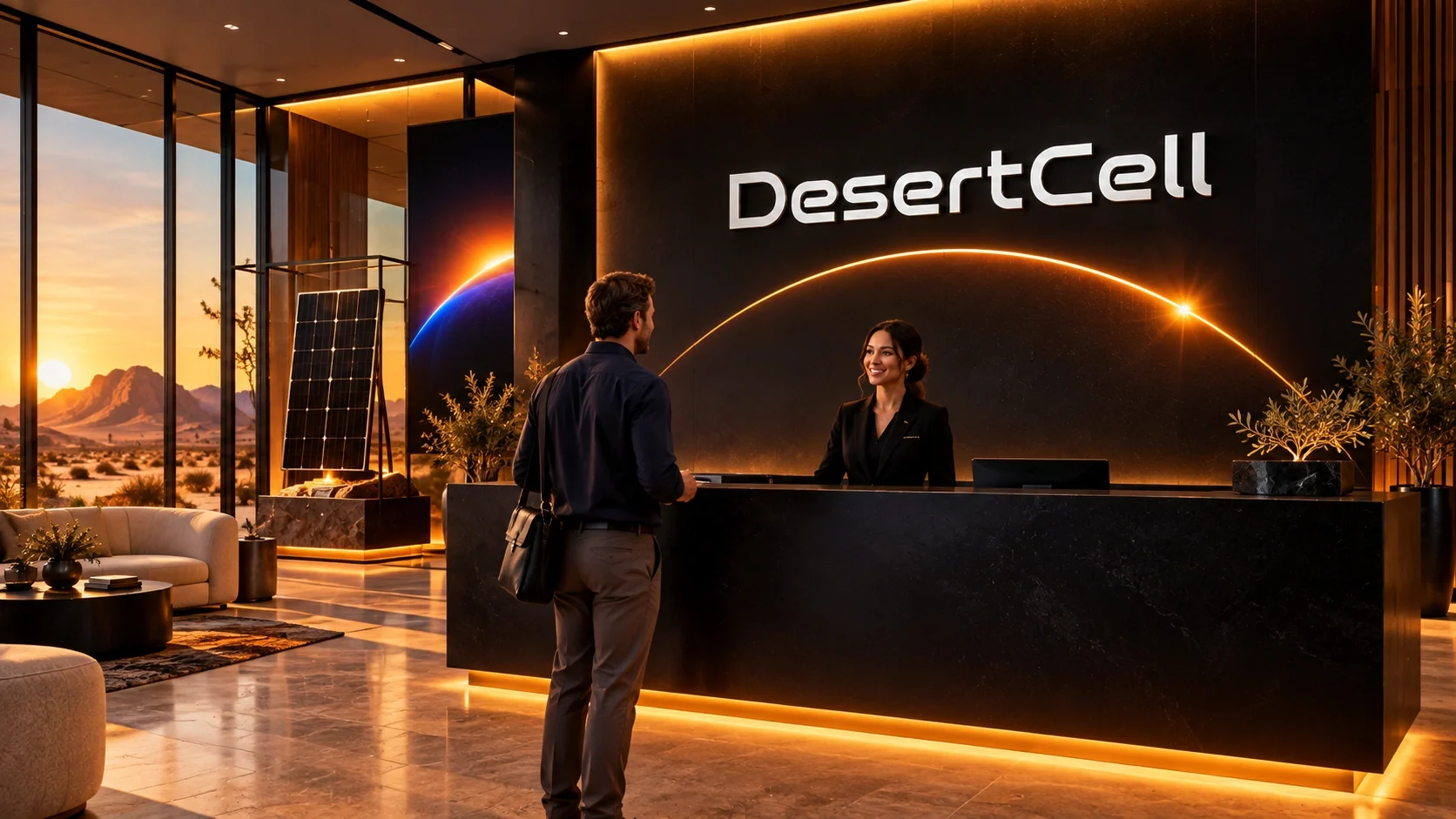
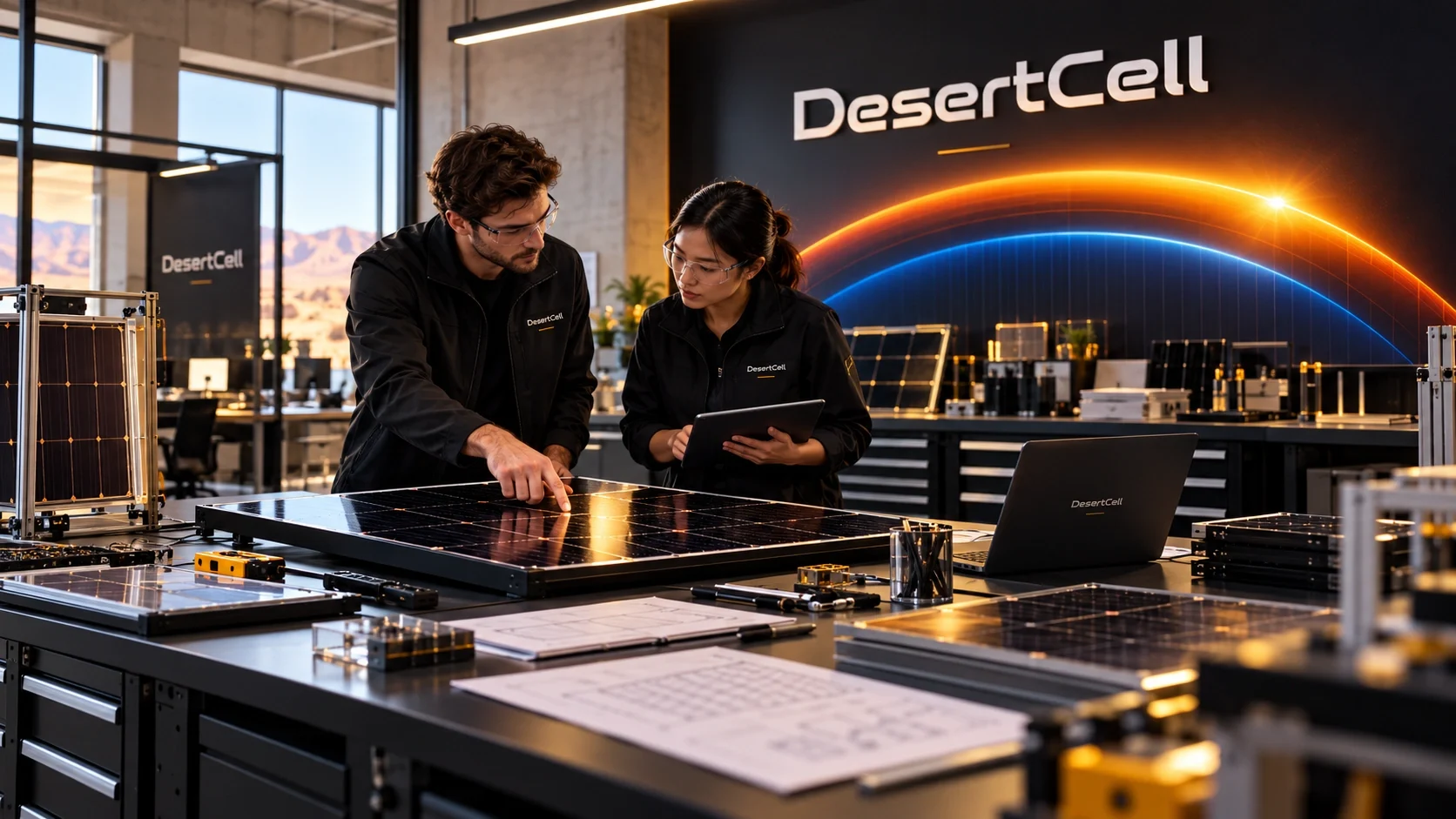
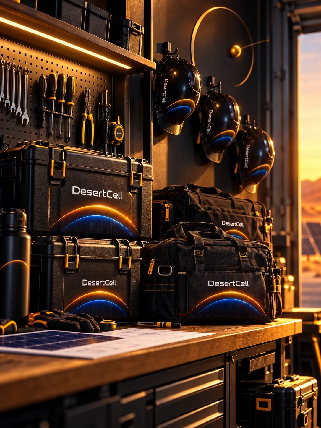
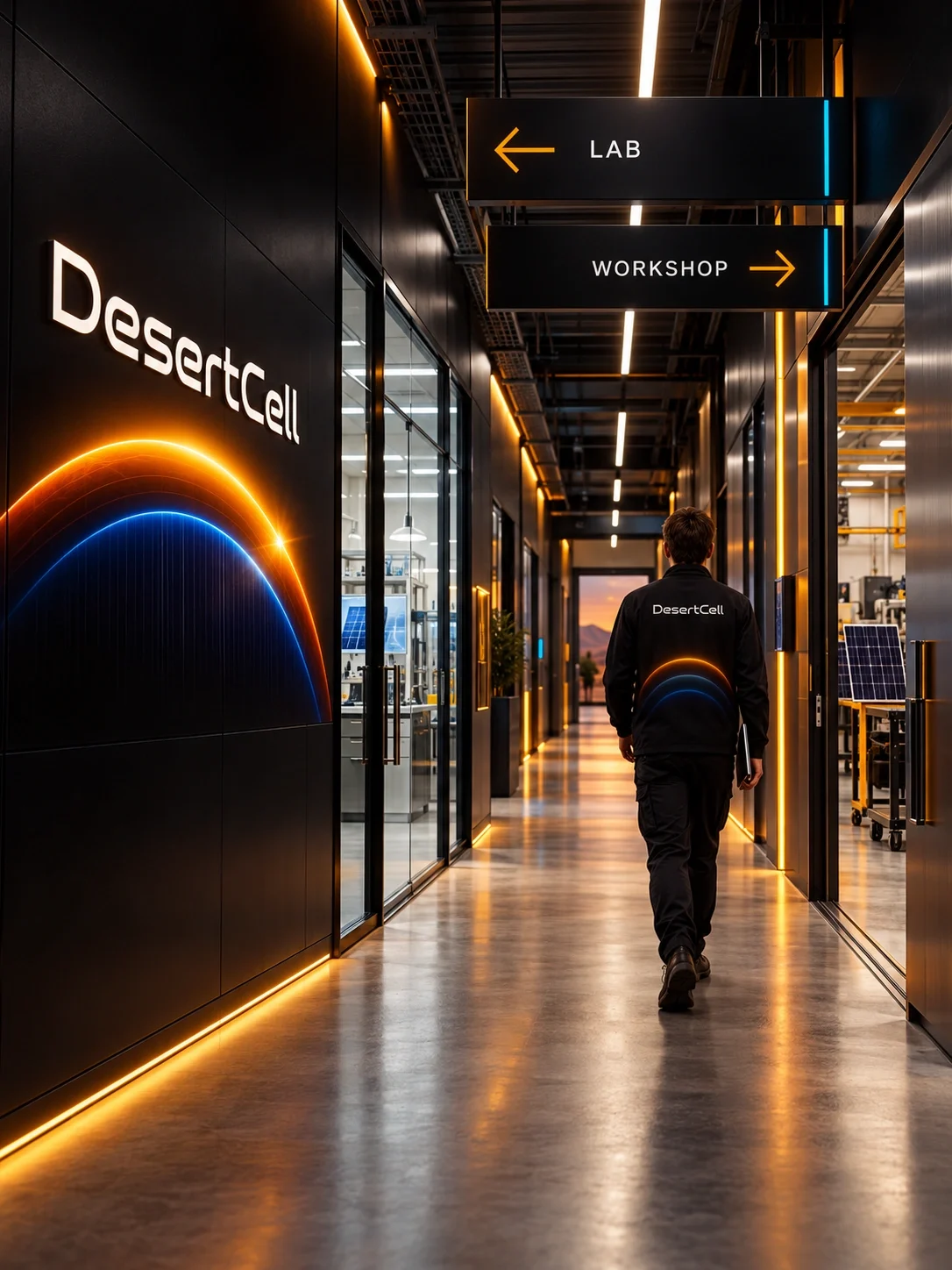
The same hierarchy carries into reception, engineering spaces and field equipment. Large wall marks establish orientation; smaller embroidered logos identify people and tools. Gold arrows and restrained cyan markers adapt the palette to wayfinding, while the orbital motif gives each setting a recognizable visual connection.
A system expressed at different scales
The presentation brings wordmark, palette, typography, packaging and workplace applications into a consistent visual family. Competence leads the intended personality, with ruggedness expressed through the desert setting and industrial materials. The application scenes are AI-assisted design visualizations, showing the proposed system rather than a documented rollout.