EcoGold
EcoGold’s campaign turns gold, silver and coins into a transparent battery, giving stored value a recognisable physical image.
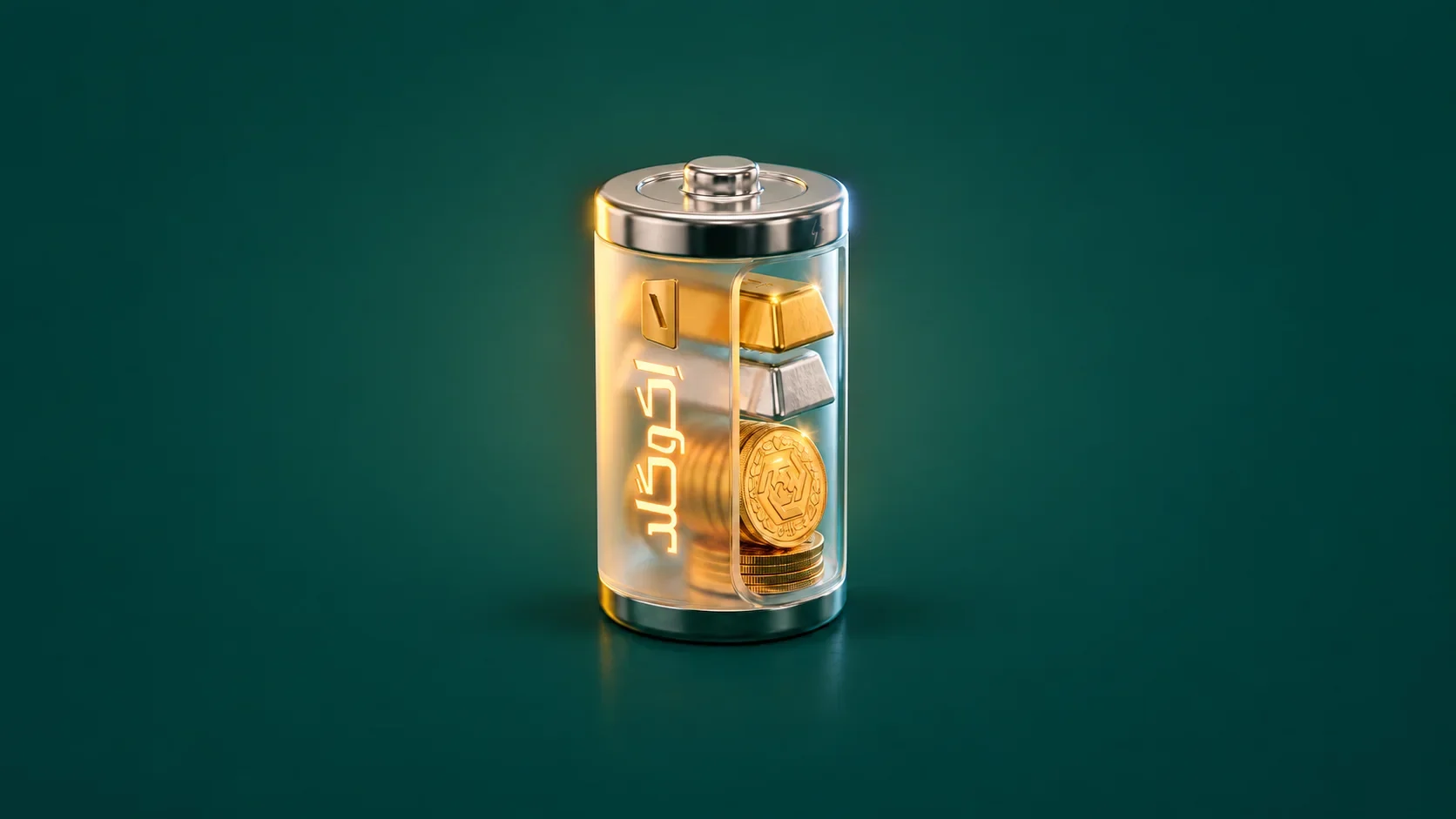
A precious-metals brand offering gold, silver and coins, as represented in the supplied campaign artwork.
Give gold, silver and coin trading a clear, memorable campaign image that works as a single object and alongside a Persian advertising message.
Campaign artwork and key visual design.
Key visual, material and angle studies, square and portrait campaign layouts, and a billboard presentation mockup.
Hero views, construction stages, material details and advertising layouts follow the same battery. Square, portrait and billboard formats change the reading distance while retaining the object and Persian message as the principal cues.
Campaign artwork by Ali Komeili. The outdoor scene is a presentation mockup.
Give stored value a familiar shape
EcoGold’s precious-metal offer includes gold, silver and coins. The campaign needs a compact image that can carry those materials together with its Persian service message. A battery supplies that structure: its transparent shell reveals the metals and gives the idea of stored value a familiar silhouette.

Make the contents carry the meaning
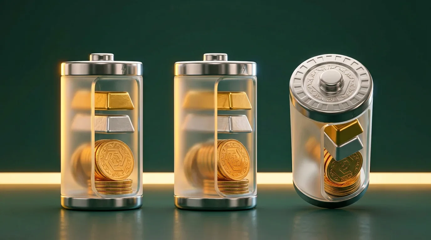
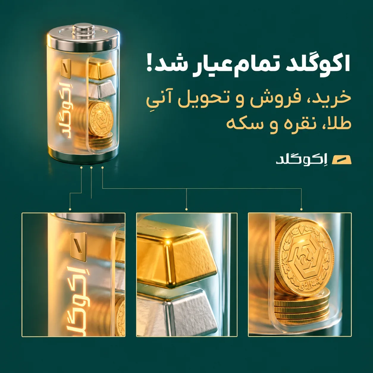
Bars and coins follow the battery’s vertical structure, with warm gold set against cooler silver highlights. The clear shell lets the materials remain visible, while the green field gives the object room. Lighting makes the different surfaces readable within one compact campaign subject.
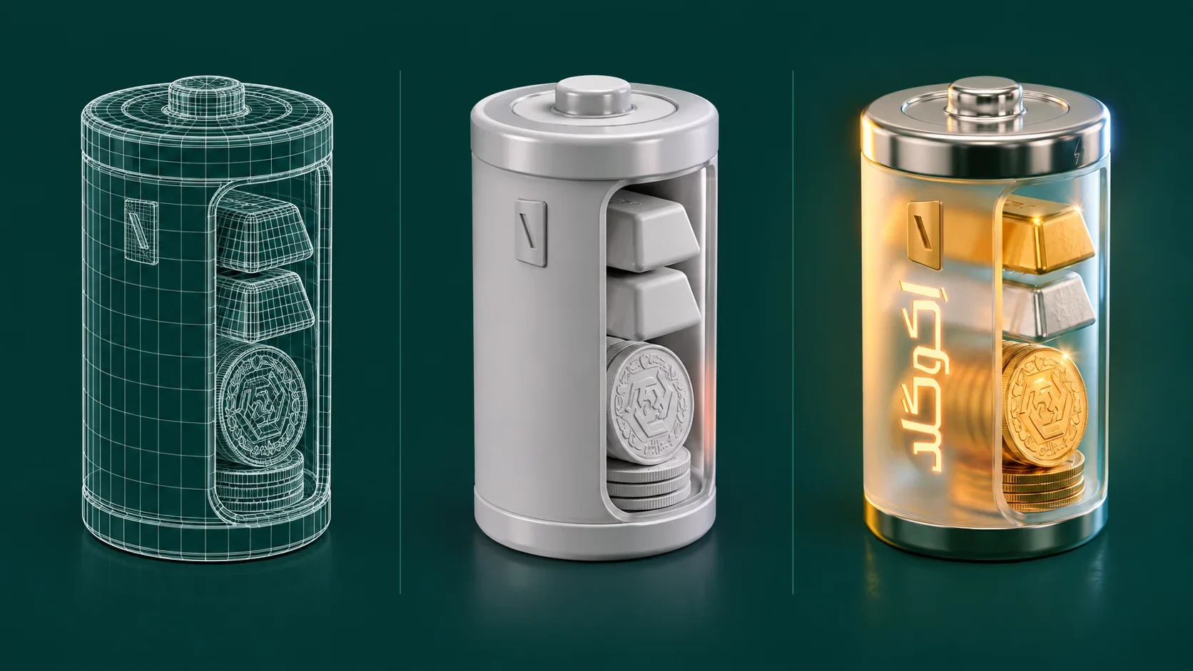
From structure to finished light
The development sequence moves from wireframe to a neutral surface and then to the finished artwork. Seeing those stages together explains how the cylindrical shell, metal cap and internal stack form the visual before lighting gives it depth.
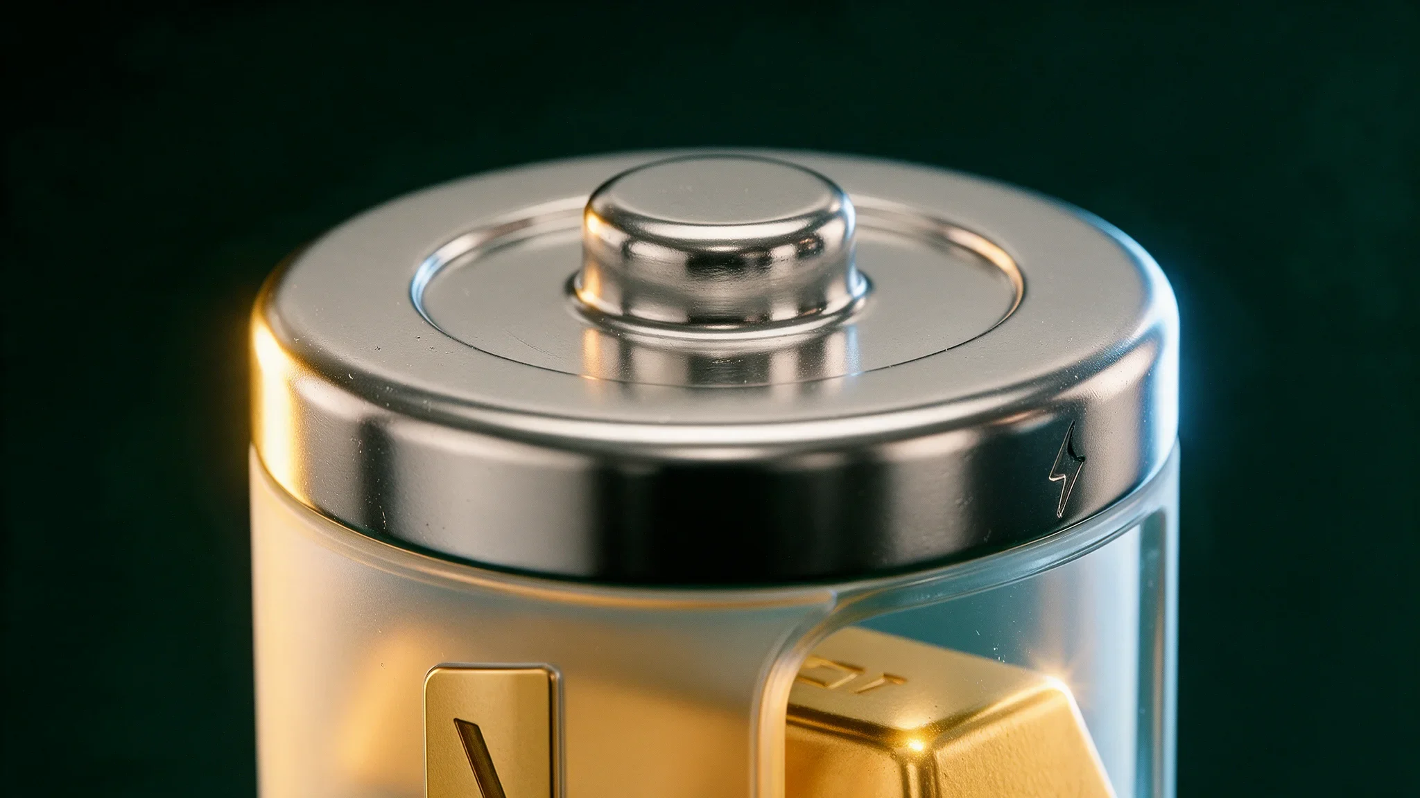
The detail carries the idea
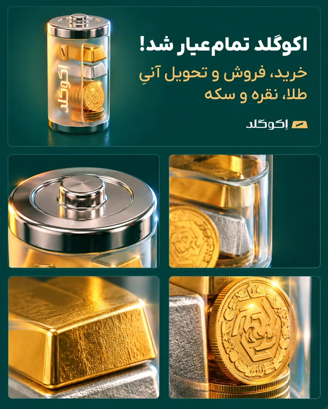
Warm reflections on gold meet cooler highlights on the cap and silver bar. The glass-like shell keeps the contents visible while adding depth. Close-ups make these material differences part of the campaign’s visual language, rather than background decoration.
The image meets the message
The square and portrait layouts pair the battery with the Persian campaign headline and service message. A strong top-level hierarchy carries the advertisement; smaller material details invite a closer look. The green field and gold accents keep both formats connected.
Read it from a distance
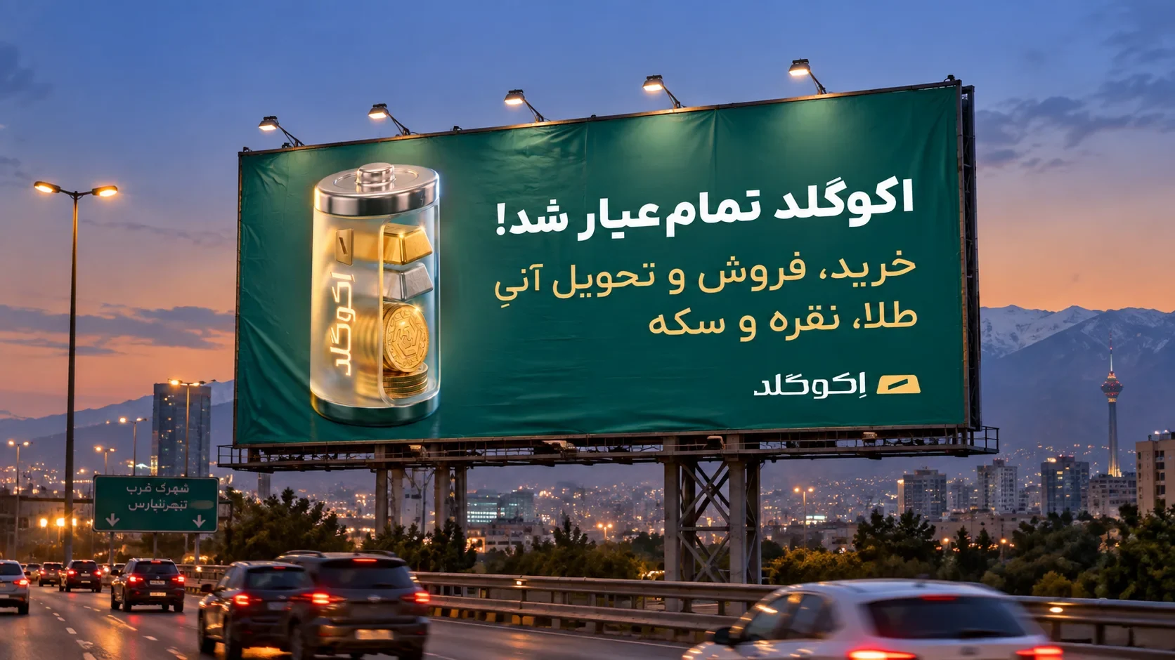
The billboard mockup places the artwork in a city setting at dusk. At this scale, the battery silhouette and Persian headline lead; the service line and brand mark follow. This is a presentation of the campaign layout in context.
One object holds the campaign together
Hero views, construction stages, material details and advertising layouts follow the same battery. Square, portrait and billboard formats change the reading distance while retaining the object and Persian message as the principal cues.