Moon Crypto
Moon Crypto connects a luminous blue-and-gold identity with wallet screens that give balances, assets and primary actions a clear order.

A visual identity and interface presentation for Moon Crypto connects a blue-and-gold brand world with wallet and portfolio screen concepts.
Carry an expressive crypto identity into wallet and portfolio screens while keeping balances, primary actions and asset information visually organised.
Visual identity, brand imagery and wallet-interface presentation.
Wordmark, palette, graphic imagery, wallet and portfolio screen concepts, mobile and desktop mockups, packaging and outdoor presentations.
The wordmark, palette and reflective graphics connect wallet, portfolio and physical identity applications. Screen layouts organise the practical information, while the imagery gives them a consistent atmosphere.
Design presentation by Ali Komeili. Product, interface and environmental applications are shown as presentation mockups.
A wallet with a recognisable world
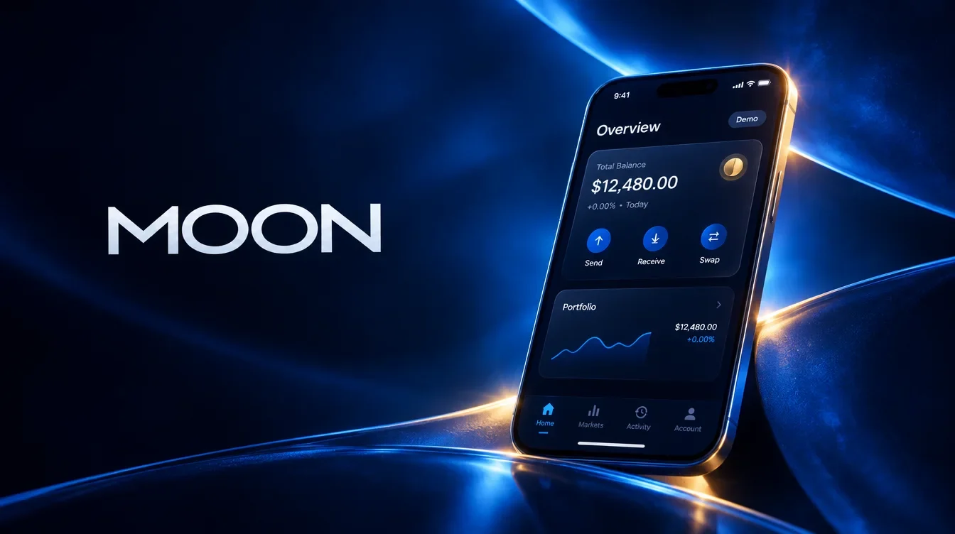
Moon Crypto brings a visual identity to wallet and portfolio screen concepts. The brand imagery gives the product depth and character, while the interface serves people checking assets or preparing a transfer. A simple wordmark connects both layers, with blue and gold creating a recognisable setting around the information.

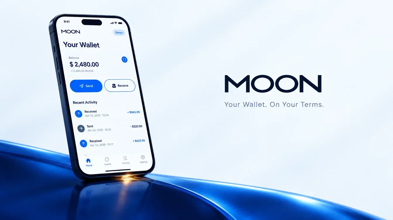
Give the balance a practical centre
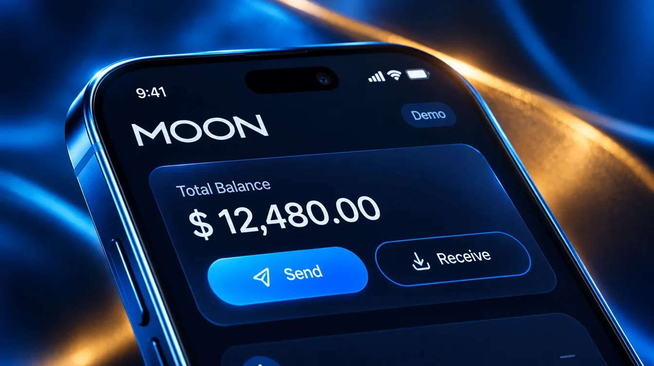
The mobile view places the balance above send and receive, keeping the main tasks within the same area. Reflective brand imagery stays around that information surface. The interface uses demo balances to show the hierarchy, with the action layer kept clearer and quieter than the surrounding visual world.


Curves and light connect the scenes
The abstract backgrounds repeat curved forms, reflections and points of gold light. Their variations create a shared setting for both the coin imagery and device mockups. A closer view of the coin surface adds a smaller, more tactile detail to the same visual vocabulary.


Make the next action visible
The mobile close-up places the balance above two prominent actions: send and receive. The surrounding brand imagery stays outside the main information area. These are interface concepts shown with demo values; the presentation describes their visual hierarchy rather than a tested transaction flow.
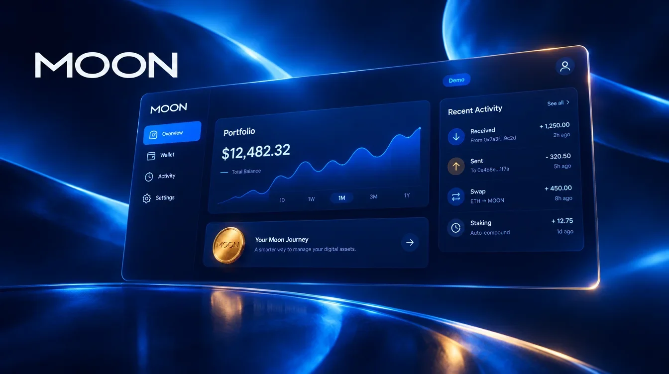
The overview adapts to its frame
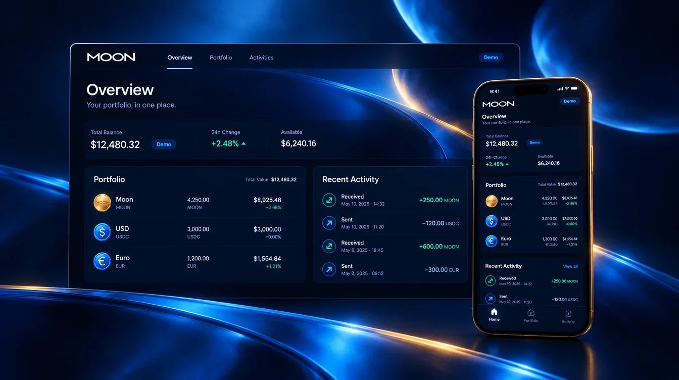
The desktop presentation gives a portfolio chart and recent activity room to sit beside each other. The mobile version condenses the overview into a vertical layout. The combined mockup shows how the same blue-led visual direction can carry across different screen sizes.
A lighter setting for the wallet
The light-themed screen shifts the emphasis from atmosphere to a brighter information surface. Beside it, the darker mobile presentation returns to the coin and blue reflections.

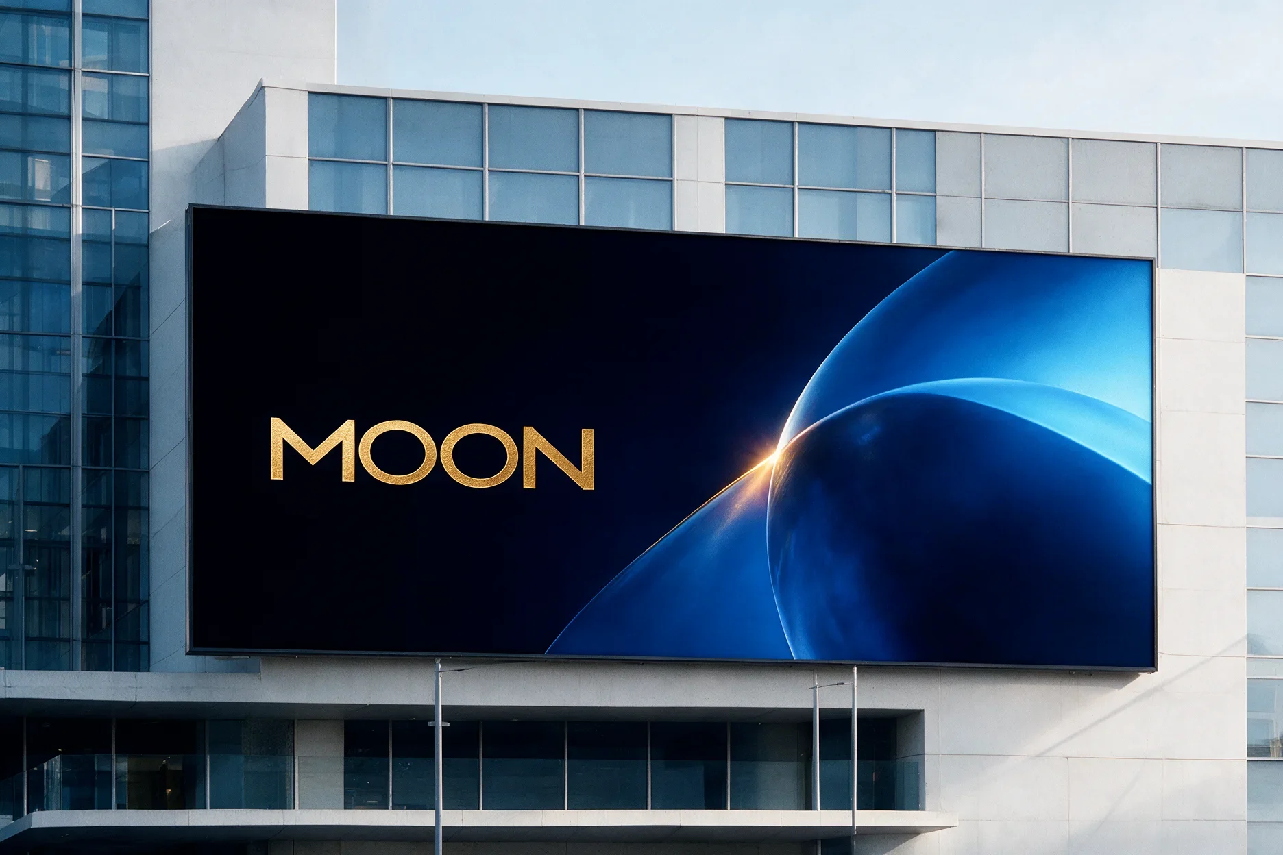
The identity extends into physical formats
The branded box uses the wordmark with a restrained gold finish, while the outdoor mockup gives the abstract imagery a larger role. Both carry the same blue-and-gold direction beyond the screen. They are shown as presentation applications of the identity.

A brand that reaches the screen
The wordmark, palette and reflective graphics connect wallet, portfolio and physical identity applications. Screen layouts organise the practical information, while the imagery gives them a consistent atmosphere. The deliverable joins a brand system with interface concepts for review.