Pasta Sugo
Pasta Sugo brings handmade pasta and Italian dining into an identity spanning ingredient-led packaging, menus and takeaway materials.
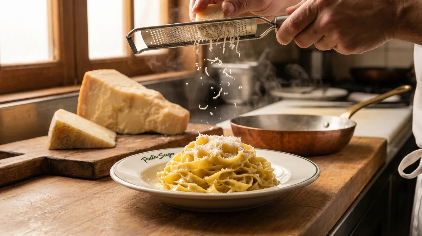
A restaurant and food identity presented through handmade-pasta imagery, packaging and dining touchpoints.
Bring handmade food, regional ingredients and a contemporary restaurant setting into one identity without losing the warmth of the kitchen.
Visual identity, lettering, illustration and brand-application presentation.
Logotype, illustration system, typography and colour system, restaurant collateral, retail packaging and takeaway applications.
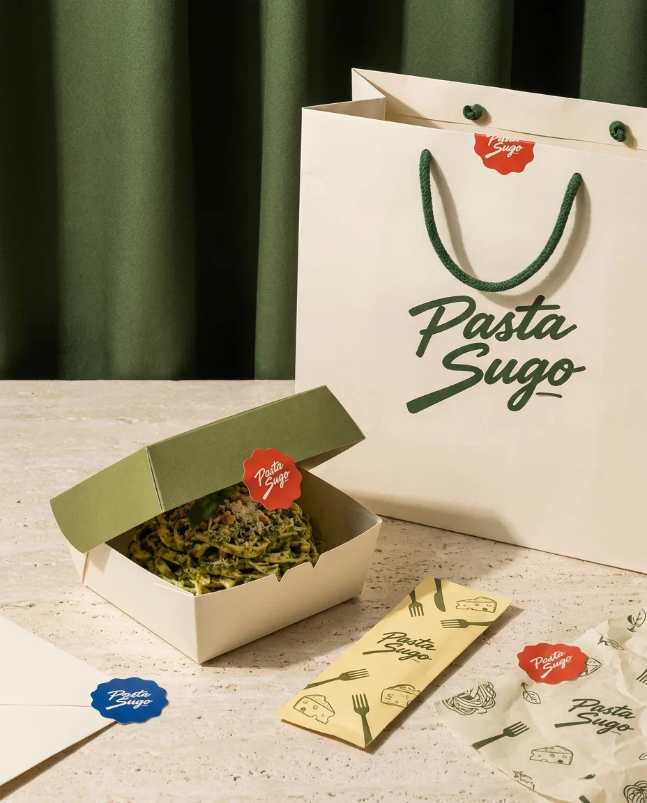
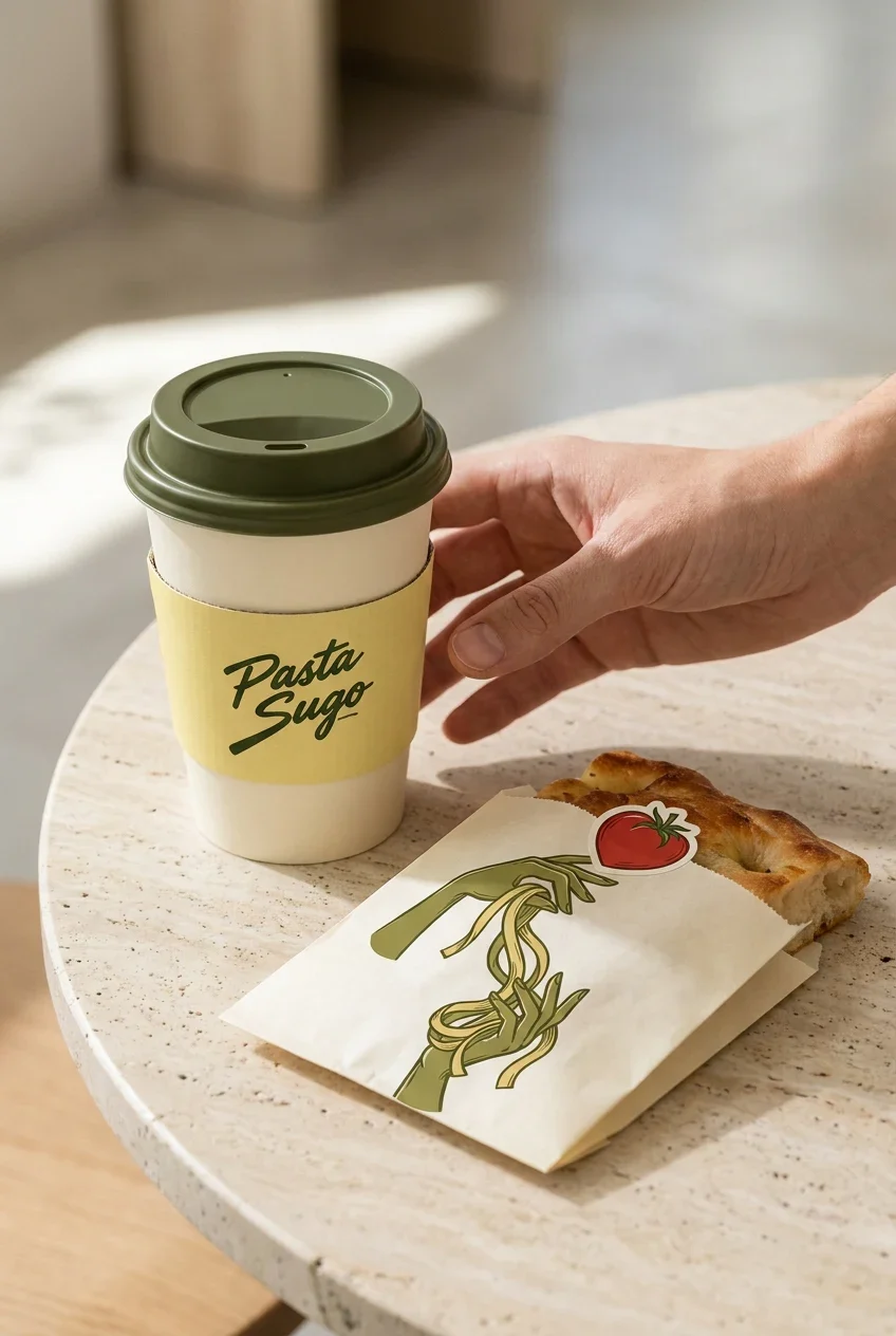
Retail packs, takeaway materials, menus and the restaurant setting share the brush-script name and ingredient vocabulary. The identity carries a consistent warmth through the different ways people encounter the food, with enough variation for each format to work on its own.
Design presentation by Ali Komeili. Applications are shown as presentation studies.
Bring the kitchen into the identity
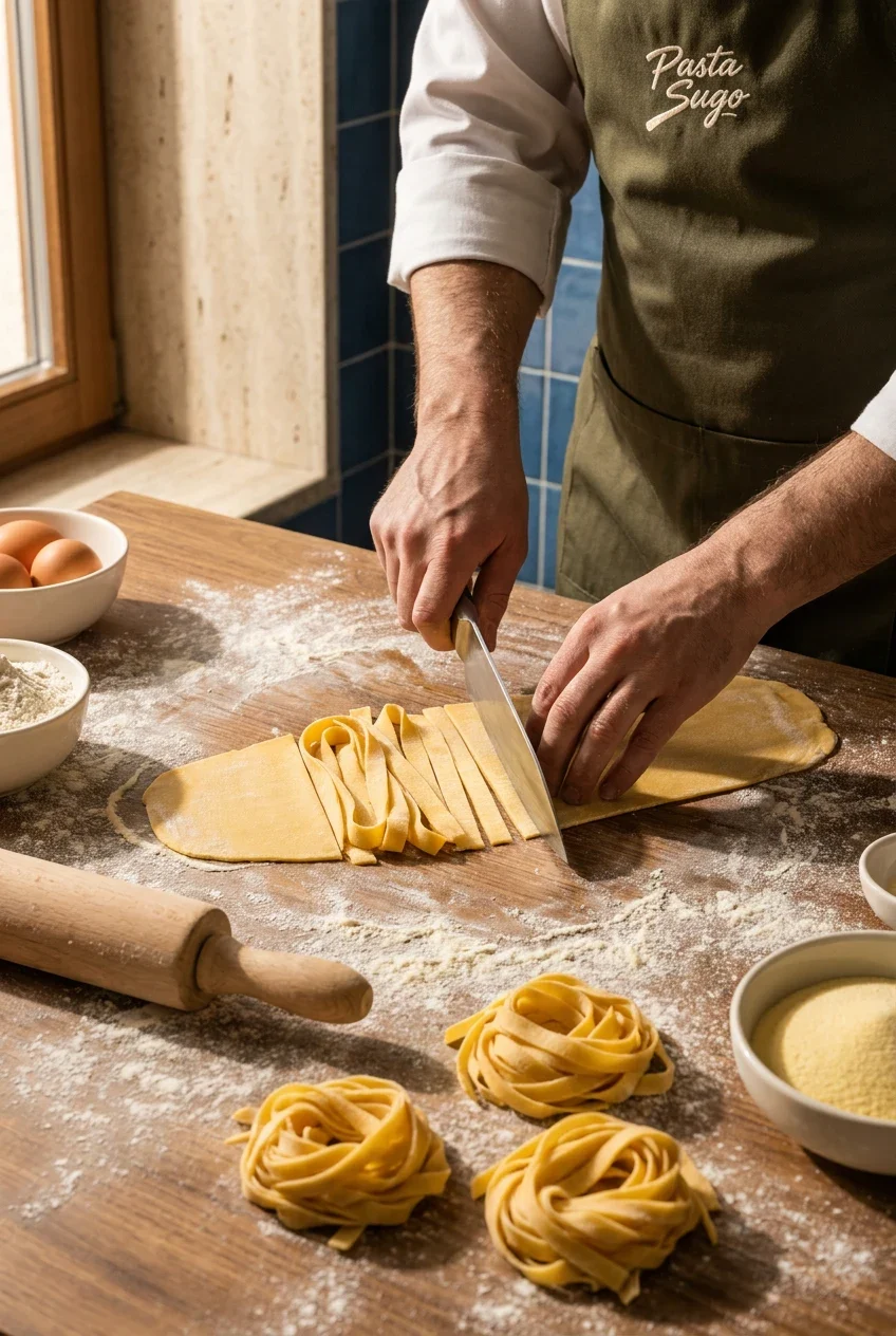
Pasta Sugo brings handmade pasta, regional cheese and the experience of Italian dining together. The identity speaks to guests at the table and people taking the food home. Brush lettering and ingredient illustrations carry the movement and warmth of preparation onto packaging, menus and everyday service pieces.
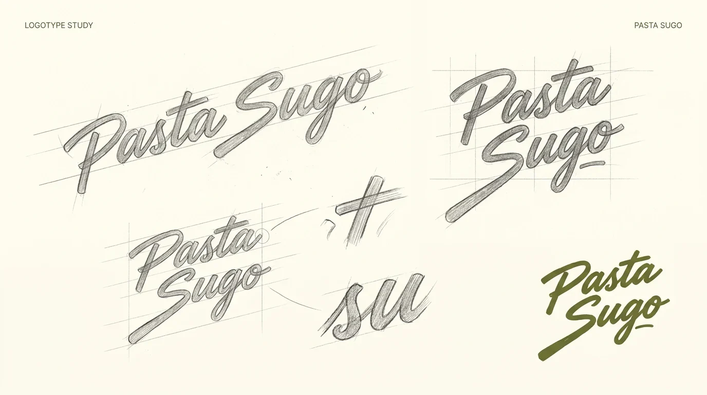
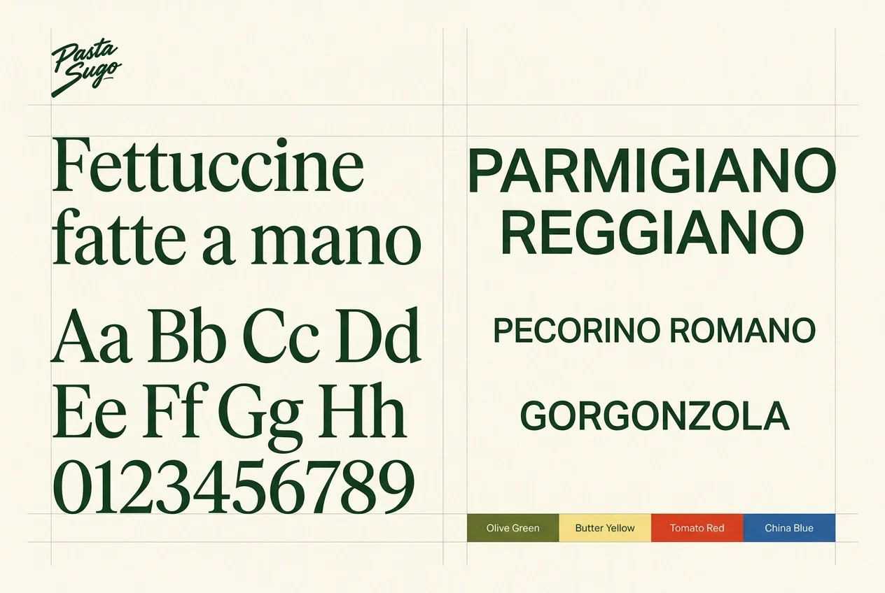
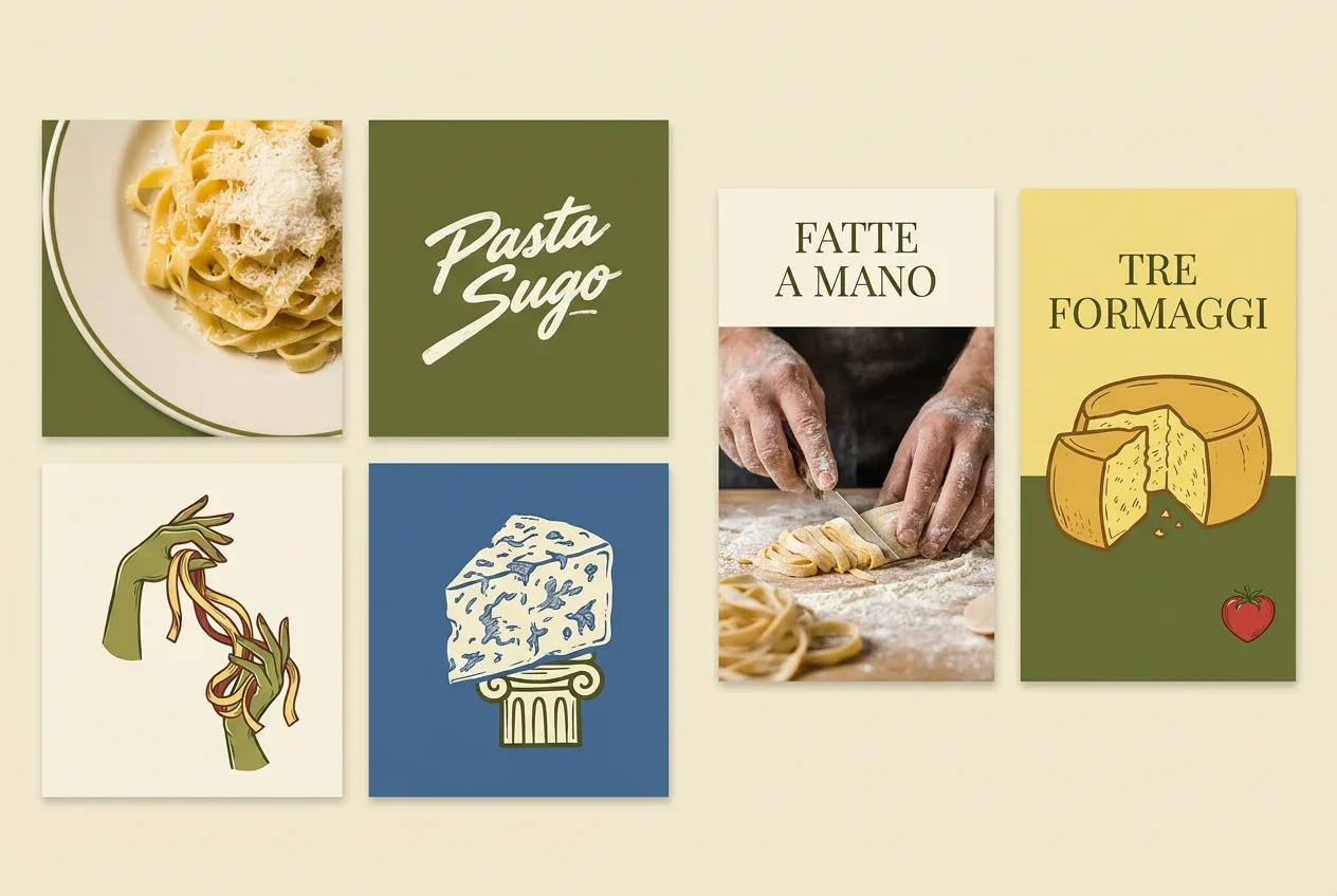
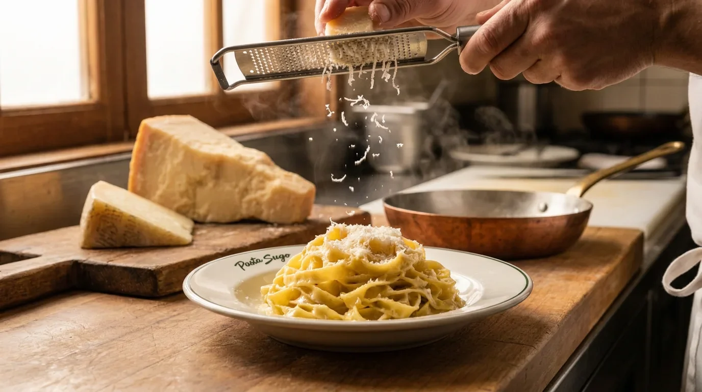
Ingredients help people find their way
Pasta, cheese and tomato illustrations give the products a recognisable subject. Olive green and cream form the base, with yellow, red and blue distinguishing the applications. Repeated lettering connects the different ingredients while clear names keep the packaging useful at a closer look.
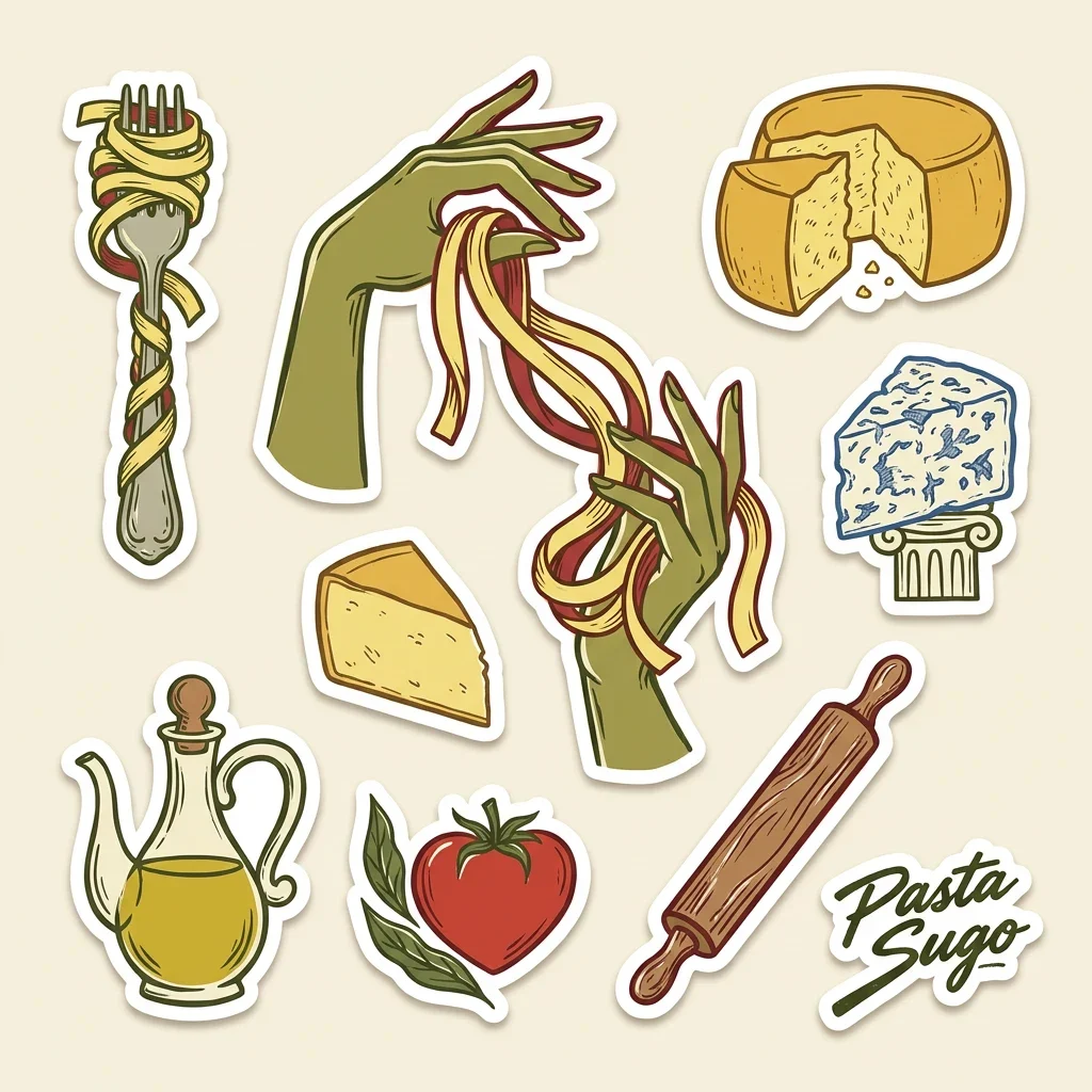
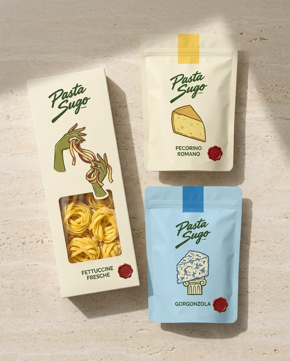
Ingredients become navigation
Cheese, tomato and pasta illustrations act as both character and product cue. Their distinct colours separate formats while the repeated logotype, cream backgrounds and red seals keep the family visibly connected.
The identity reaches the table
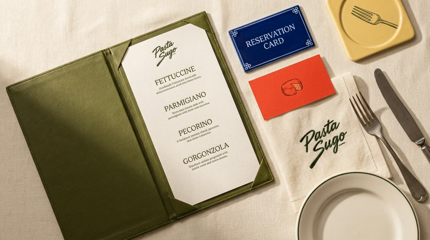
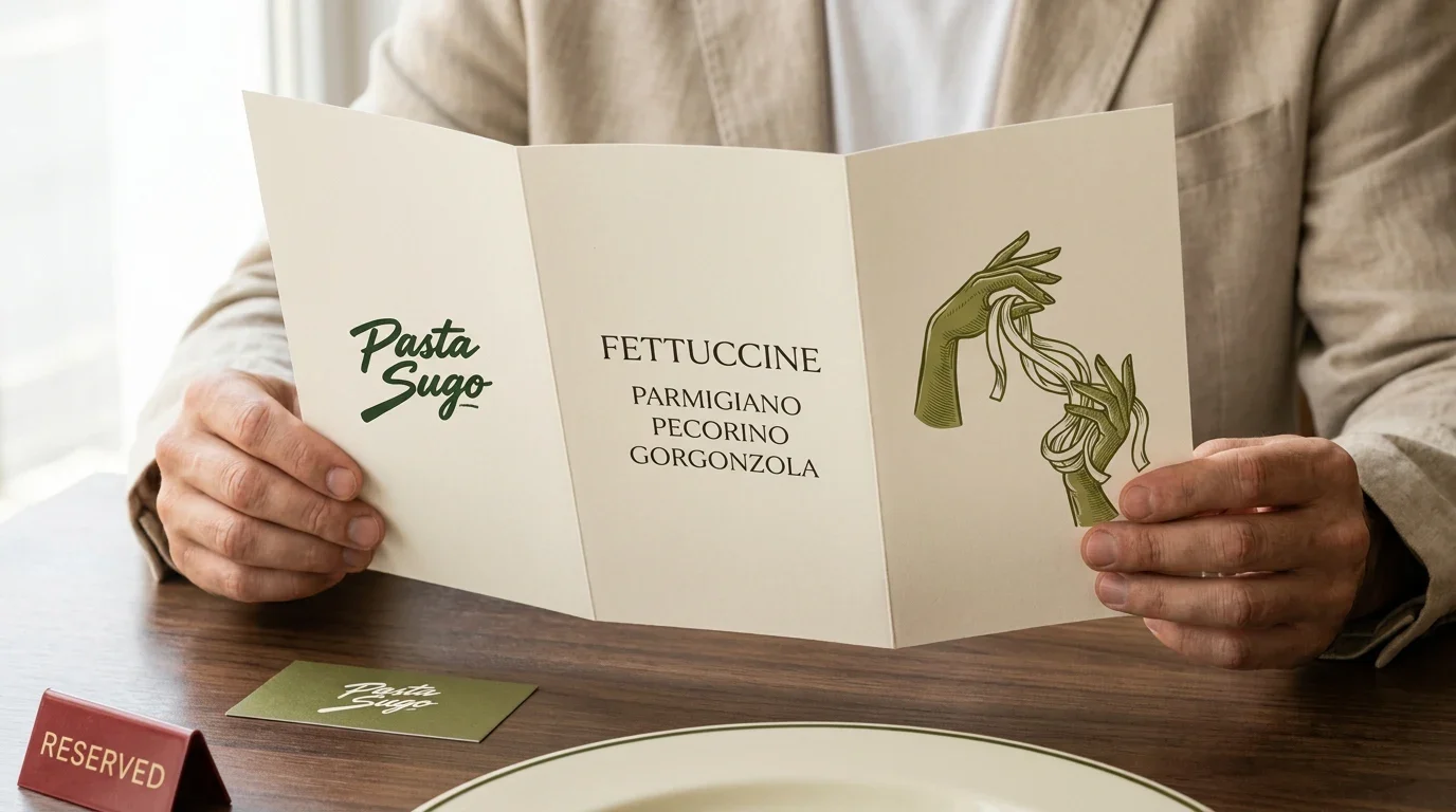
Menus, reservation cards, napkins and tableware use the same restrained palette and direct typography. The applications show how the identity can move between the dining room, retail shelf and takeaway service without becoming fragmented.
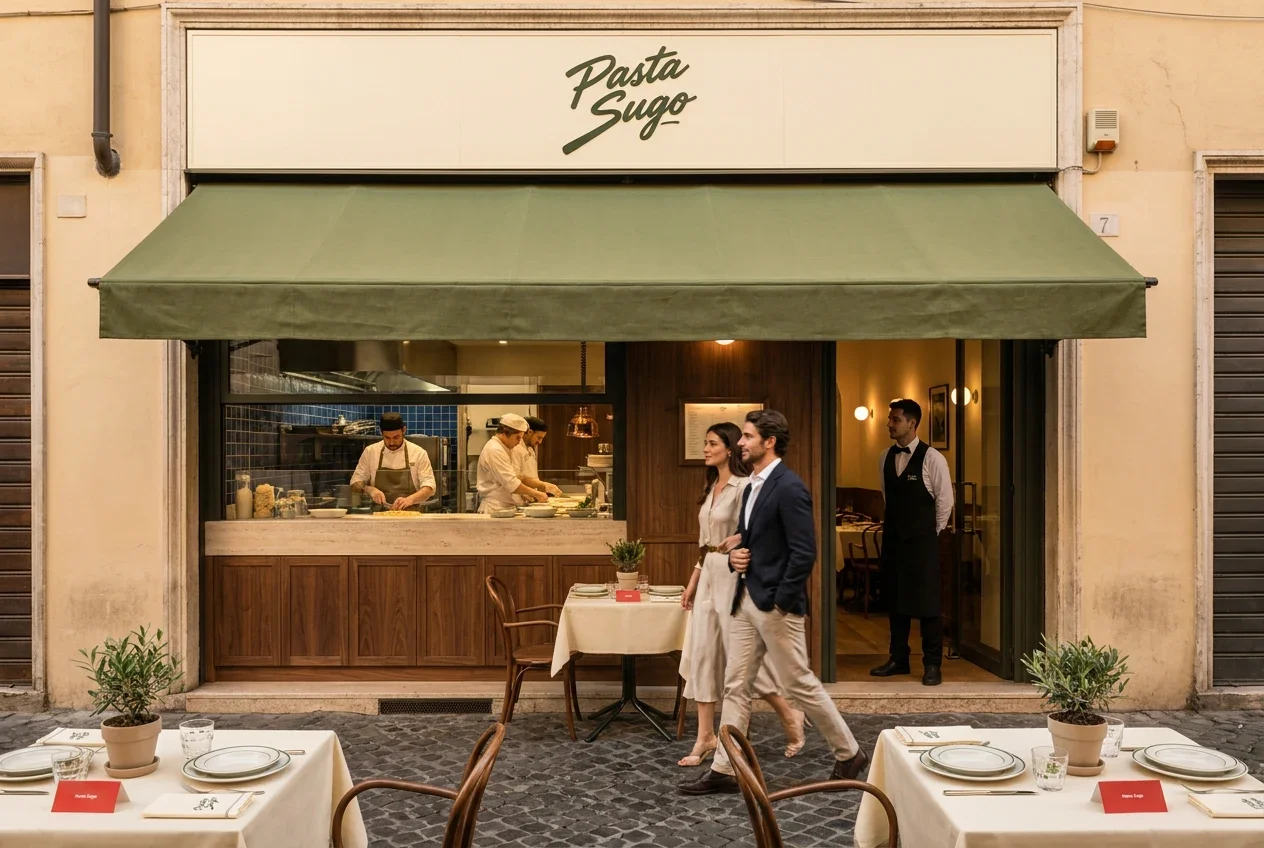
The same kitchen at several touchpoints
Retail packs, takeaway materials, menus and the restaurant setting share the brush-script name and ingredient vocabulary. The identity carries a consistent warmth through the different ways people encounter the food, with enough variation for each format to work on its own.