Quello
Quello’s water-park identity carries a colourful illustrated day out through visitor passes, staff materials, food packaging and souvenirs.
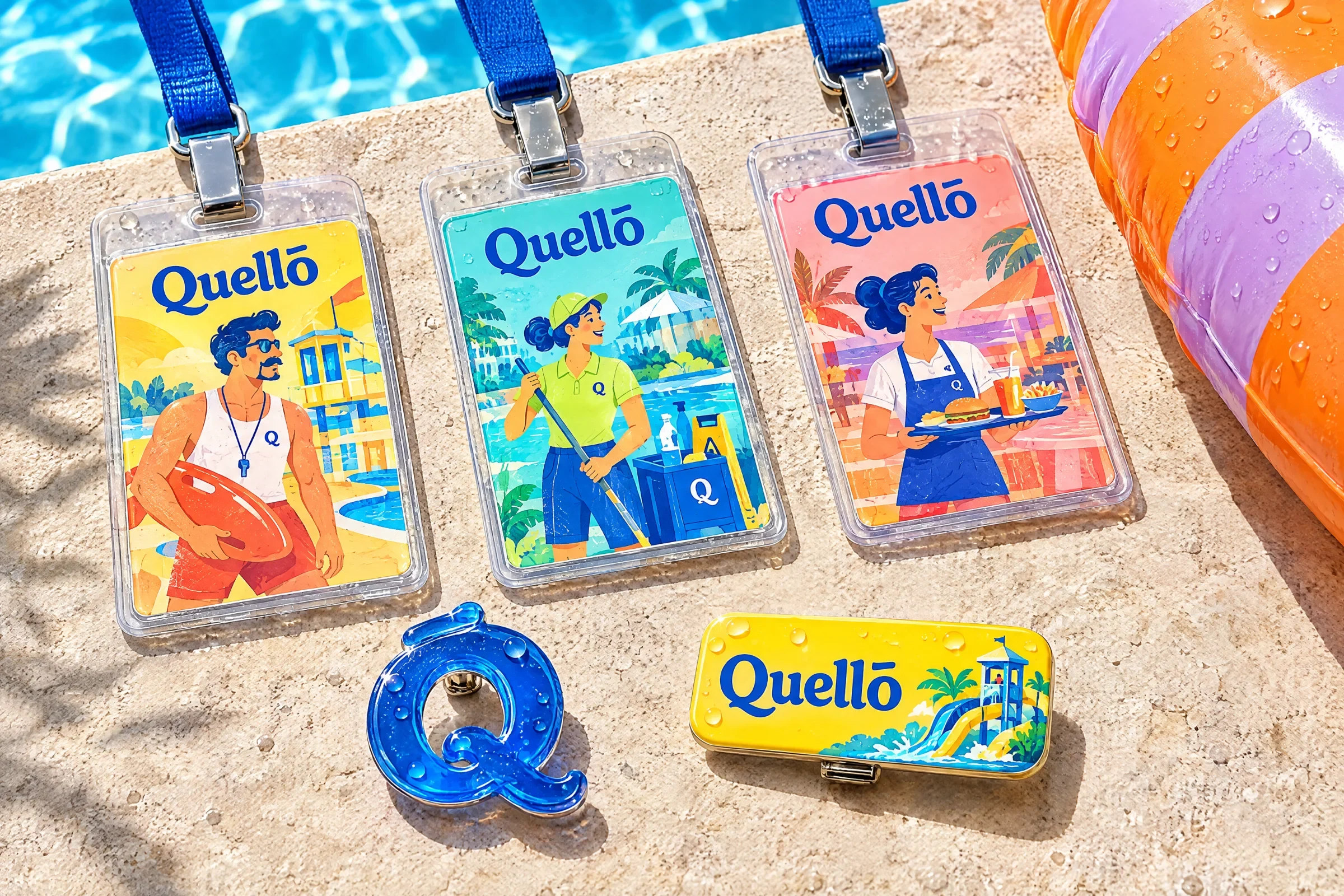
A water-park brand presented through a colourful visual system, illustrated scenes and visitor-facing applications.
Bring the excitement of a water-park visit into a recognisable visual system that works across small access items, illustrated scenes and larger branded surfaces.
Visual identity, illustration and brand applications.
Identity style sheet, park illustrations, access passes and wristbands, visitor print, food packaging, merchandise and vehicle presentation.
Passes, wristbands, uniforms, packaging, souvenirs and the shuttle share one illustrated world. The identity changes density with the object: a large scene on a towel, a compact symbol on a keyring.
Design presentation by Ali Komeili. The environmental, product and vehicle scenes are shown as presentation mockups.
A whole day in the water
A water-park visit includes much more than the slides: arriving, finding the team, stopping for food and bringing something home. Quello’s identity follows that day through illustrated scenes and useful visitor objects. Blue lettering and a compact Q symbol keep the lively world recognisable across its different moments.
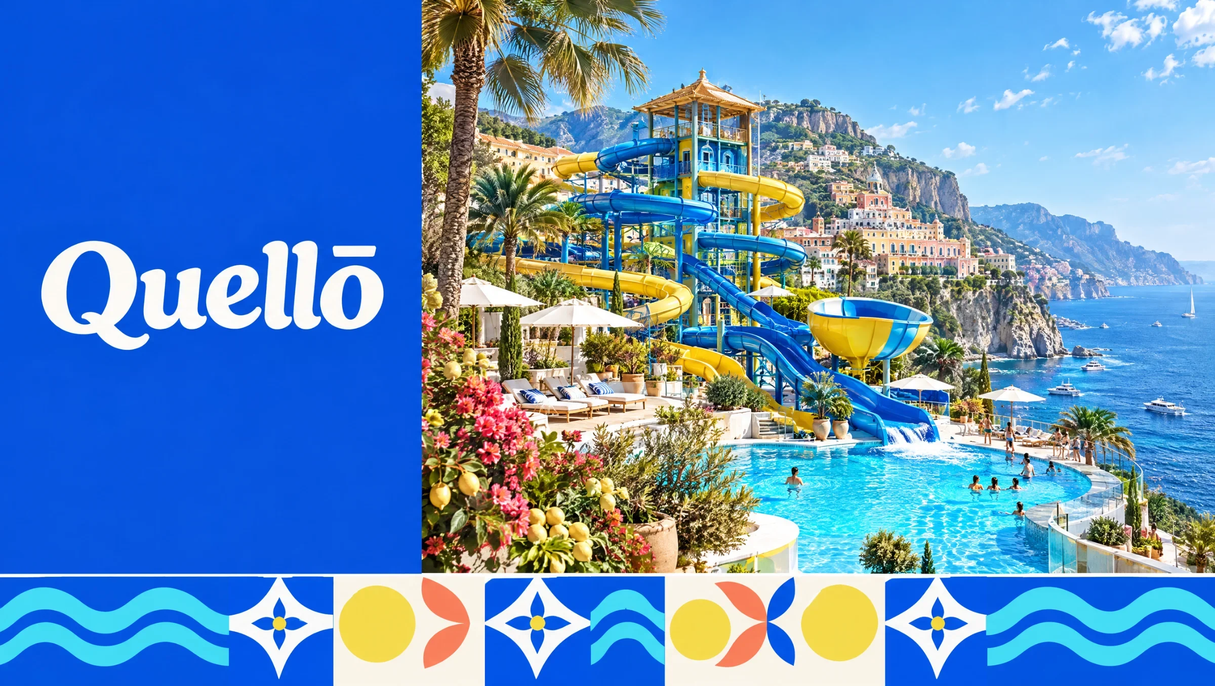
Give the visit a familiar cast
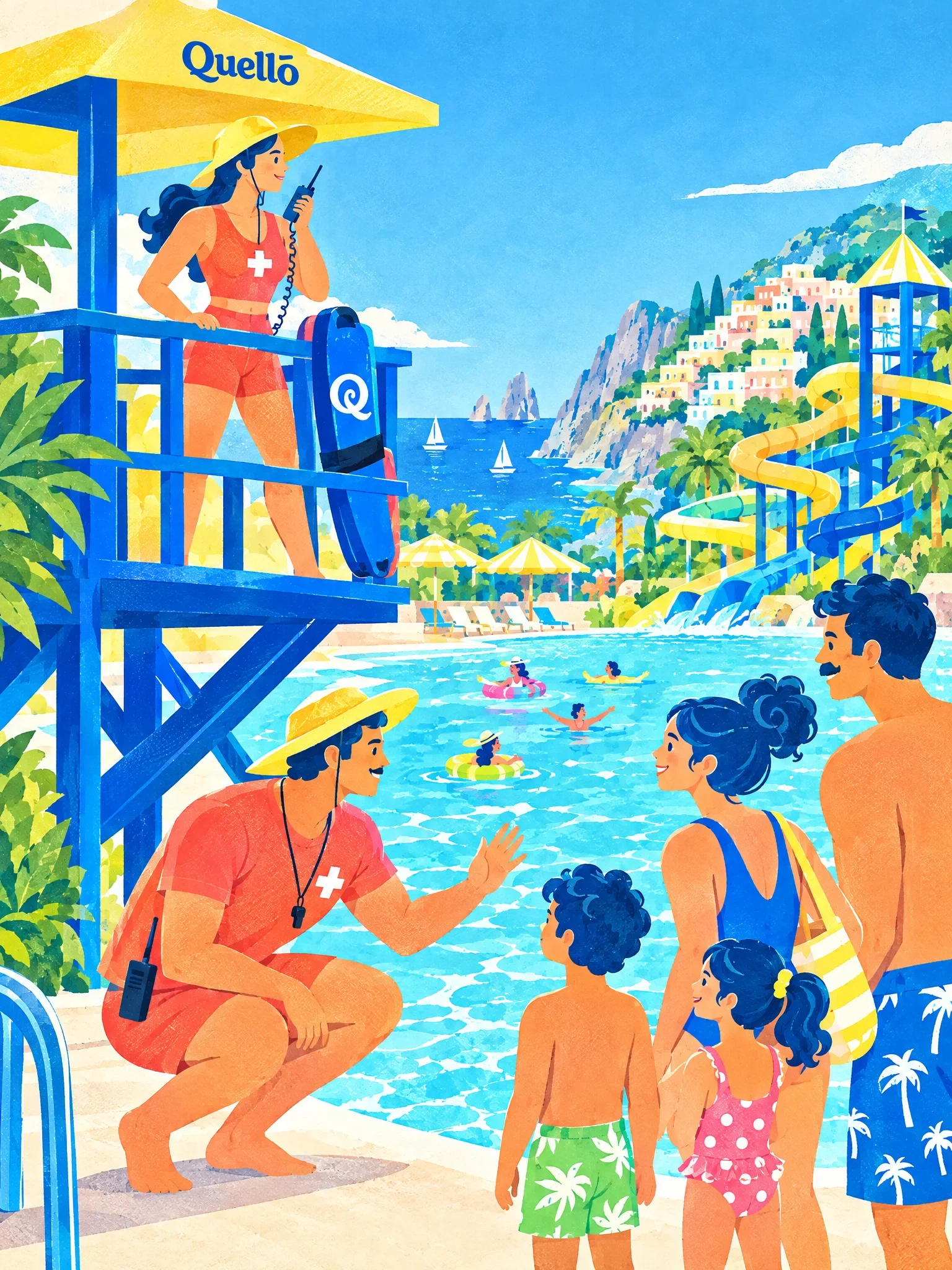
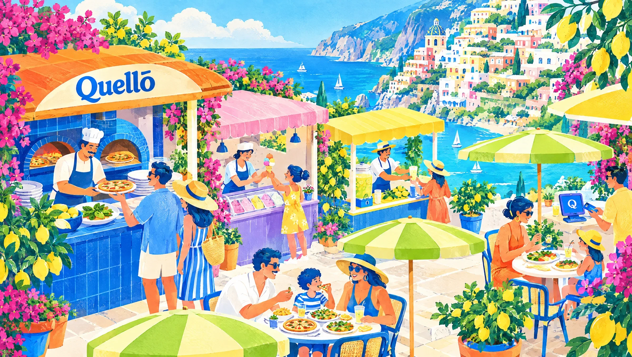
Swimmers, lifeguards, park staff and people at the food court give each illustration a purpose. Rounded forms and a shared palette connect them. The scenes help the brand feel populated and welcoming, while the simpler Q mark works where a full illustration would be too much.
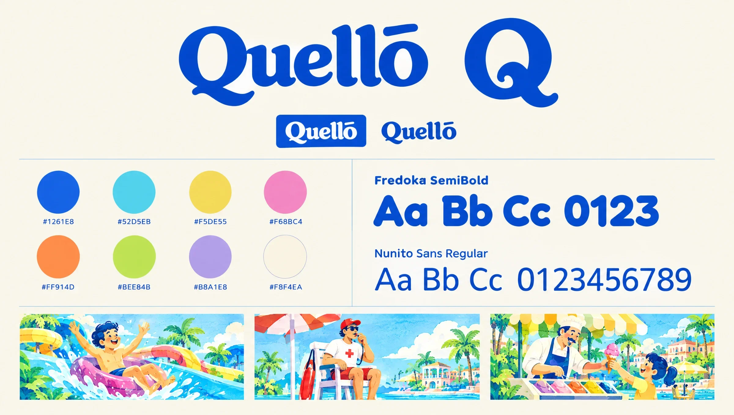
People make the place feel alive
The illustrations focus on everyday moments rather than an empty park. Staff look after the pool, families gather near the slides and visitors pause for food. A consistent palette and rounded forms connect those scenes while each composition tells a different part of the day.
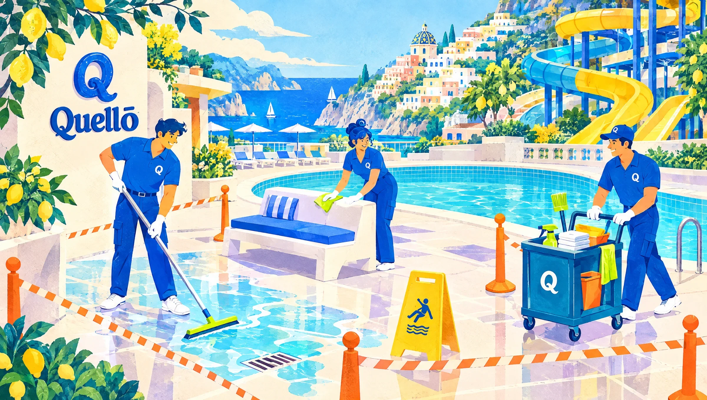
The visit starts in the details
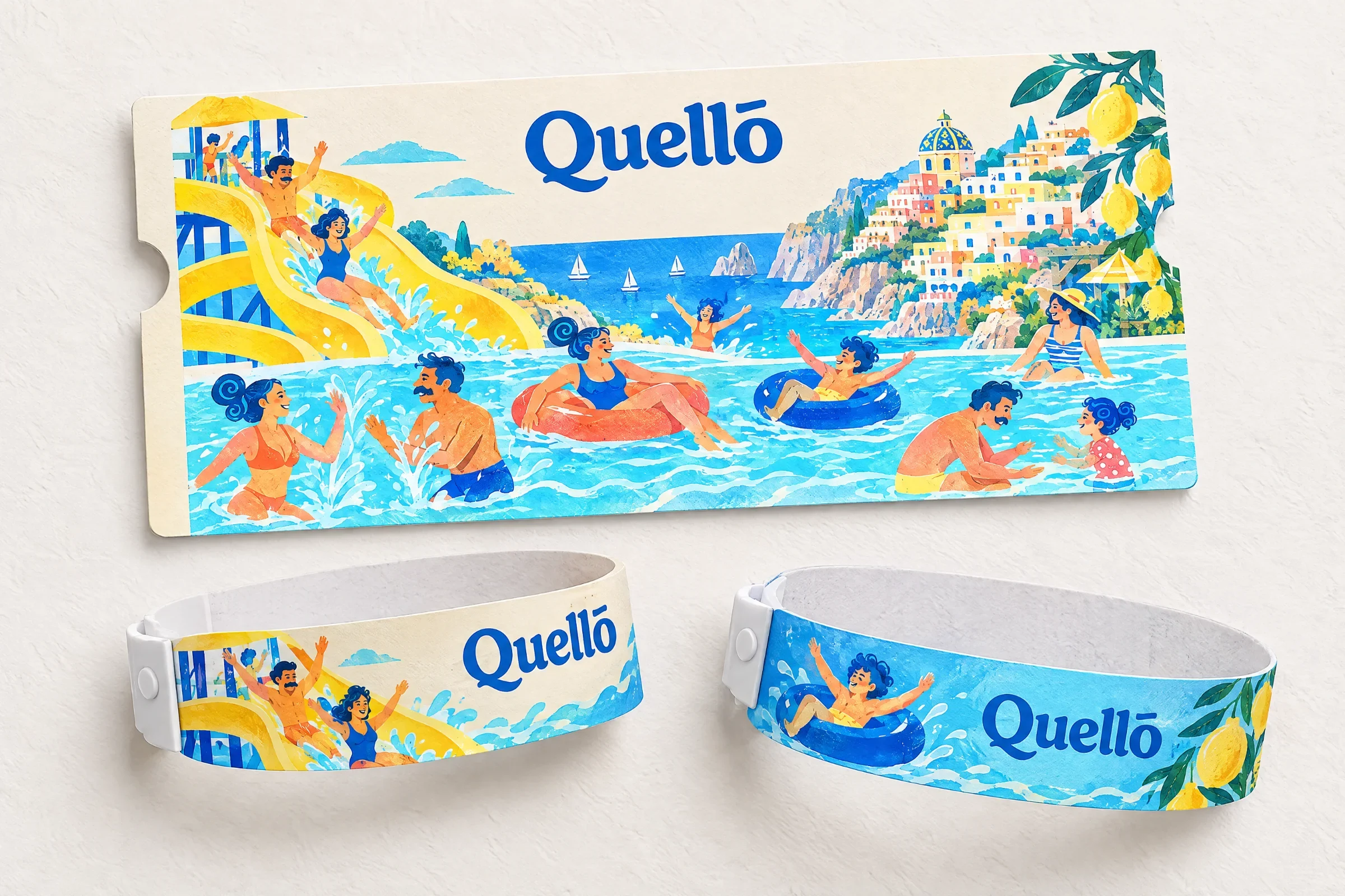
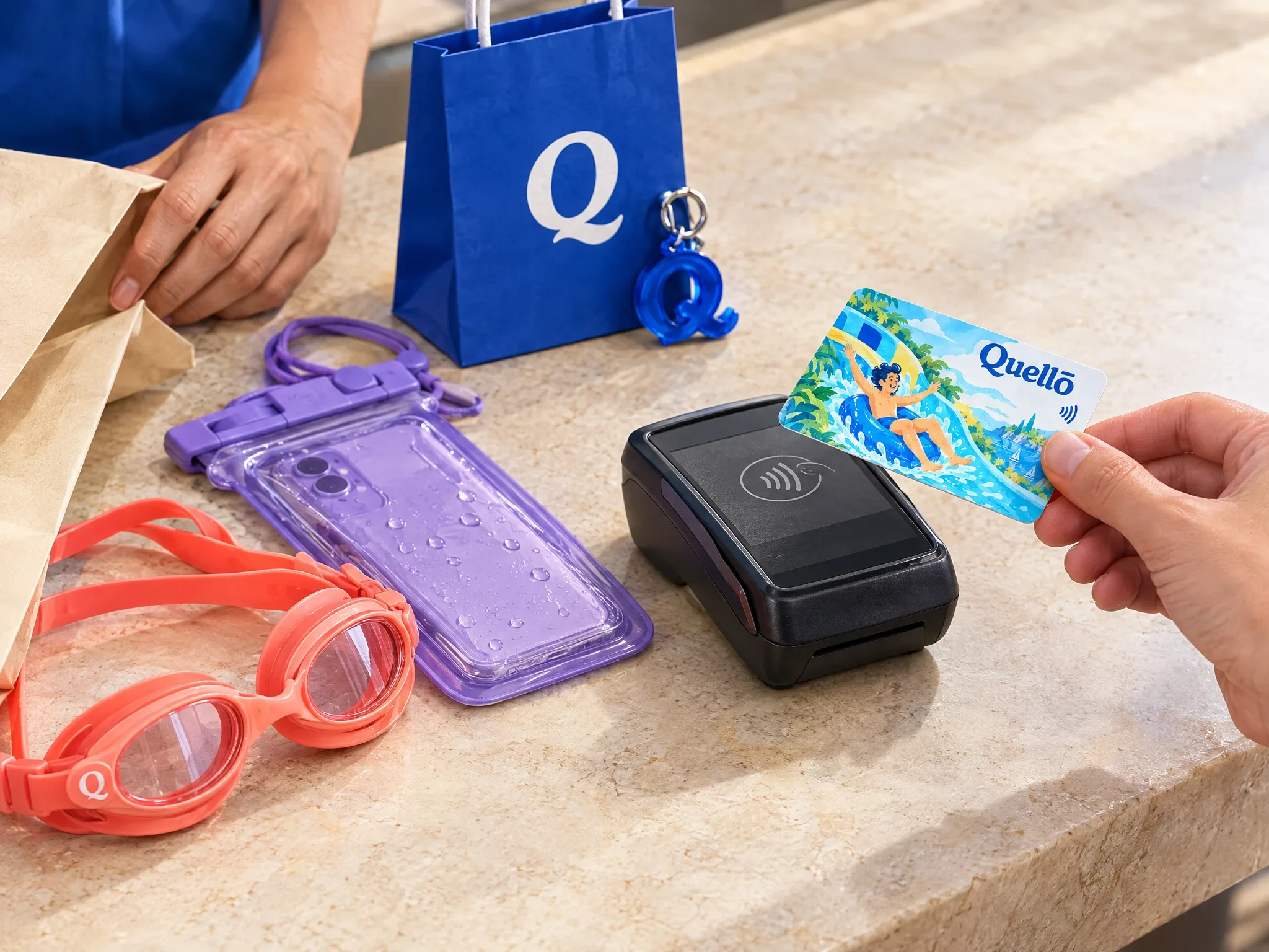
Before the first swim, the brand appears on passes, lanyards and wristbands. Large marks keep the smallest items recognisable, while the illustrations give each format its own character. These applications connect the practical parts of arrival to the more expressive world of the park.
Small formats, distinct moments
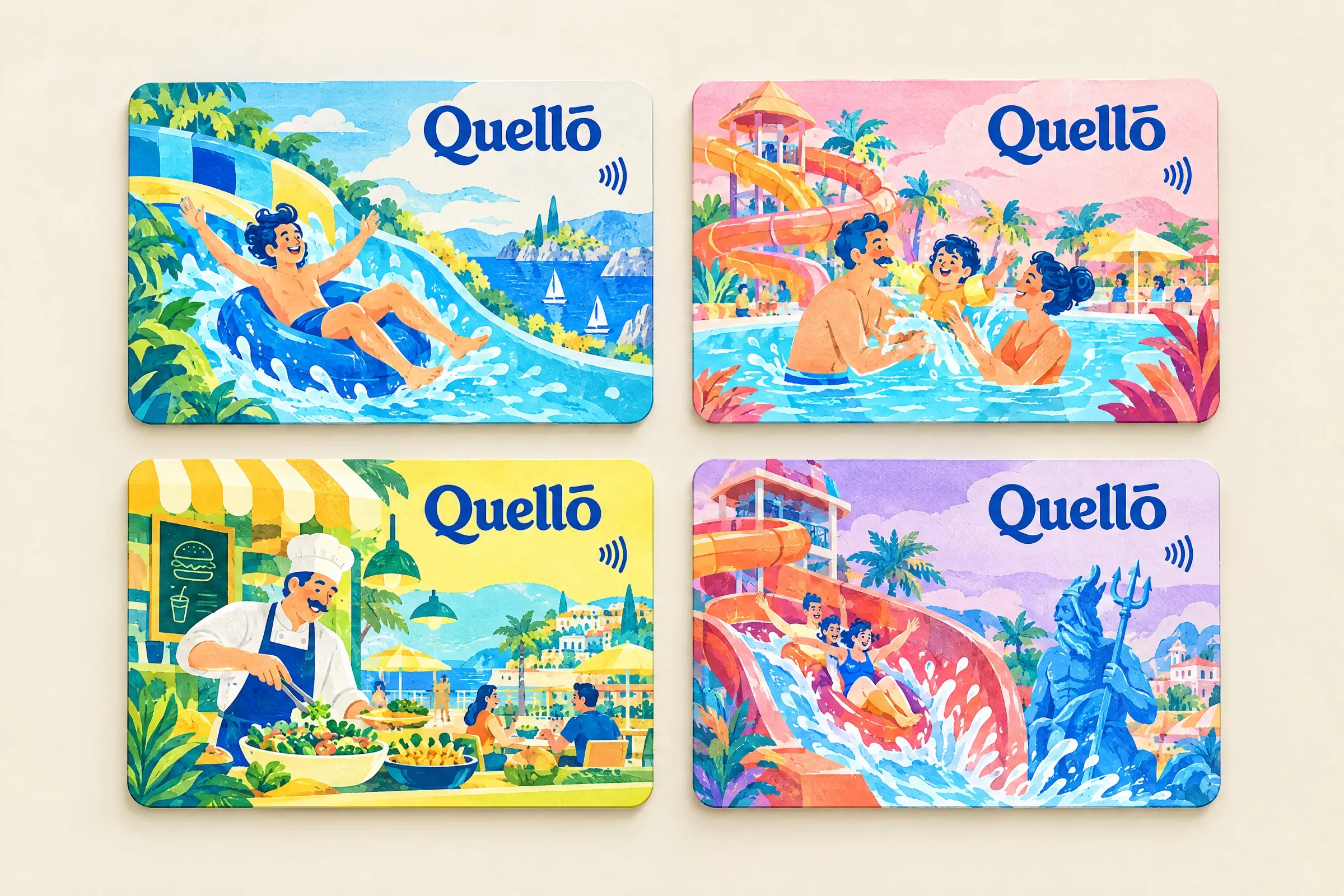
The access-card series uses four different illustrated scenes within a consistent frame. The shared wordmark and contactless symbol establish a familiar layout, while swimmers, slides and food-court moments change the image. Each card becomes a small window into the same park.
Useful objects belong in the picture
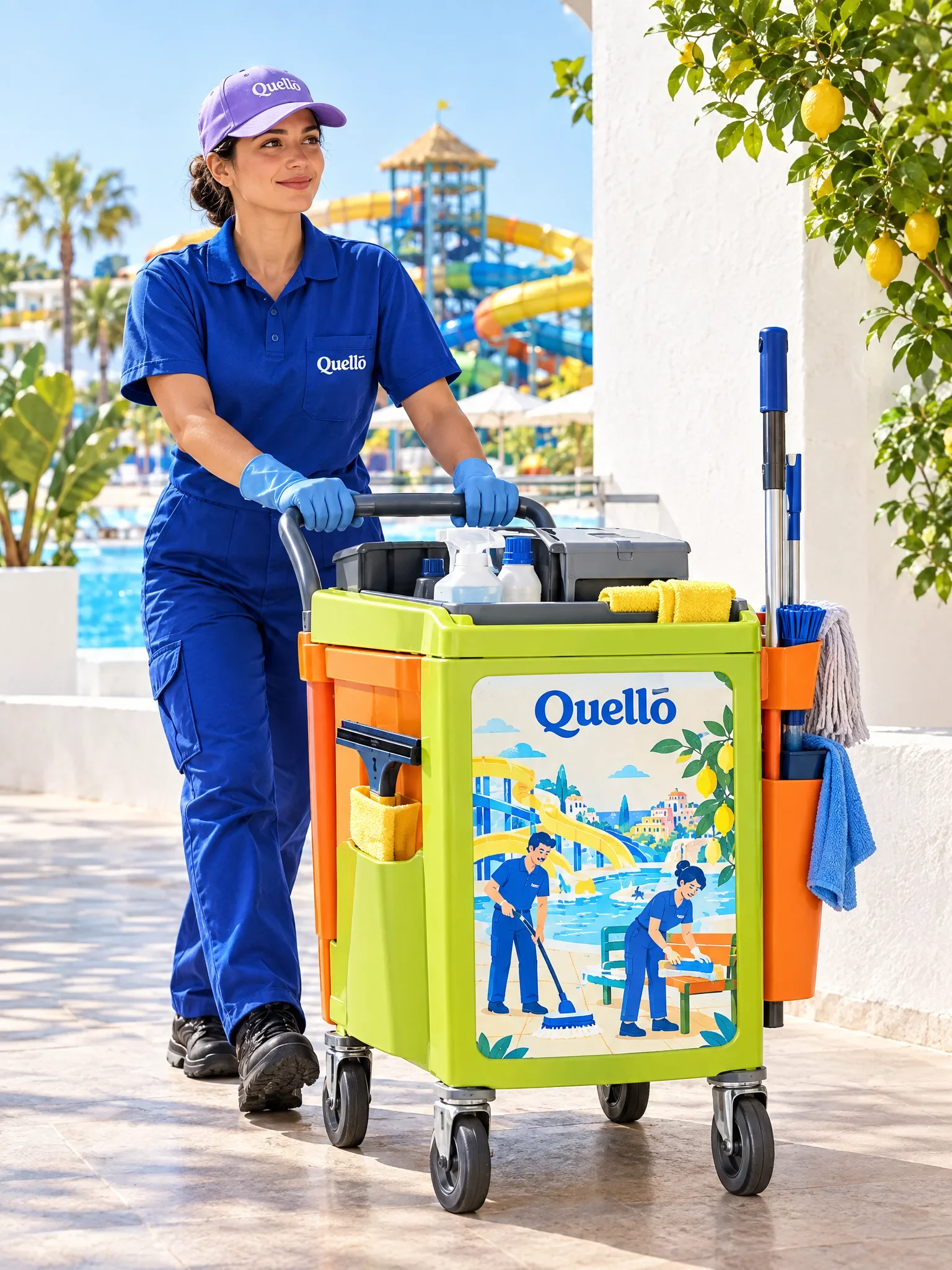
The blue uniform and illustrated trolley bring the identity into the park team’s everyday setting. The presentation pairs a recognisable colour with a detailed scene, showing how staff-facing equipment can share the same language as the visitor-facing materials.
A change of pace, the same world
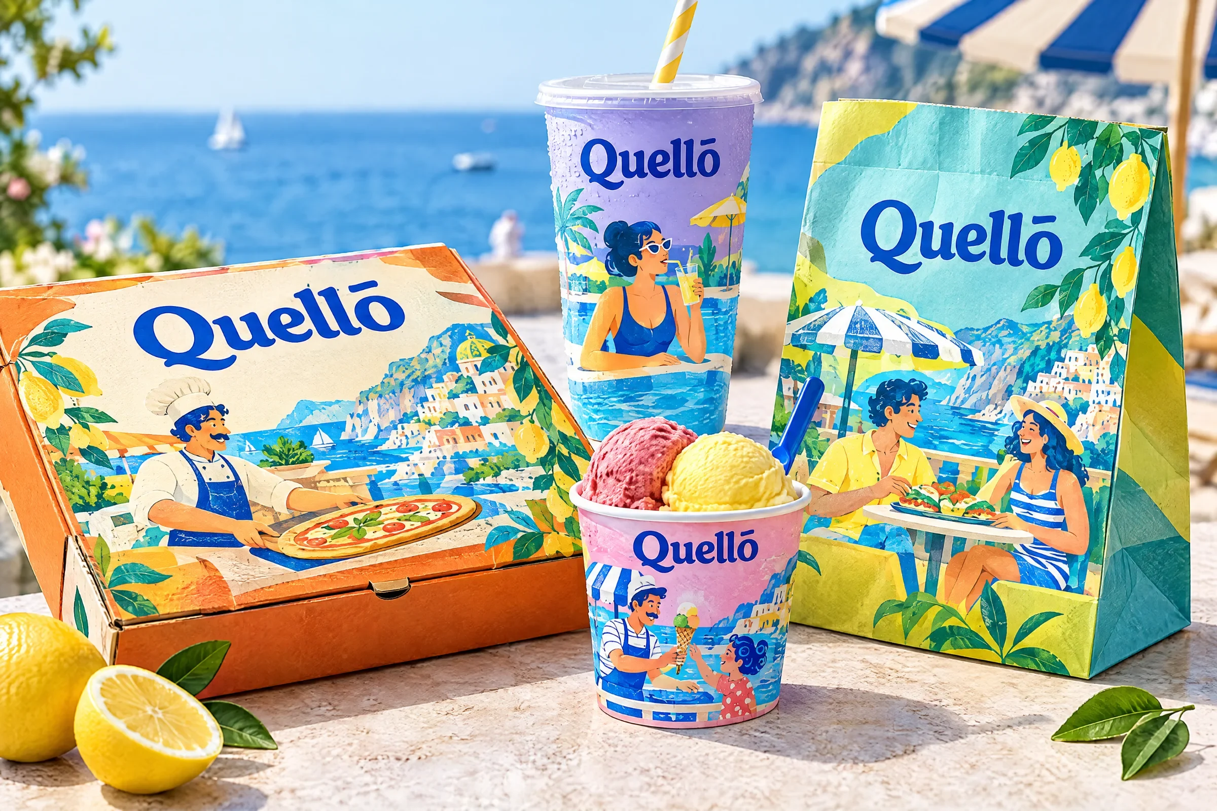
Food packaging offers another surface for the illustrations. Boxes, cups and bags frame smaller parts of the park’s colourful scenes, keeping the blue wordmark visible. The change of scale lets the artwork move from a broad landscape into objects held at the table.
The park becomes something to keep
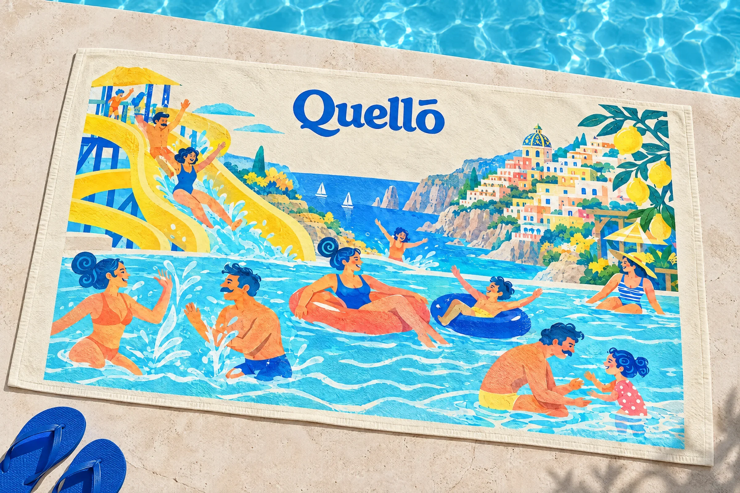
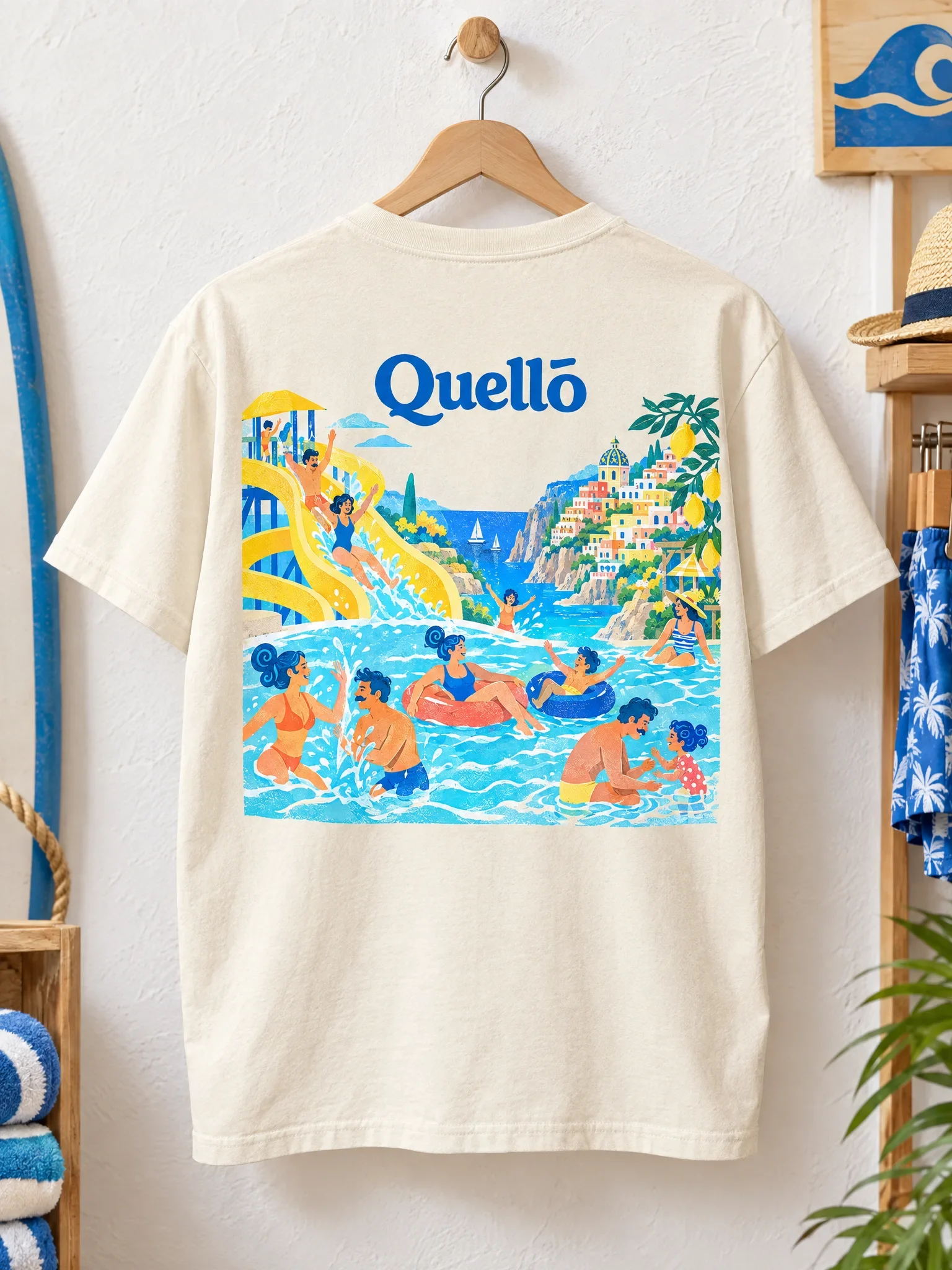
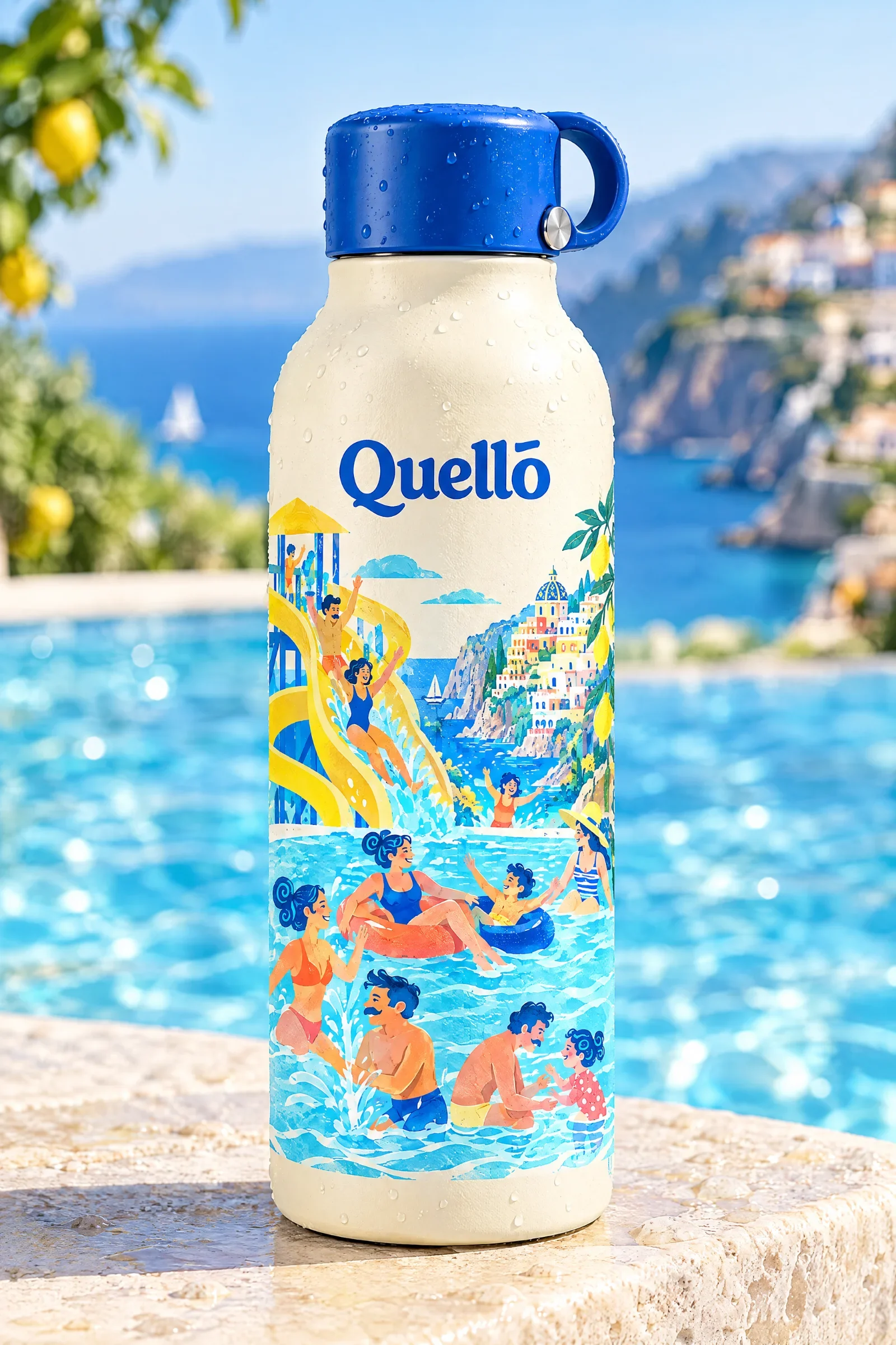
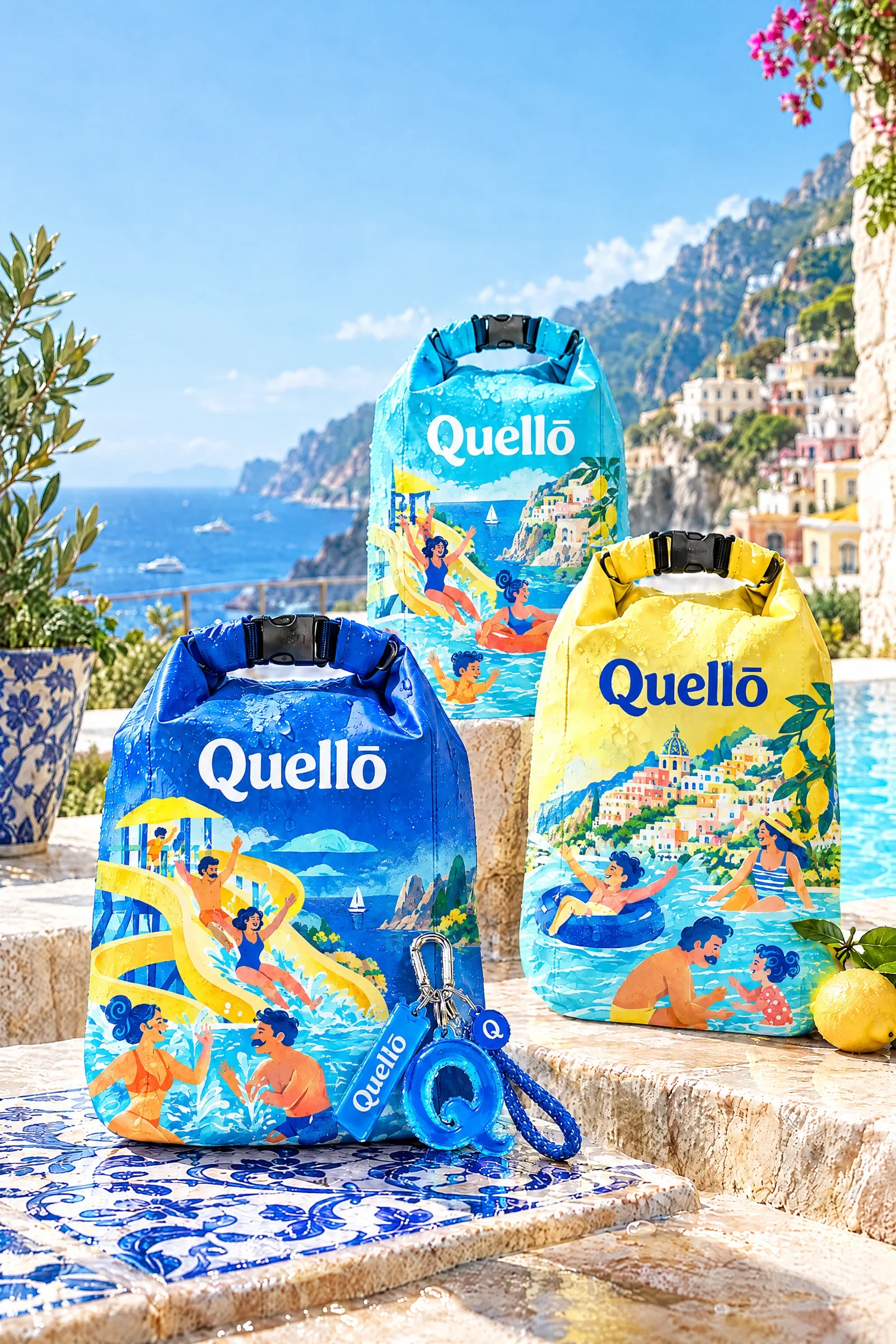
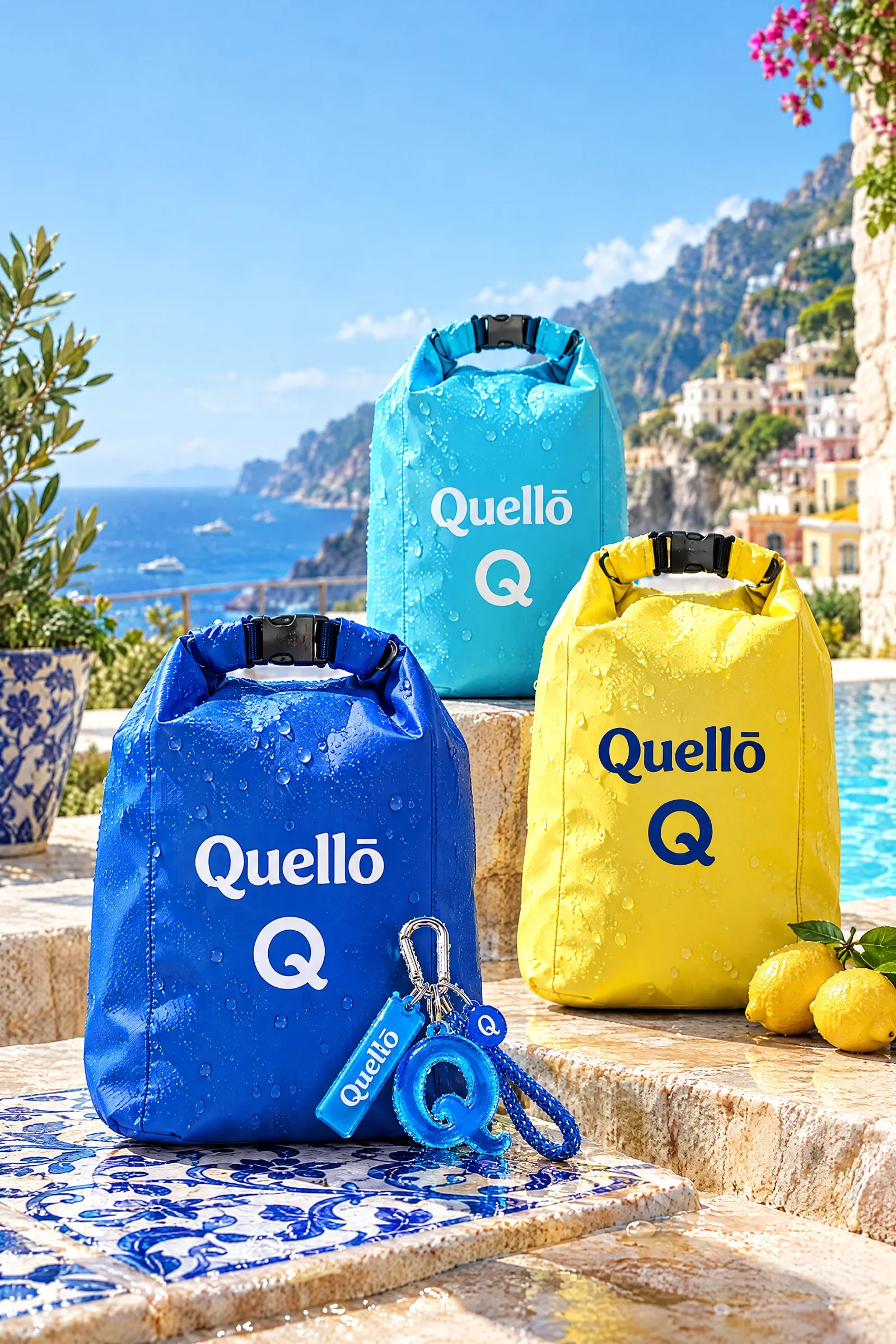
The towel, clothing and reusable accessories extend the illustrated world beyond the visit. Some carry a whole scene; others rely on the Q symbol and colour alone. Together, they show how the identity can be expressive without giving every object the same treatment.
Recognisable before the next visit
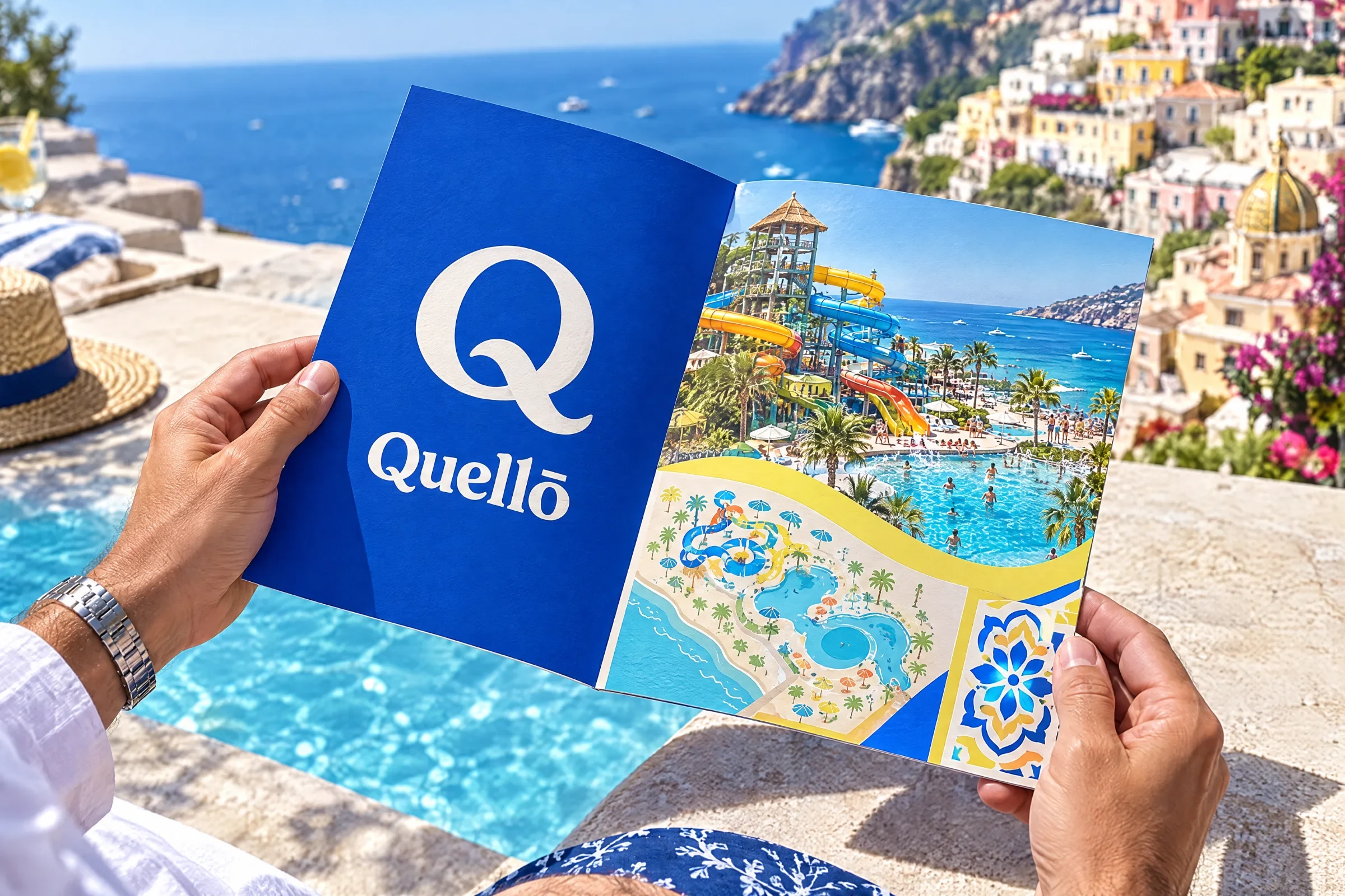
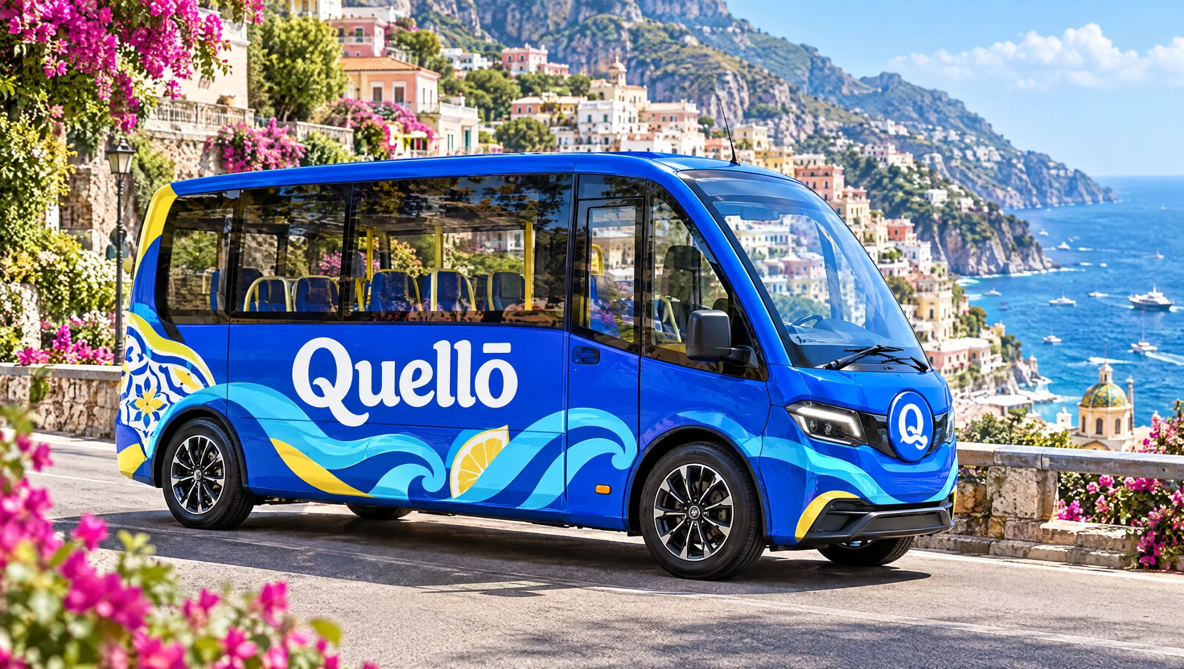
The brochure uses the Q symbol to introduce a more detailed illustrated interior. On the shuttle mockup, the blue field and flowing wave graphics work at a larger scale. These quieter applications give the identity contrast beside the densely illustrated park scenes.
The park stays with the visitor
Passes, wristbands, uniforms, packaging, souvenirs and the shuttle share one illustrated world. The identity changes density with the object: a large scene on a towel, a compact symbol on a keyring. Each touchpoint carries a recognisable part of the visit.