Swerve
Swerve’s riding identity gives bikes, scooters and equipment a directional wordmark and electric-green visual language.
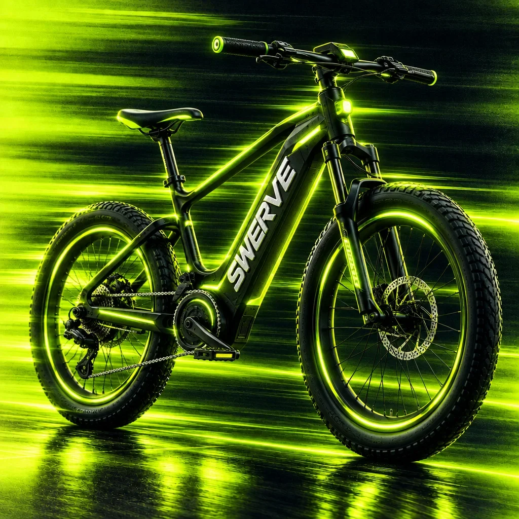
A high-contrast visual identity for Swerve translates the energy of riding into a wordmark, electric-green graphics and equipment applications.
Create a recognisable visual language that carries the feeling of speed across a compact identity, riding equipment and larger campaign surfaces.
Visual identity, graphic language and brand applications.
Wordmark and symbol system, colour palette, graphic treatments, riding-equipment and apparel presentations, and outdoor campaign mockup.
Equipment graphics, clothing and campaign applications share the directional lettering and green accent. Some surfaces use the name alone; others bring in the full trail treatment.
Design presentation by Ali Komeili. Product, interface and environmental applications are shown as presentation mockups.
An identity that belongs to the ride
Swerve connects bicycles, scooters and riding equipment through the feeling of movement. The brand speaks to riders through a low, angled wordmark and electric-green trails against near-black. The identity keeps that energy recognisable on a narrow frame, a helmet and a much larger campaign surface.
The name has its own direction
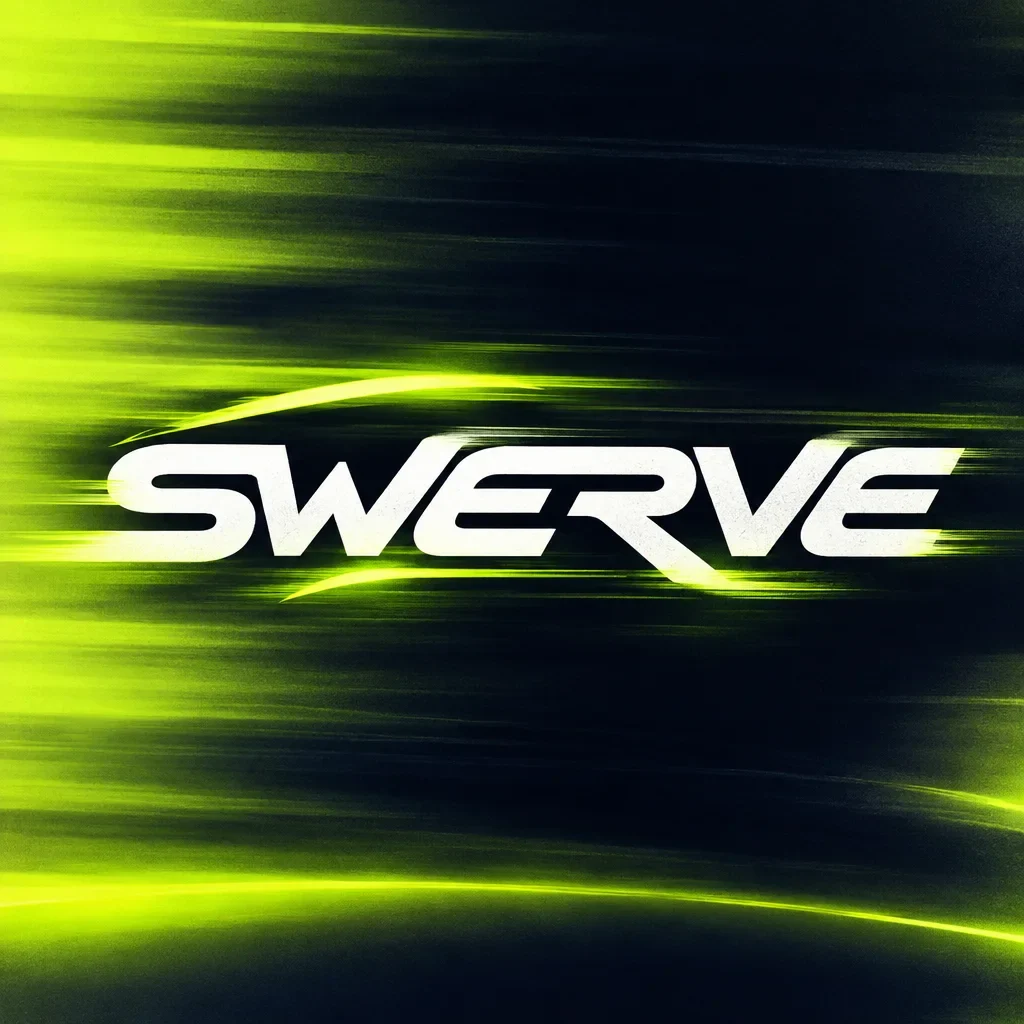
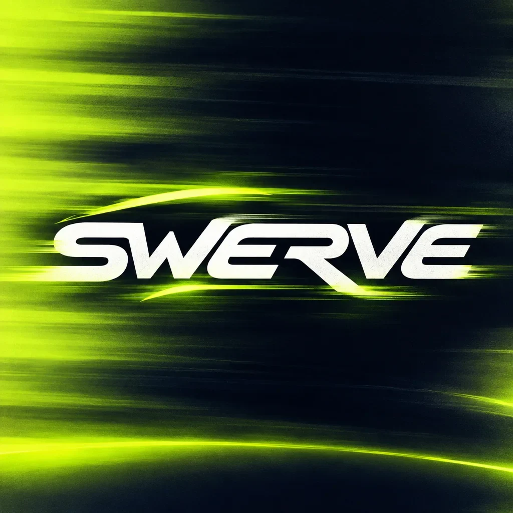
The forward lean and sharp terminals give the lettering movement before a background is added. A compact S carries the same construction onto smaller objects. Light trails become the more expressive layer around that steady name, letting the system change intensity from one surface to another.
Light trails carry the energy
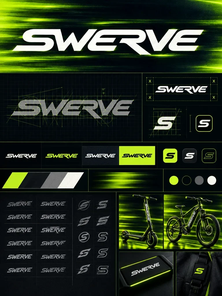
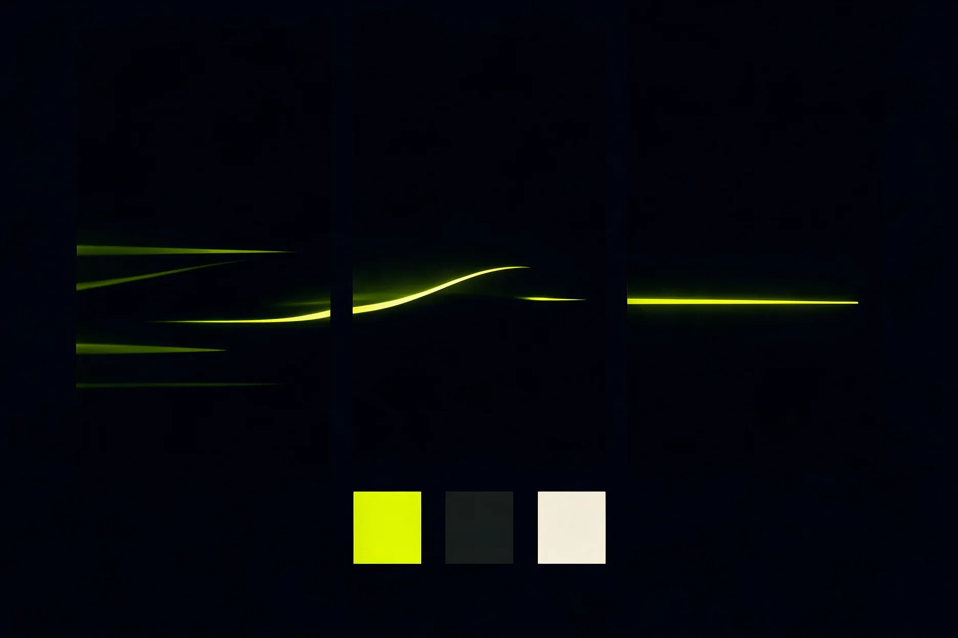
The green trails introduce movement without relying on an animated asset. Their direction and brightness give the dark compositions a sense of acceleration. A quieter palette study isolates the colours, then the wordmark returns inside the more immersive visual treatment.
From a frame to a full ride
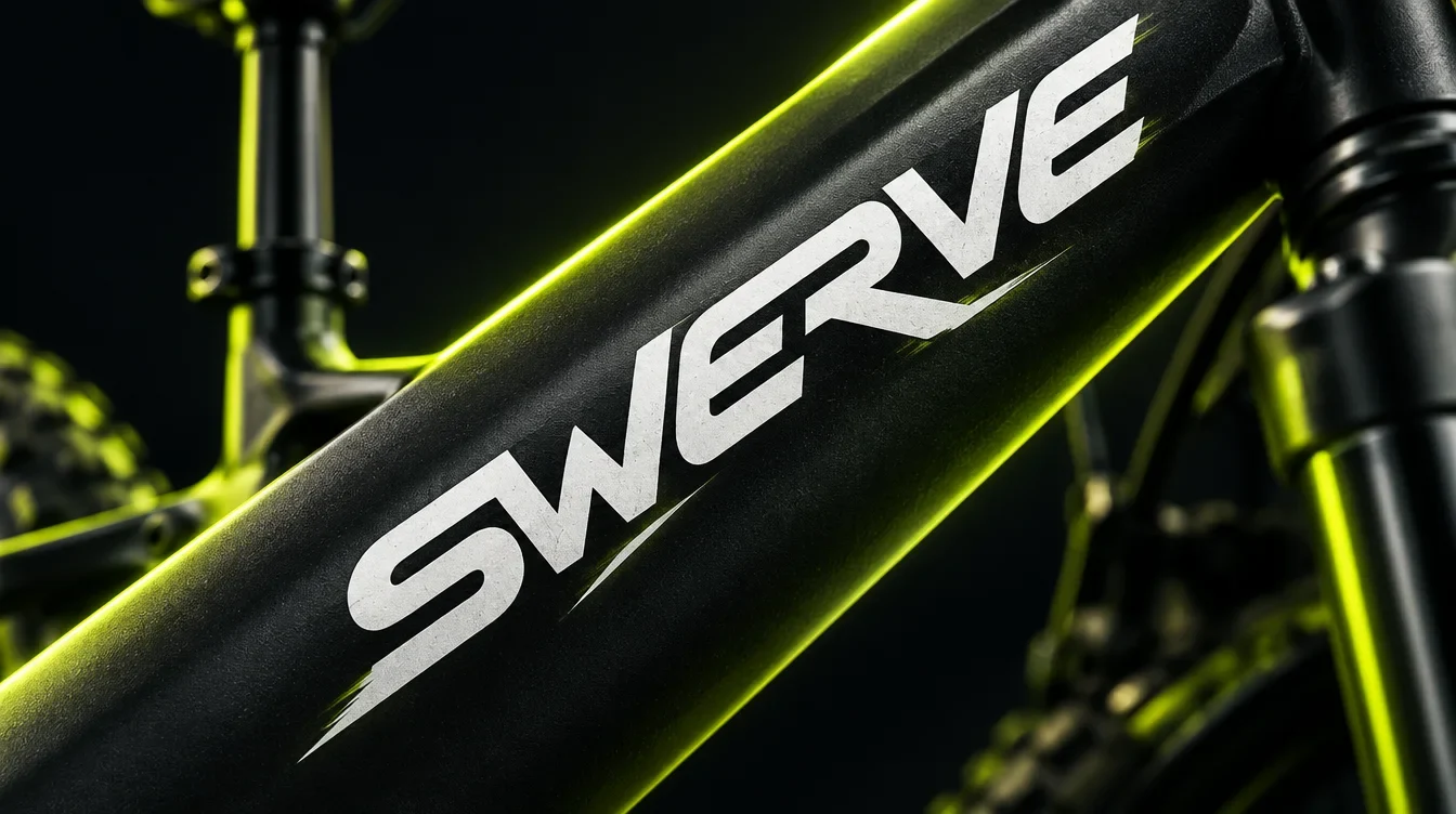
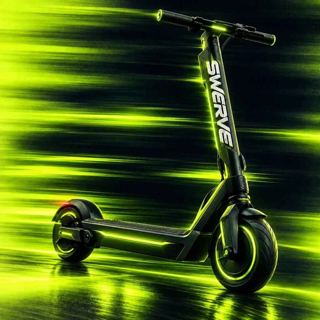
On the bicycle frame, the white name follows the geometry of the product. Wider views bring the light-trail language back around the bike and scooter. These presentation mockups show the identity moving between a small branded detail and a complete equipment scene.
The same language, closer to people
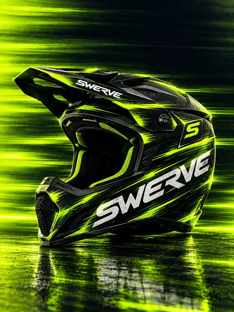
The helmet uses the wordmark and electric-green lines across a curved surface. The apparel collection carries related marks through clothing and accessories. Viewed together, the mockups show how the visual system can change scale while holding onto its dark base and directional energy.
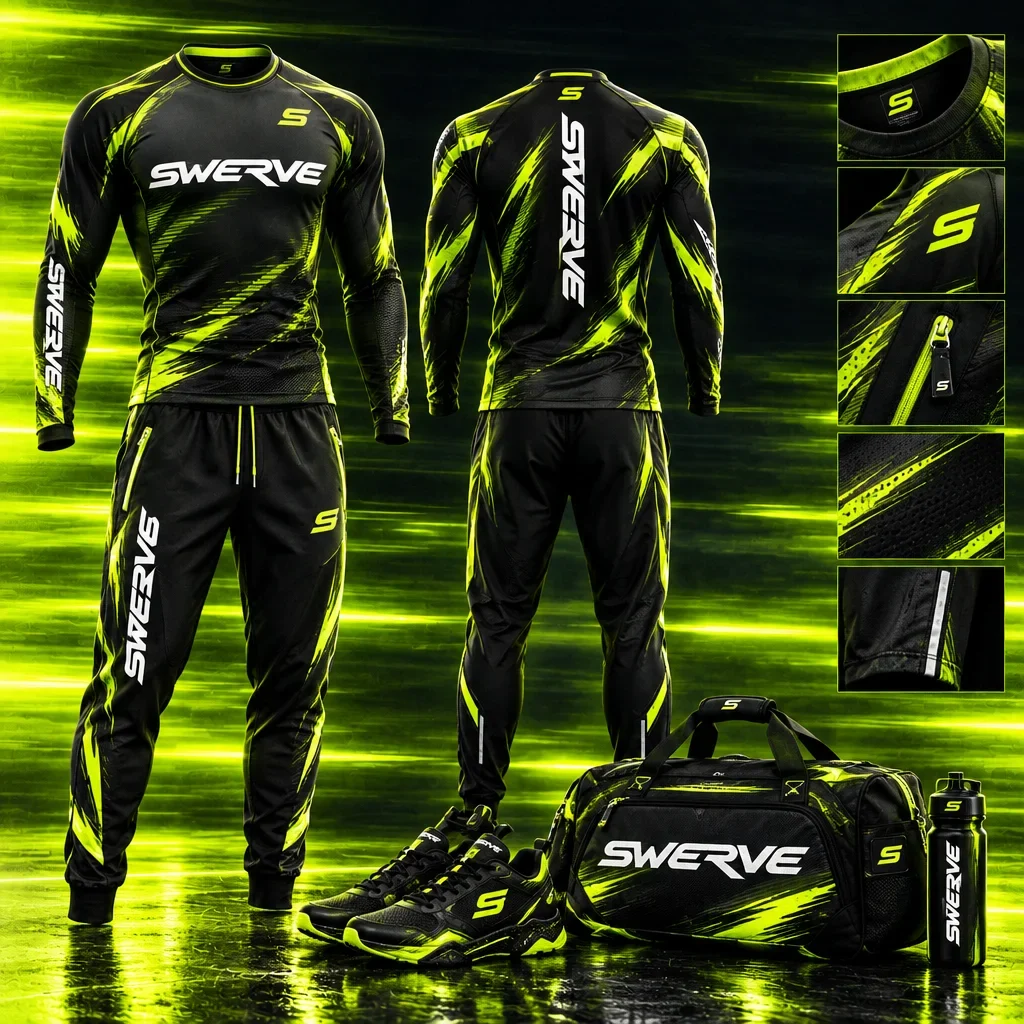
A larger surface for the ride
The outdoor presentation gives the bike, wordmark and green trails room to work as one composition. The name stays prominent while the product becomes the focal point. The billboard is shown as a campaign mockup, illustrating the identity at an environmental scale.
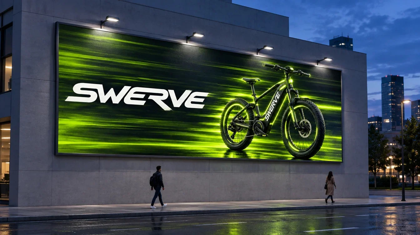
Movement at the scale of the rider
Equipment graphics, clothing and campaign applications share the directional lettering and green accent. Some surfaces use the name alone; others bring in the full trail treatment. That range gives Swerve a recognisable identity without requiring every application to carry the same amount of detail.