Vitanex
Vitanex’s logo and packaging organise six wellness ranges through expressive colour, layered surfaces and a consistent product-information structure.

A British brand developing health-focused products, including multivitamins and nutritional supplements.
Give a varied supplement range a coherent identity while making each product easy to distinguish through colour, typography and a consistent information hierarchy.
Logo design, brand identity and packaging design
Wordmark, visual identity, colour and pattern system, and packaging design across six product ranges.
The identity connects the logo and packaging while allowing each wellness range its own colour and surface treatment. The same hierarchy carries into close product views and everyday settings, giving future additions a clear structure to follow.
Logo, branding and packaging designed by Ali Komeili. Project visuals supplied by the designer.
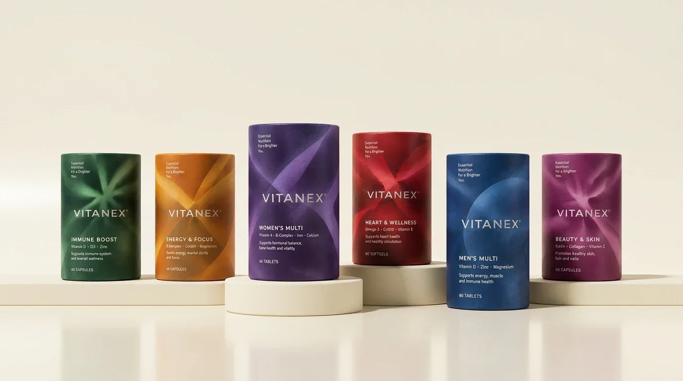
Find the right place in the range
Vitanex is a British wellness brand developing multivitamins and nutritional supplements. Its range needs to feel coherent while giving each product a clear identity. I designed the logo, branding and packaging together, using consistent typography and placement with a different colour family for each product.
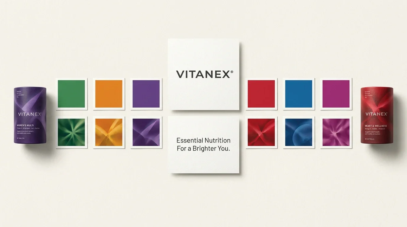
Let colour do the first reading
Green, orange, purple, red, blue and pink separate the six ranges before the finer information is read. The uppercase wordmark and repeated product-name placement provide a steady structure. Layered surface graphics add depth while leaving that reading order intact.
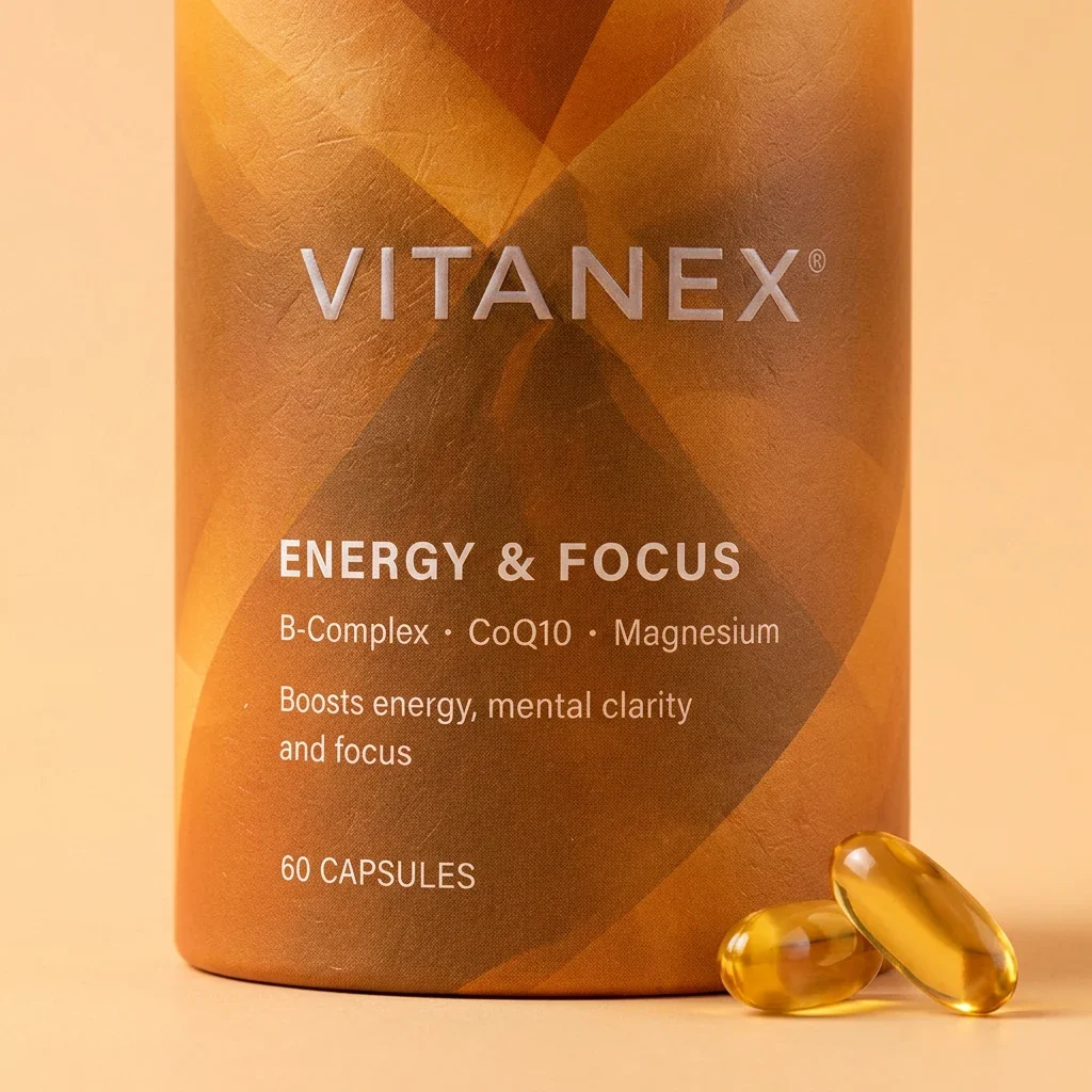
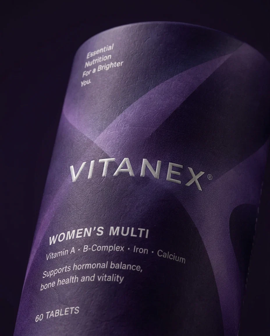
A quiet wordmark, expressive surfaces
The uppercase wordmark gives the identity a steady centre. Around it, translucent folds and overlapping shapes introduce depth and movement. The contrast between restrained typography and richer surfaces gives the range a composed, tactile character without competing with the product names.

Colour makes the range readable
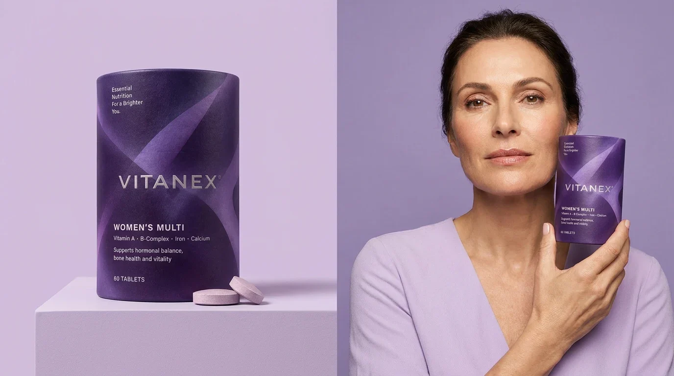
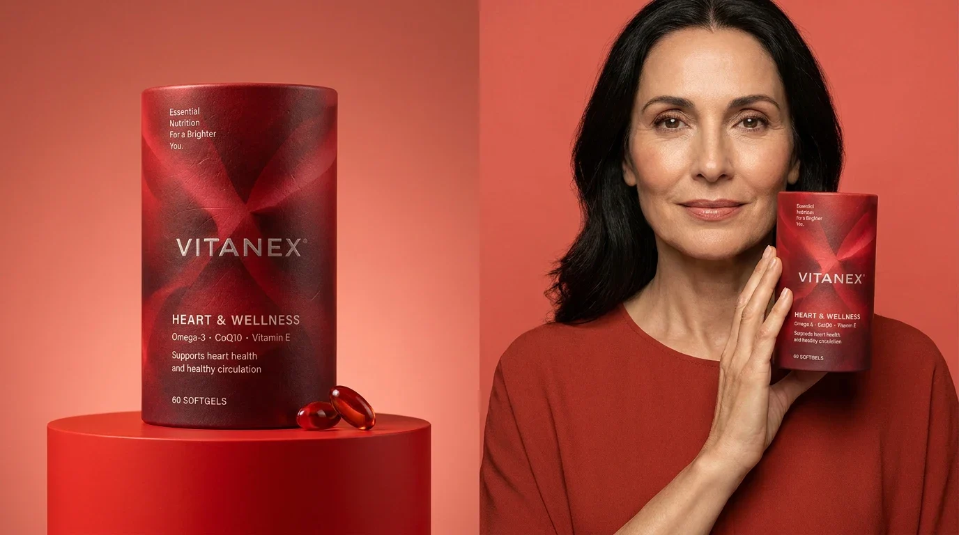
Each product occupies a distinct colour family, from green and orange to purple, red, blue and pink. The same placement of the wordmark, product name and supporting information holds the range together. This repeatable structure makes variation feel intentional across the six packages.
Bringing the identity into daily life
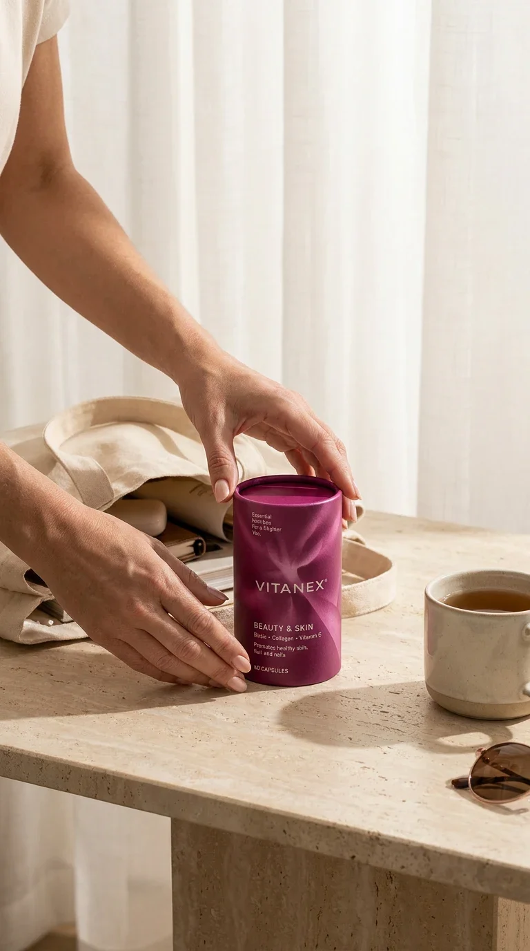
The presentation moves from close views of the packaging to portraits and everyday settings. Colour connects each pack to its surroundings, while changes in scale reveal the surface details. These applications show how the identity can retain its character beyond an isolated product image.

Six ranges with a common structure
The identity connects the logo and packaging while allowing each wellness range its own colour and surface treatment. The same hierarchy carries into close product views and everyday settings, giving future additions a clear structure to follow.