Zippi
Zippi’s children’s gummy-vitamin packaging pairs illustrated animal adventures with a clear flavour family and consistent information hierarchy.
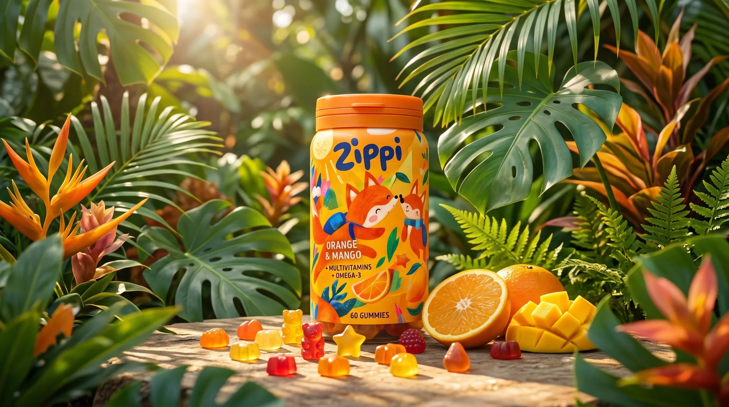
A children’s gummy vitamin identity built around illustrated animal adventures and a colour-coded flavour family.
Give a children’s vitamin range a playful, recognisable identity while keeping product names and flavour information organised across richly illustrated labels.
Visual identity and packaging design
Wordmark and typography direction Colour and character system Four-variant packaging presentation Label layout and brand applications
The illustrated variants share a rounded wordmark, flavour hierarchy and coordinated colour palette. Flat-label studies and bottle details show how that structure supports lively scenes on the pack.
Design: Ali Komeili / Desartly
A small adventure around a routine
Zippi brings an animal world to children’s gummy-vitamin packaging. Children meet a fox, koala, penguin or rabbit; parents need to find the product and flavour information. The label gives the illustrations an expressive area while keeping the name and essential text in consistent places across the range.
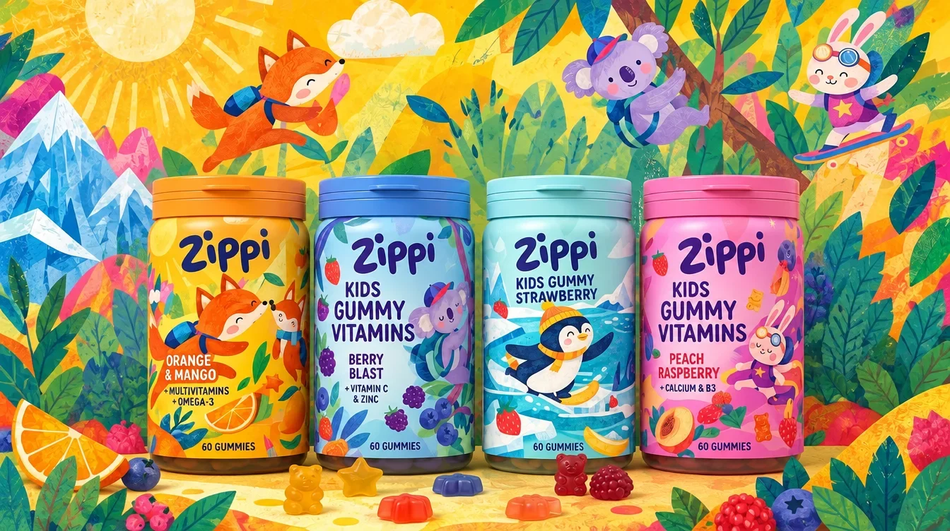
Let each character change the climate
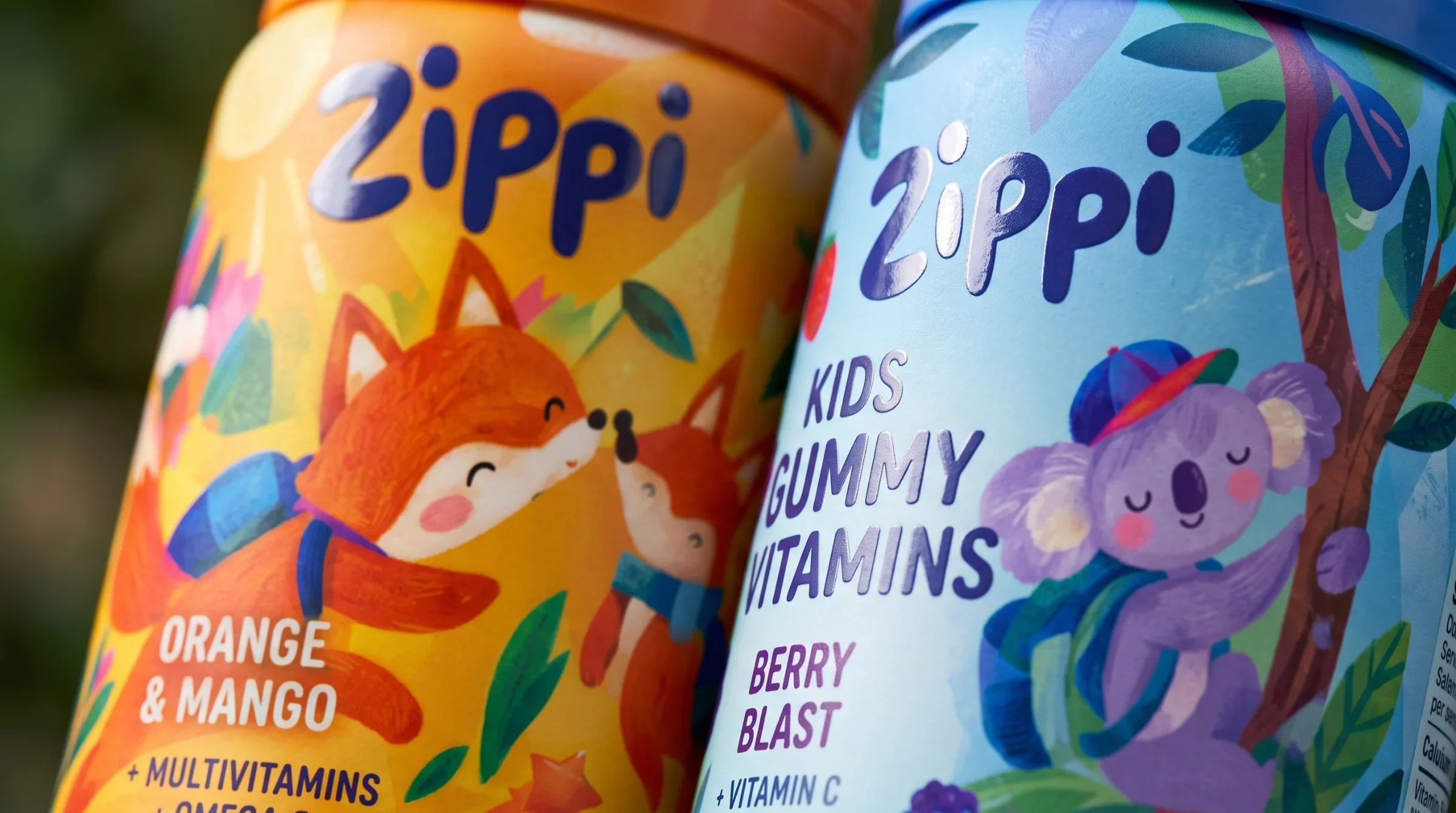
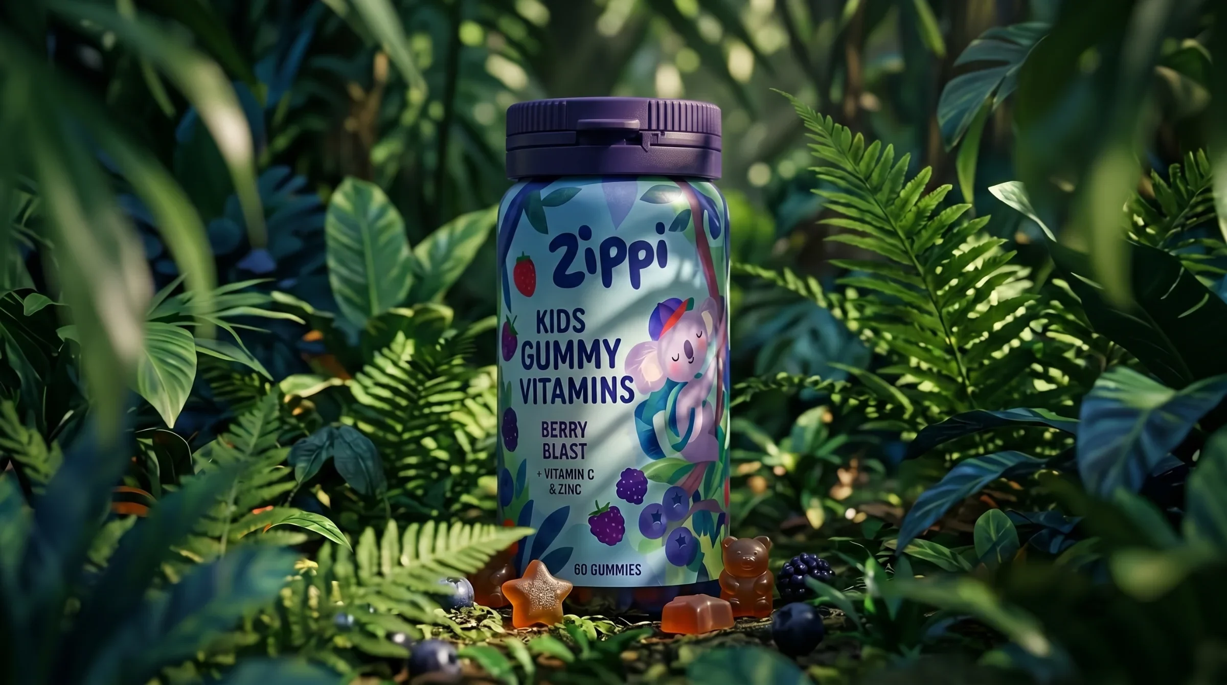
The fox introduces a warm orange scene, the koala a berry-coloured forest, the penguin an icy blue setting and the rabbit a pink world. Colour and character make the variants distinct. The bottle format and wordmark hold their place so the range remains recognisable as a family.
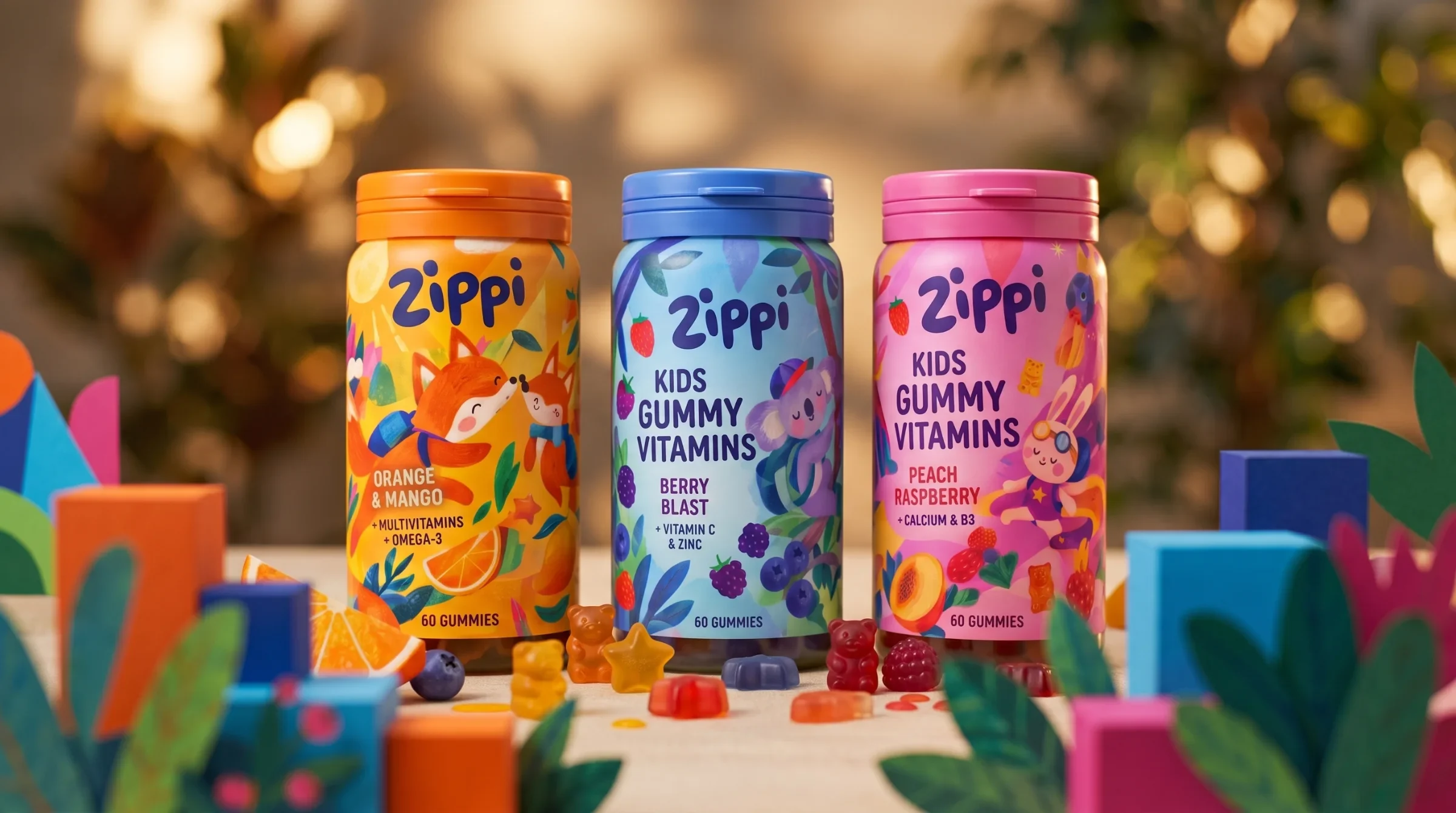
Soft letters, steady placement
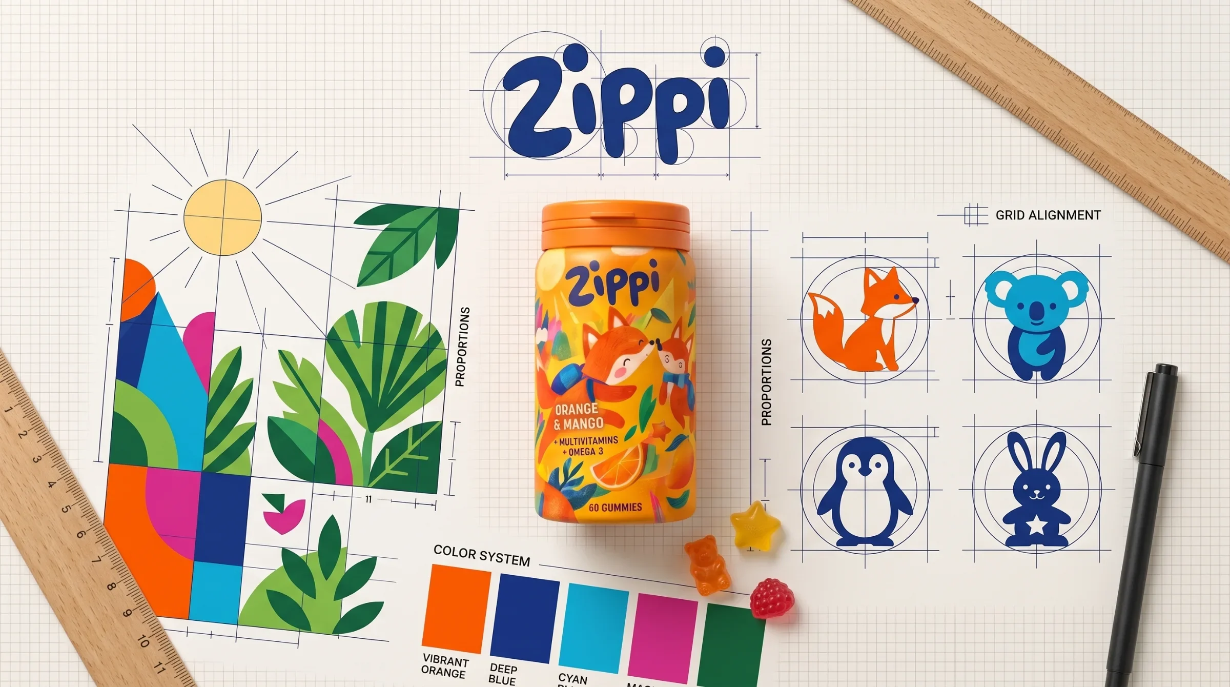
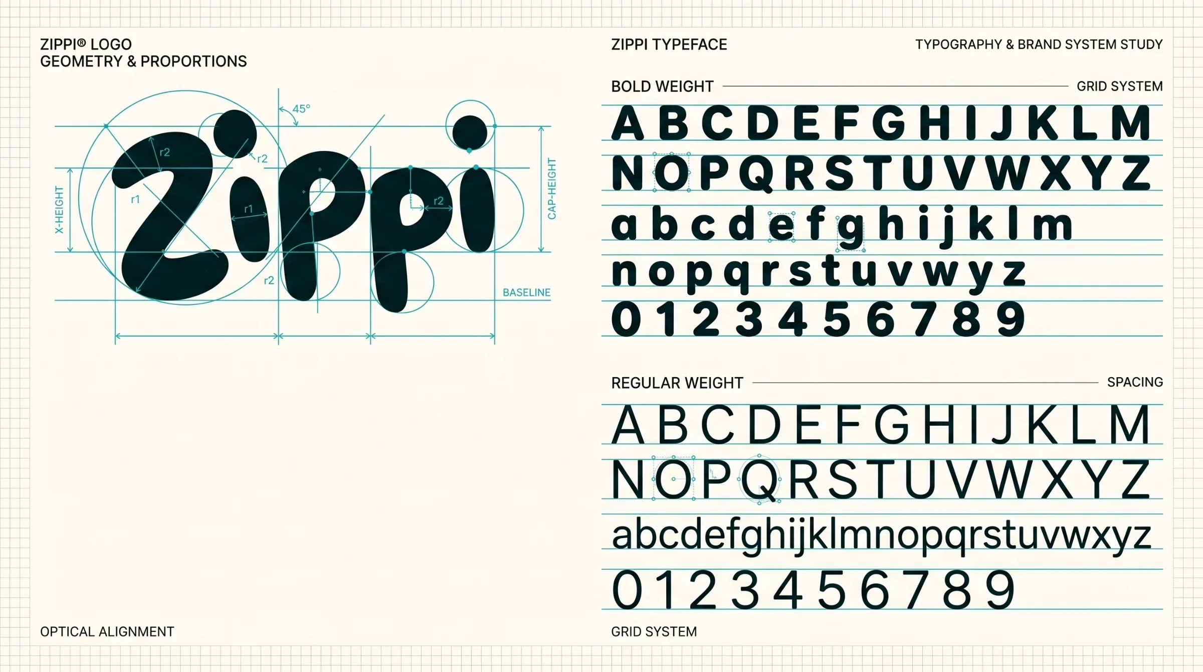
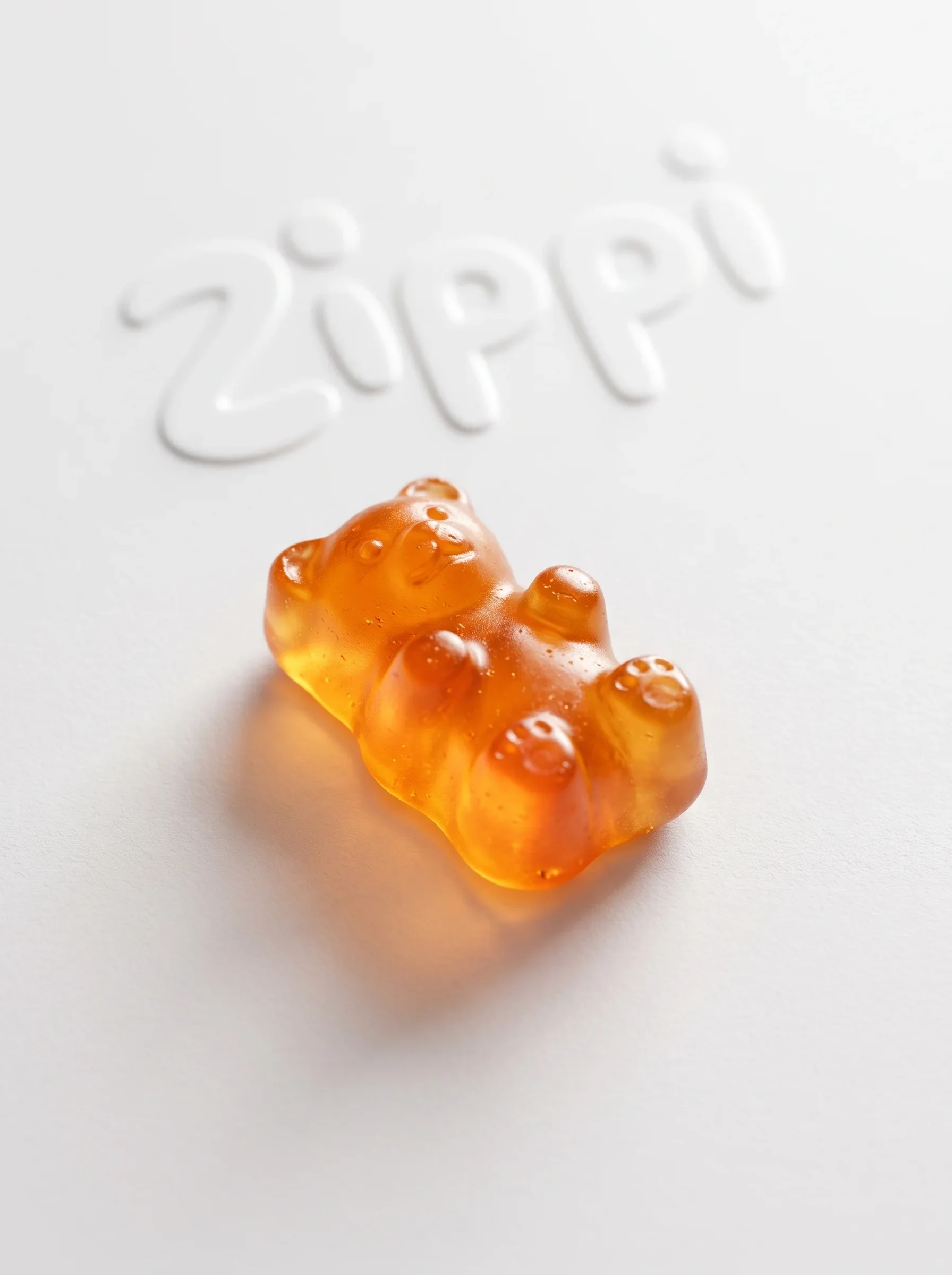
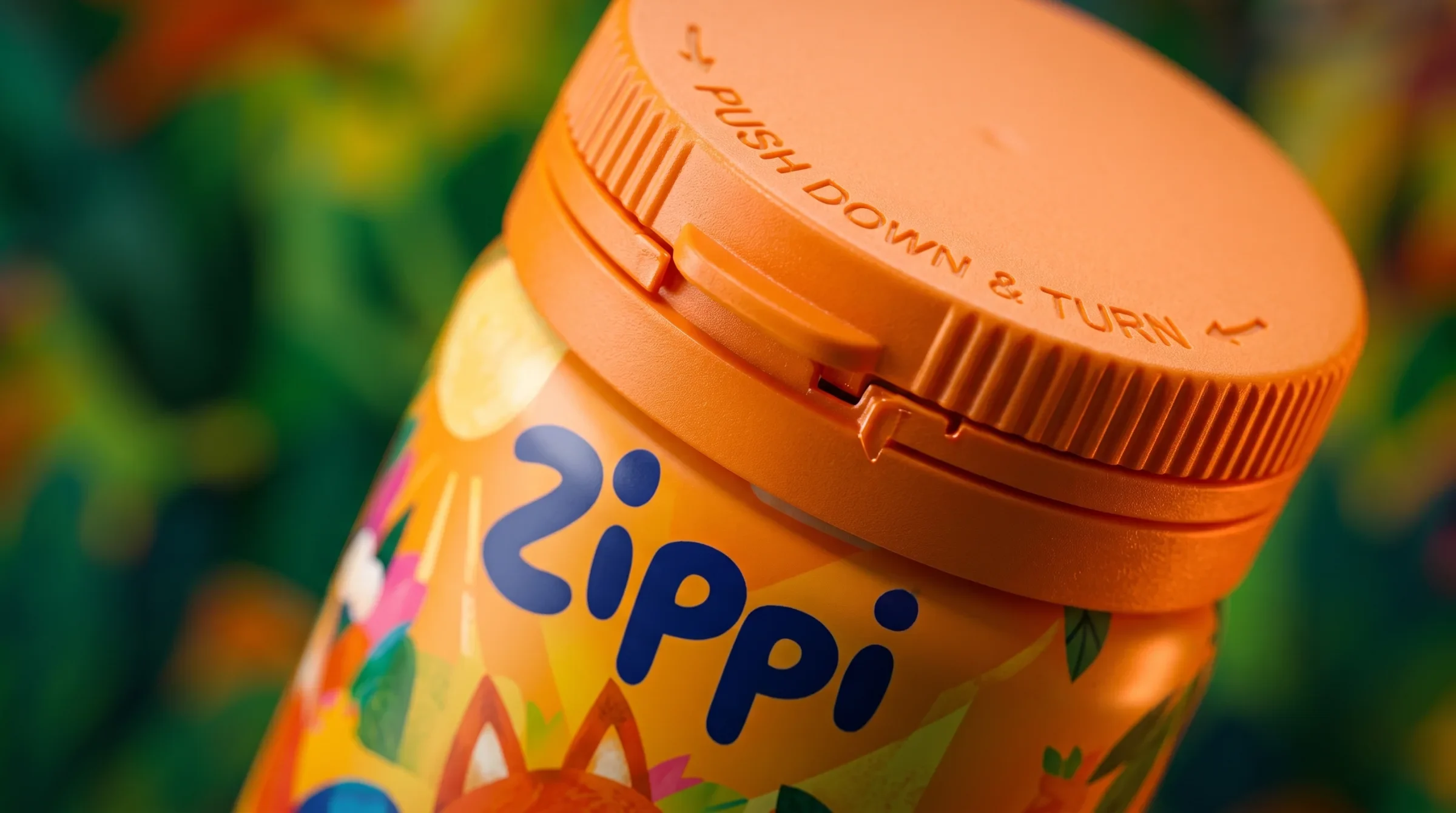
The wordmark’s rounded strokes, oversized dots and uneven letter rhythm echo the softness of the gummy form. On the bottles, its dark lettering sits near the top of the label, giving the lively illustrations a stable point of recognition.
A shared world with different climates
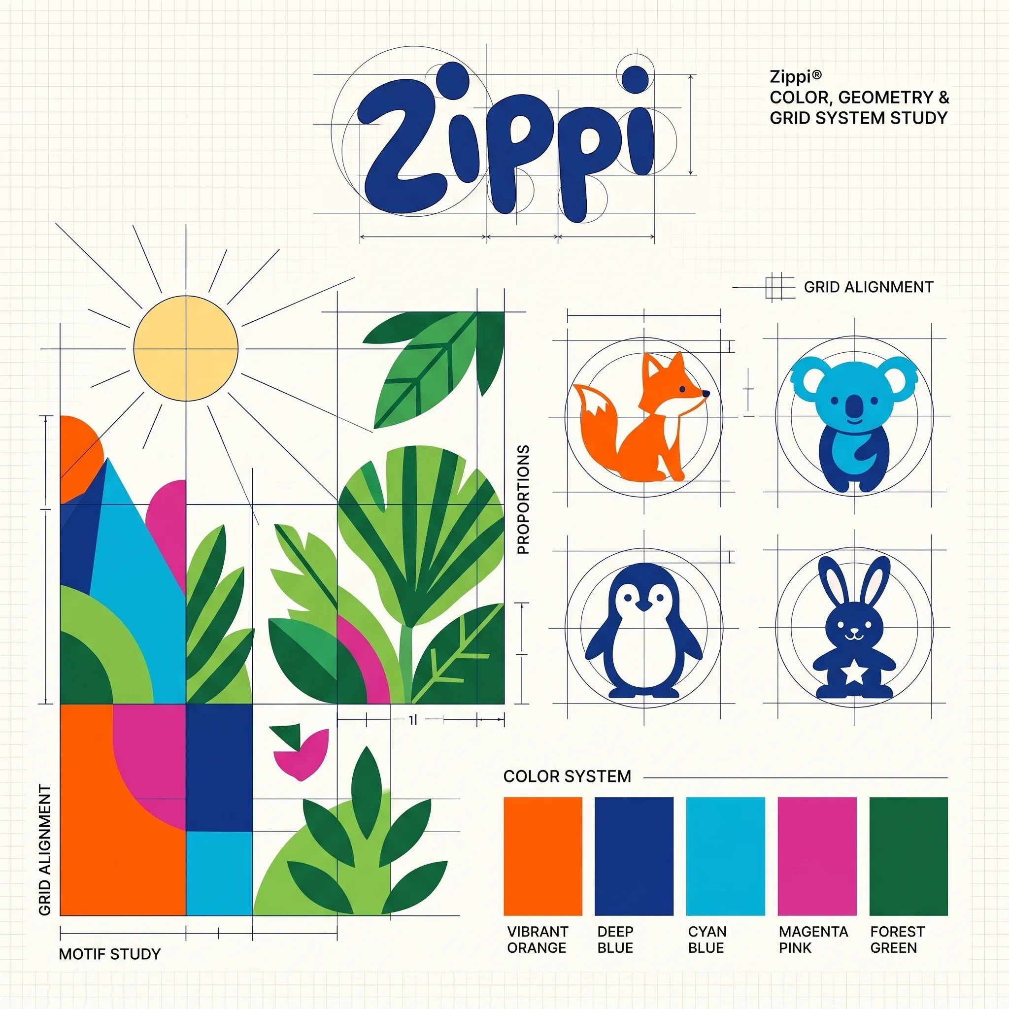
Orange, deep blue, cyan, magenta and forest green form the shared palette. The system board links these colours to geometric leaves and simplified animal shapes, while each label gives one colour family more space to distinguish its flavour.
The label has two reading speeds
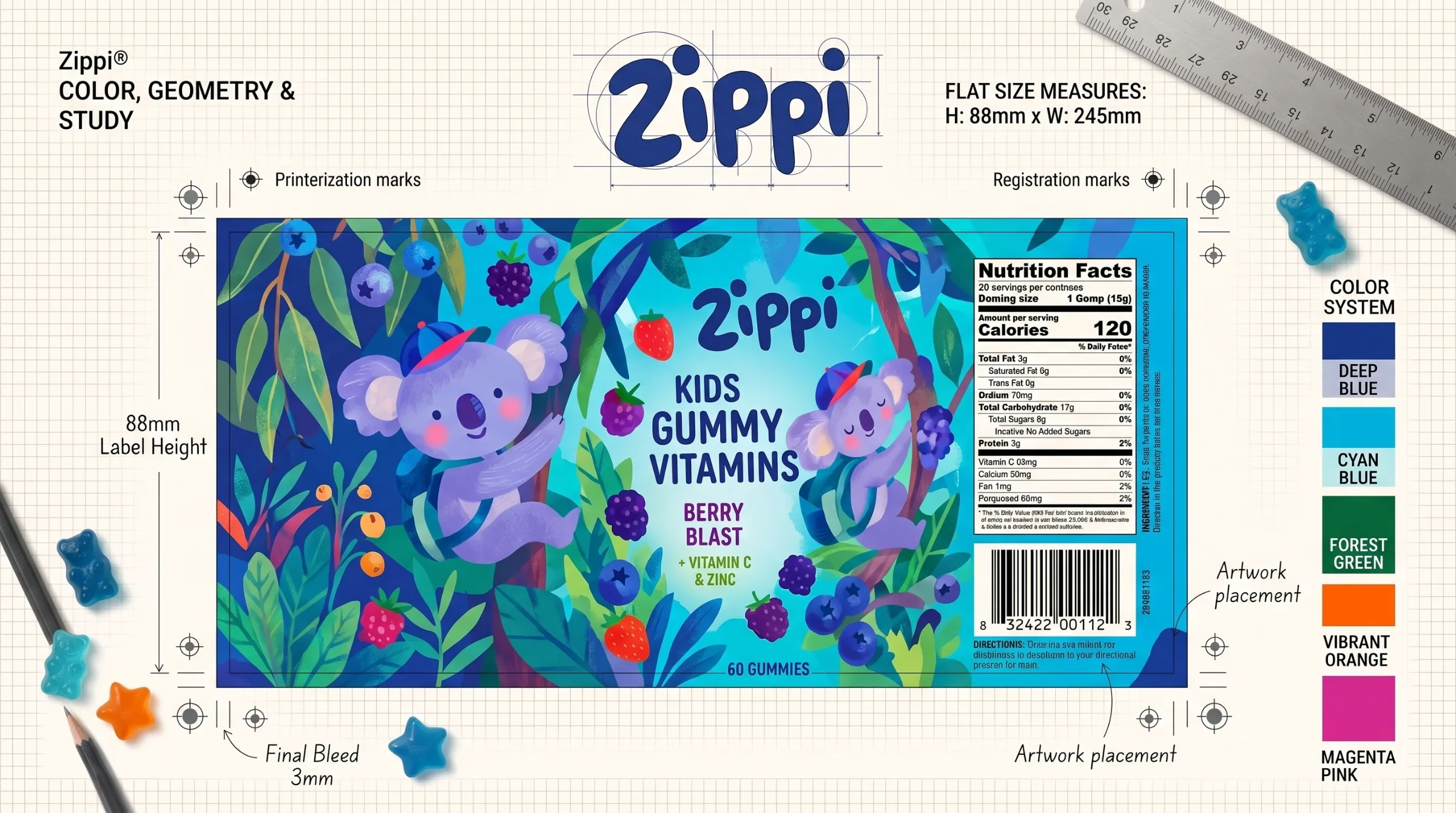
At a glance, colour and character separate the variants. Closer inspection reveals a repeated order for the brand, product name and flavour, with a separate information panel on the flat label study. This hierarchy gives the illustration a defined area rather than asking it to carry every message.
From the drawing to the bottle
The close views show foliage, fruit and characters wrapping around the bottle, with the large wordmark holding its place beneath the cap. Illustration gives each variant its own world. Consistent label structure ties those worlds together and keeps the product information easy for parents to find.
Four worlds within one label system
The illustrated variants share a rounded wordmark, flavour hierarchy and coordinated colour palette. Flat-label studies and bottle details show how that structure supports lively scenes on the pack. The delivered identity gives each variant its own story within a consistent range.